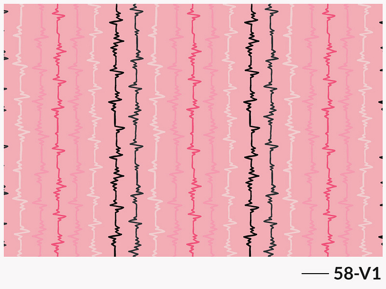
Repeat pattern 58
Pattern filled with heartbeats.
Why vertical instead of horizontal? You may wonder. I think verticality and a bountiful of colors both represents the pulsing life much better than it would in horizontal version. Wanted to capture the thriving pulse, that’s where the idea of using vertical orientation came. The beats are coming from a strong, courageous heart. Verticality is a symbol here to convey the strength, resolve to stick to its core. And colors, as a sign of alive in full spectrum.
The sketchiness remains as a sign for the hits it takes in the journey of finding its strength. Though I could smooth out them all, I stopped at a point. I think the sketchiness suits its overall vibe more.
Likes and feedback are all welcomed. ❤
For more color variations, you can visit my Instagram account: https://www.instagram.com/that.pattern.ninja/
I usually publish all the color variations there.
Interested in working together? Got a project that you think I might be a good fit for? Let’s talk in the email: 9bithi.sumaiya9@gmail.com
