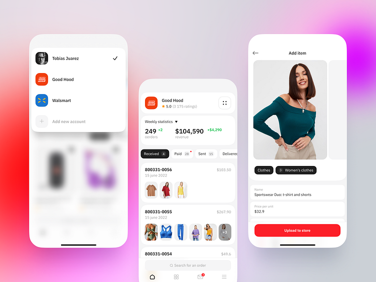
Concept of e-commerce mobile app, new approach
Hey, guys!Let's consider the other side of e-commerce.
What if you want to sell goods as well as buy them? Super easy! All you need to do is choose your seller account and start setting up your own shop. On the dashboard you will see current metrics such as the number of orders and sales, as well as a list of your current orders with a status filter. You can also add items directly from your phone, super fast, super easy and convenient if you have a small shop.
This is our new concept for a mobile e-commerce app. This time we decided to do something different and try a new approach to the structure of the whole app. Endless scroll on the home page, making you spend hours scrolling down the products? Not now! We believe the online shopping experience can be different — ethical, less stressful and more conscious. It can serve the purpose of finding cool and useful items and buying them when you need them. That's why on the home screen you can find your profile info, current orders, a list of favourites and a search bar. It's everything you need to get started. No annoying banners, no endless scrolling of useless and unnecessary stuff, no catchy "IT IS YOUR LAST CHANCE" texts. Just a light and minimalist design and the features you really need in an e-com mobile app.
Cheers! Be sure to follow our team to receive updates on this project =)

