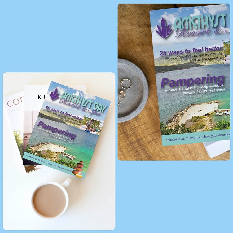
Amethyst Bay Magazine Cover
(The following assignment is a magazine cover I designed in college. The logo, fonts, and most of the color palette were pre-selected. The rest was up to me)
Amethyst Bay is a resort that provides spa treatments and other relaxation activities. It's located by a beautiful ocean in St. Thomas, VI. The requirements of the assignment were to advertise the location and the spa's offers, I had the freedom to choose those services. I chose to go with eco-friendly treatments and herbal medicine, along with the usual massage and facials that every spa offers. I chose services that benefit the environment because I knew it would give my spa a competitive edge. Many people like to relax while being surrounded by nature, and combining it with pampering services is a great marketing strategy.
For the background image, I chose to advertise the location because describing the spa required a lot of information, better to leave that for the headings and other text. Also, it attracts customers who want to find a relaxing destination. I chose a stock photo of an island on Google because the rocks and water reminded me of a resort, specifically the ones in commercials that show a helicopter view of the beach. I wanted to have that same feel.
For most of the text, the ones directly on the background, have a drop shadow legibility. I started off with a header that reads "25 ways to feel better with our eco-friendly spa treatments and herbal remedies."I wanted to add a number of ways a viewer can relax to portray that Amethyst Bay has so many services available. Next to the header is a small image of someone receiving a massage by the beach to include the location (island=water) again because again, it's one of the Bay's best attractions. I also wanted to catch the eyes of anyone looking for a vacation. A resort by the beach is a perfect match. Originally, I left the image as is but felt it was missing something. Then, I added a purple border to give it a pop of color. Purple was used simply because the blue hue would have blended with the background. As for the placement of the text and image, they were placed on the right side to direct the viewer's eyes to it after viewing the background. For the text underneath the heading, I added black to the color palette so that it is readable against the background without using purple again. I also needed to separate it from the header. I chose black because it's the color of elegance, which is something spas thrive for.
Then in the middle, I included the text, "Pampering services available including massage, therapy, facials, and more" as the next line of focus. I chose white for the smaller text because it is the color of purity. Spas are known for helping their customers remove impurities. Similar to the above text, I wanted to separate the header from the body of text so purple was used again. It also makes the middle of the cover pop. It is an important color for in this brand after all. The header, "Pampering" was used to attract balance-seeking viewers to the spa.
For the bottom portion of the cover, I put the location in purple text with a blue banner to keep up with the brand color scheme. I already used purple a lot in the design so I chose blue for the banner to switch it up. I also added balancing rocks to add the calmness of a spa to the design. I noticed that rocks are sometimes used to soothe aches. So I wanted to include it to go with the eco-friendly treatments I mentioned earlier because it's a unique approach to spa services.
