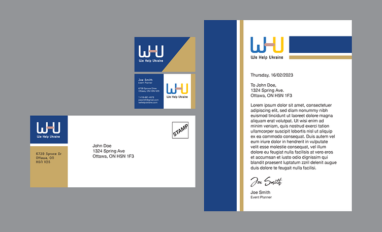
"We Help Ukraine" - Identity System
This is a brand identity system I created based on a fictional non-profit charity organization which specializes in sending aid and disaster relief to those affected by the conflict in Ukraine.
First, I created the lettermark logo, which represents the act of sending aid to Ukraine through the Band-Aid imagery creating a bridge between the two letters. Also, the negative space around the bandage and the stems of the "W" and the "U" form the letter "H", as in "Help".
Then, for this system, I created a business card, an envelope, and a letterhead. I chose a colour palette of royal blue and gold because those colours invoke a sense of trust and professionalism that tie the system together. They are also indicitive of the colours of the Ukrainian flag. To keep the design focused, I stuck with simple rectangles and geometric shapes, which add visual interest while not overpowering the legiblity of the identity system.
Overall, this design system feels organized, professional, and trustworthy. So, I am happy with how these designs came out.
