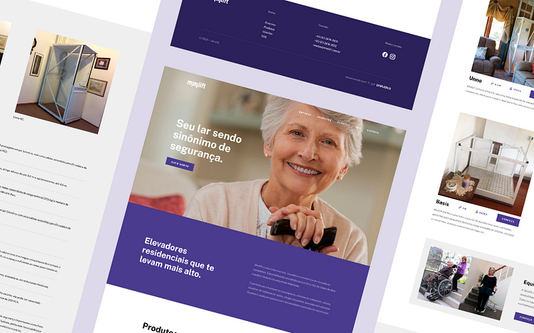
Minilift | UX/UI & Web development
Website redesign for a residential lift manufacturer
Despite its 30 years in the residential lift market, there was a difficulty for the Minilift company to reach its target audience: People with mobility difficulties. Our goal then was to make the brand's website reach those who really need it.
After a market survey, my work then focused on attracting the attention of an audience whose mobility difficulties are more common: elderly people.
Simple design, modern and easy to understand
The entire project was designed so that a person without proper experience with the internet can navigate easily. For this purpose, I use well-defined sections and columns, in addition to organizing the images in order to always make the most of the available screen space.
Something that bothered me a lot with the old site was the lack of conversation between the brand and the site. The color palette defined, in addition to being non-aggressive, brings the tranquility that blends very well with the overall scope of the project.


