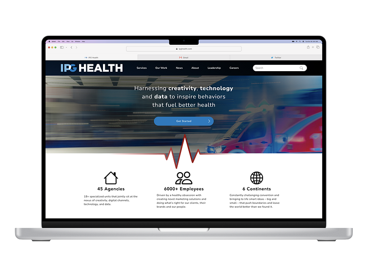
IPG Health - Landing Page
About
This concept was created for the Daily UI Challenge :: 003, which provided the following prompt: "Design a landing page." I decided to expand upon this prompt and go for a broader home page instead.
Utilizing IPG Health's existing branding/style guide elements, I created this concept for an update to their home page.
My goal was to create something that would make their business's value more apparent. The current site heavily relies on large text blocks to convey services and information. I aimed to design a simplified home page that could be quickly scanned and would encourage site visitors to take action. To achieve this, I broke down some of the copy into smaller points and ensured that the information users would need to see prior to taking action was visible without scrolling. The current site also lacked a call to action (CTA), requiring users to navigate through the site. By making a CTA the central focal point of the page, it will allow users to contact the company more quickly, increase lead generation, and hopefully, conversion.
Want to work with me?
Feel free to send me a message here if you're interested in working together on a project.
If you would like to see more of my work, including full project case studies, hop on over to my portfolio website.
I look forward to connecting with you!
