Coyotes Rebrand -- Jerseys Pt. 1
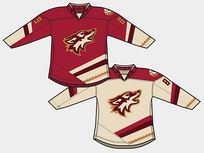
Working with a new hockey jersey template-- and decided it was time to execute a first pass at my new idea for Coyotes jerseys as part of this rebrand.
I must say, I don't like what the team did last week surrounding the new uniforms. Too generic for my taste, especially considering the wild Kachina jerseys of the past. It's hockey in an untraditional market-- they can have a little fun with it.
Not to mention some motifs that not only connect the team to the desert, but also separate the Coyotes from all of the other red/black teams in the league.
The road takes on the "desert sand" color, while the unbalanced striping pattern uses a triangular design that tones down the craziness of the kachina era while still being distinctive.
I considered a sublimated desert landscape in the space behind the crest logo.... but it might be a litttttttle much. More to come!