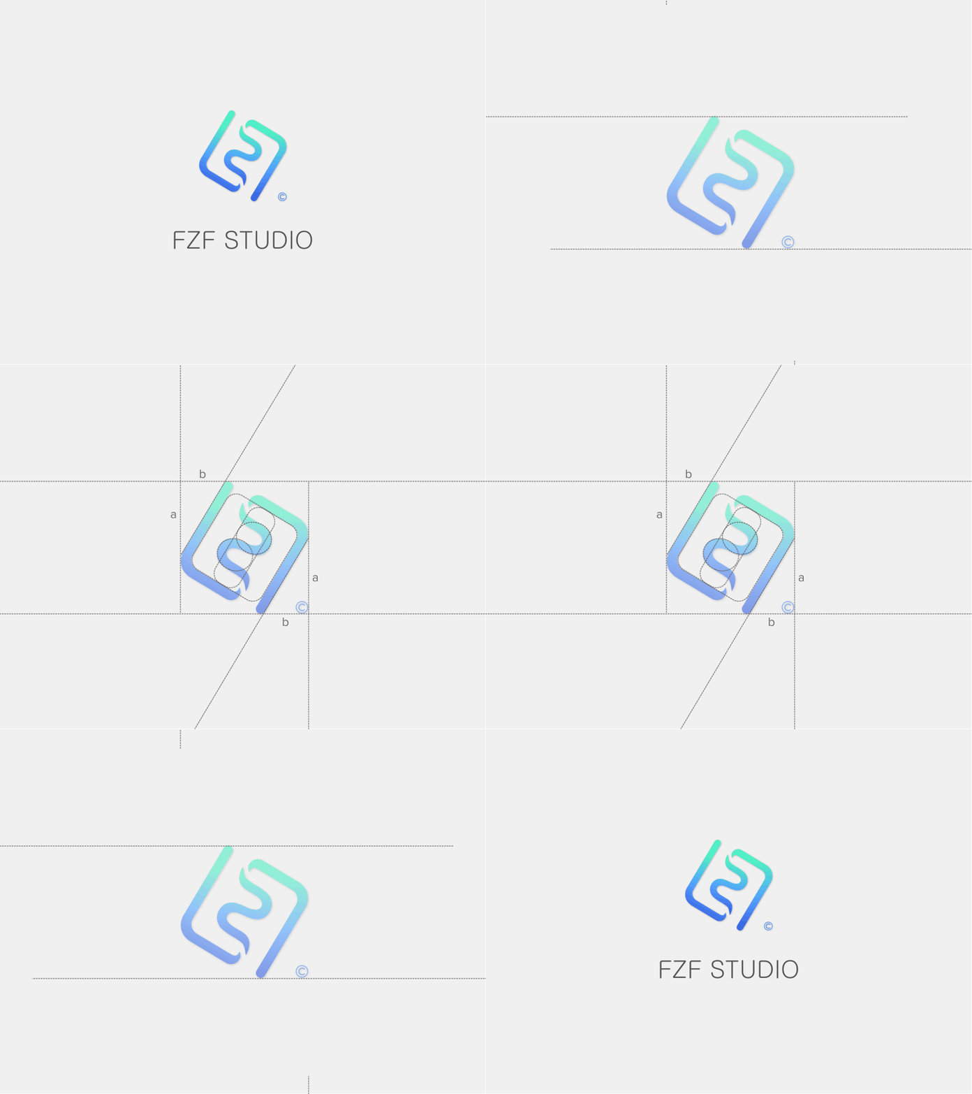
FZF Logo
Trying out a logo concept with negative space. Two "F"s nest with each other and one "Z" emerges in the middle. Can you see them? I am also applying the golden ratio to the angel which the logo tilted in. Feel free to download the Sketch source file.
Press "L" to show some love.
FZF_Studio.sketch
90 KB
More by Chuanqi Li View profile
Like
