Radient: coin marketplace, state of a list
Hey guys,
Today I published a coin marketplace that has been redone from the workable product but with fixes and redesign. That means this is a concept that I did but with product thinking and user patterns.
Some essential things are evident for me as a designer with experience in the digital field, and I want to share with you the list of fixes I did.
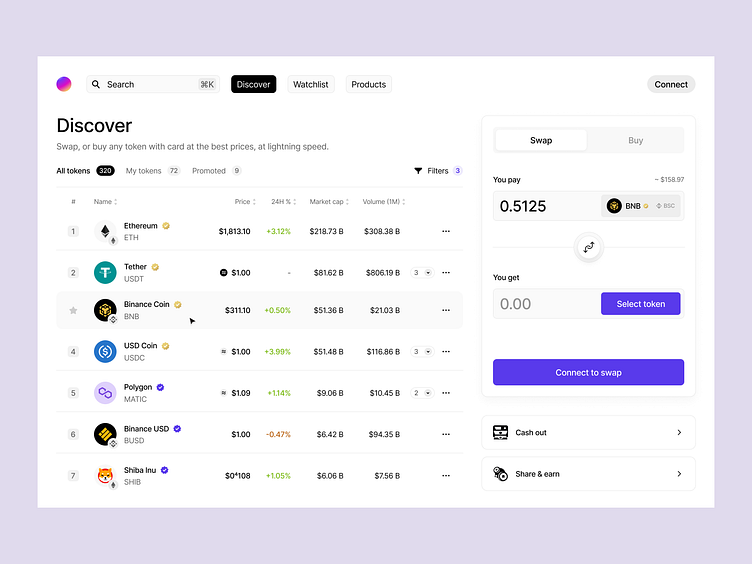
1) All indicators should be visible to users. We can't make decrease indications gray color.
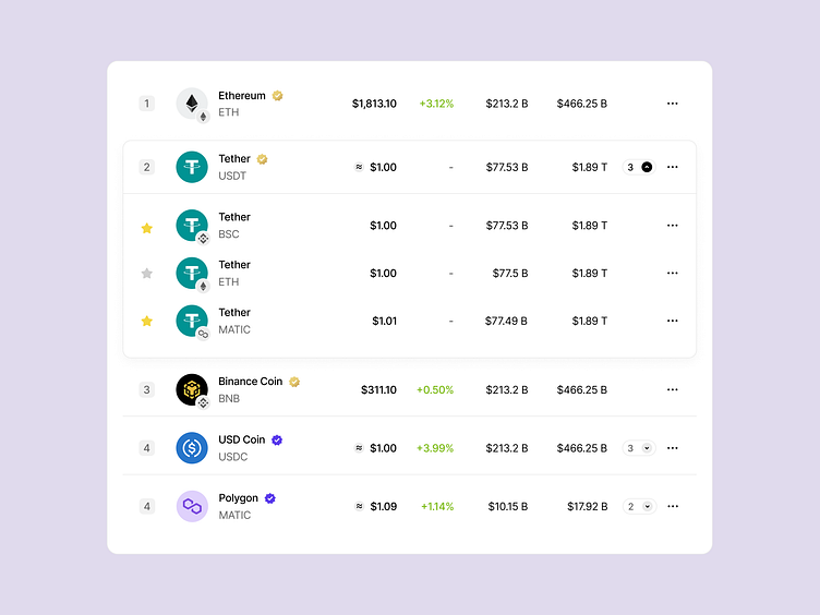
2) Coins can be in nested lists if they have similarities. It makes your scrolling easier. And don't make you struggle with this.
3) Symbolism is more understandable than text. Due to this reason, I made icons of the chain nearby coins. Your eye is cline glance for symbols faster than text.
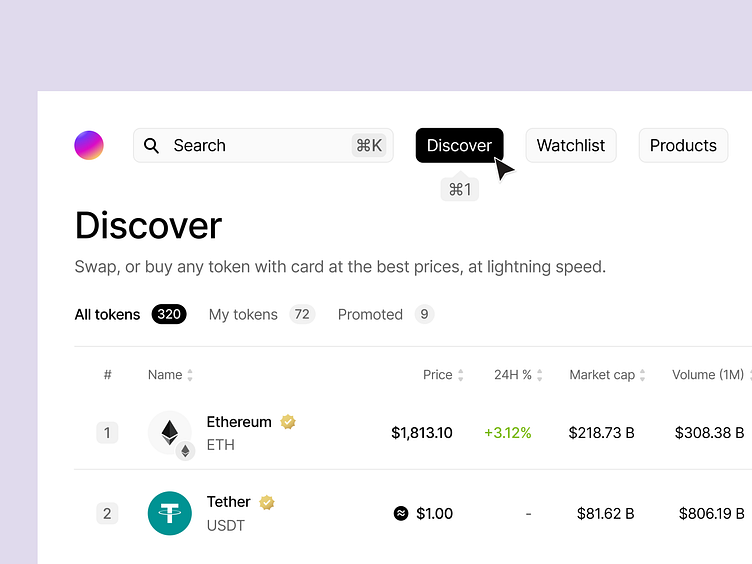
4) Improved token counter for understanding how many tokens are in your list or how many coins I've added to favorites.
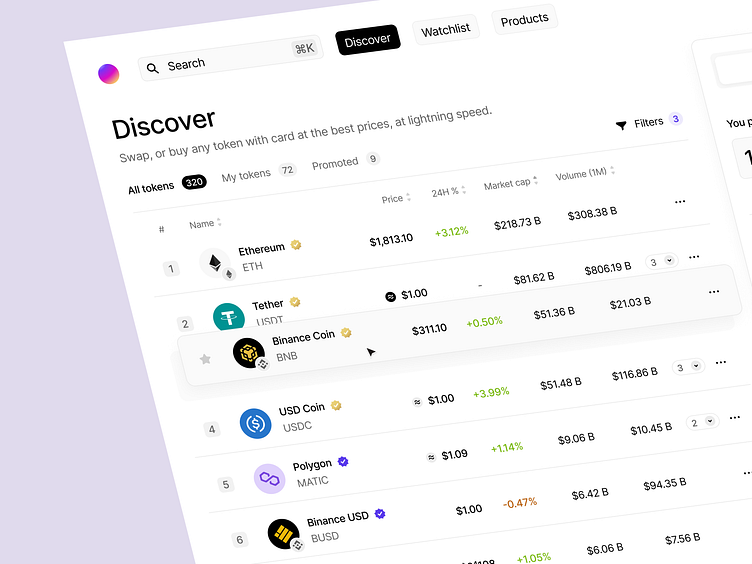
5) Filter. I don't have here specific comment. I think this is obvious that better to have a special place for all your filters.
6) Hierarchy on the board, before a redesign, there were a lot of elements that overlapped with each other, and it seems like an idea, but I would say it looks like a mess.
7) Equally important are the hotkeys I added to the menu to improve user quality of work with the marketplace.
Here I described significant moments that should be improved from my perspective.
Thank you for your attention. I hope you like what you saw. I am waiting for your comments and opinion.