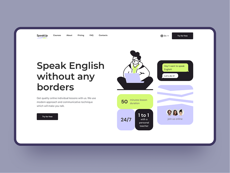
English online school | Hero section
Hi there! 👋
Today I want to share my work — a landing page for an English online school. I decided to use bright accents, illustrations, and a minimalistic pattern to diversify the design.
You can see part of the landing page - the Hero section. Stay tuned for further shots to see the entire landing page.
Have any feedback? Share in the comments.
Press "L" for Like! 💚
More by Kristina Moiseeva View profile
Like
