Button
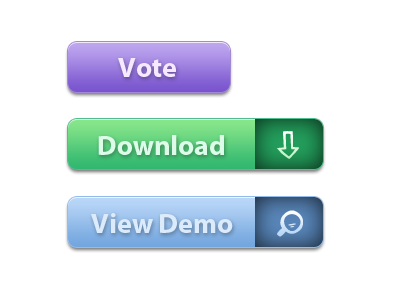
Nice style Chris – although the sections with the icons look a bit strange? They look recessed due to the inner shadows but then the drop-shadow makes them pop off the background.
If you give the icon some clear space inside the button it looker neater. Could also put it inside a roughened circle to match the icon style? Might even work better with a different typeface to further compliment the icons
More by Dean Hudson View profile
Like

