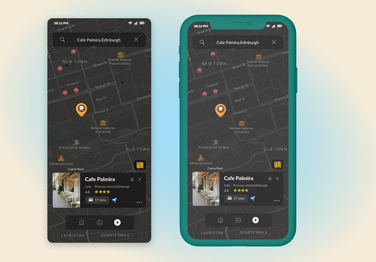
Map #DailyUI #29
Hi Dribblers!
Key principles to keep in mind when designing a map:
Simplicity: Map design should be simple and uncluttered. Avoid adding too many details, labels or features that can overwhelm the map reader.
Legibility: Text on the map is legible and easy to read, even at small sizes. Selection of font that is clear and legible, and used appropriate text sizes and styles for different types of information.
Hierarchy: A clear hierarchy of information to guide the viewer's eye through the map. Used different visual cues, such as size, colour, and font style to differentiate between different types of information and to highlight important features.
Contrast: Used contrast to create visual interest and to highlight important information.
Balance: Balance of visual elements of a map to create a harmonious overall design.
Consistency: A consistent use of styles and symbols throughout the map to create a cohesive and unified design. This includes the use of colours, fonts, and symbols.
Functionality: Keep the intended function of the map in mind when designing it. The map should be easy to use and should effectively communicate the desired information to the viewer.
Please provide your feedback and hope you like it. Cheers!
Thanks for your likes and comments.
Want to create something great?
Feel free to contact: designer.ux.san@gmail.com


