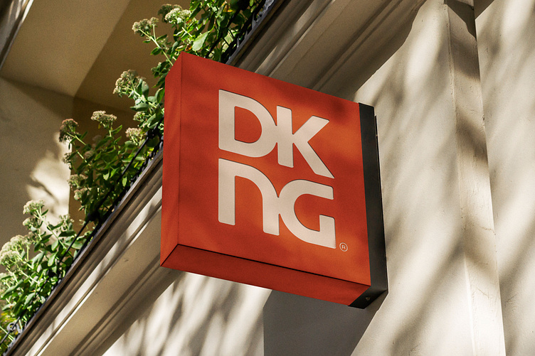
The DKNG Branding!
Branding yourself often feels like a nearly impossible task, so it’s no surprise that our current logo and brand look stayed consistent for many long years. But as a designer it’s hard to resist the urge to tinker with a logo here and a color palette there, so we’re proud to finally unveil a new look for DKNG. Our goal was to keep the refresh minimal and to stick with what we’d already established in our red and white square motif. However we wanted to lean further into custom lettering and a slightly retro vibe, aiming to complement the childhood nostalgia that we try to achieve with much of our work.
The new logo is a bit of a callback to our original 2006 logo that appeared on our very first gig posters for the Troubadour. Although that first version wasn’t quite as legible, we wanted to bring back the symmetrical way that the “D” and “G” bookend the wordmark. We also updated our color palette to feel more aged with a less primary red, a creamier white, and a slightly faded black.
The new logo system is also designed to be more modular with specific versions for large and small scale use cases, single line and stacked versions of the logo, and options with and without containers and supplemental square icon. The new system has already been much more functional for us and we look forward to trying it out in new fun applications like merch, new event signage, and general DKNG swag.


