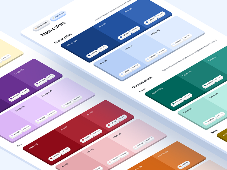
Design System Color Palette - Light Mode
Creating a "digital ready" color palette can be either a simple and enjoyable process, or a difficult and frustrating one, depending on how we approach it. Although it may seem like just a few hex codes, it could be a smooth, peaceful road trip or a challenging trek through a dense jungle.
Don't create just a color palette; create a color palette system.
To make my life easier, I prefer to establish systems, patterns, or methods that help organize my tasks instead of doing everything manually right off the bat. Although this may require more effort initially, it ensures that my work is easily scalable, customizable, comprehensible to my team, and error-free.
In this scenario, I have many mobile app components that use a primary color by default but can be themed using other colors to enrich the visual experience.
What was my plan to execute this idea?
I have decided how many shades I need and how distanced they must be to make interactive states, backgrounds, etc.
Based on that pattern, I have created multiple other colors that can entirely swap the primary color on any component.
Even though blue is a primary color, I can change the accent color on a different component in a flash without any trouble.
Remember to work smart, not hard.
The last thing you want to do is unthinkingly dig a hole you don't even need to dig. Think twice and ask yourself a question whenever you do something - Do I really need it? Can I make it simpler?
Here are a couple of gold tips that I need to remind myself of from time to time:
Not every color must pass the accessibility contrast - Only those with direct contact with texts, images, or components like CTA buttons.
Some colors are just tough to work with - If you can, avoid using yellow or rich blue shades because it is a challenge to make them look good and be accessible simultaneously.
The less, the better - Don't overgenerate shades you won't use. More things to maintain leave less time for fun work.
Semantic colors don't need to be so much different from the primary colors - Look for the red, yellow, and green colors in your existing palette and update them just a little (make lighter or darker, cut some shades).
I hope you find it helpful!
For more, check out my profile and hit follow!
If you have any questions or want to chat, connect with me on LinkedIn!


