The Ray Kids: Landing Page & Visual Design
Social Media and Paid Advertisement
Visual concept for the summer collection that will connect with the landing page.
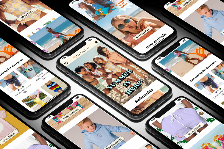
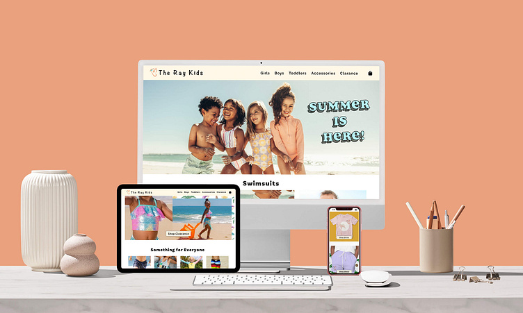
Responsive Landing Page
Leading with the swimsuits shown in the advertisements for a seamless connection and transitions into the rest of the summer collection's new arrivals.
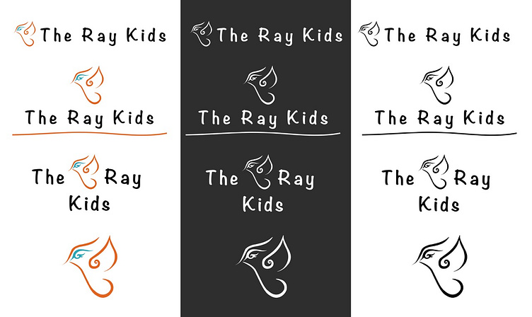
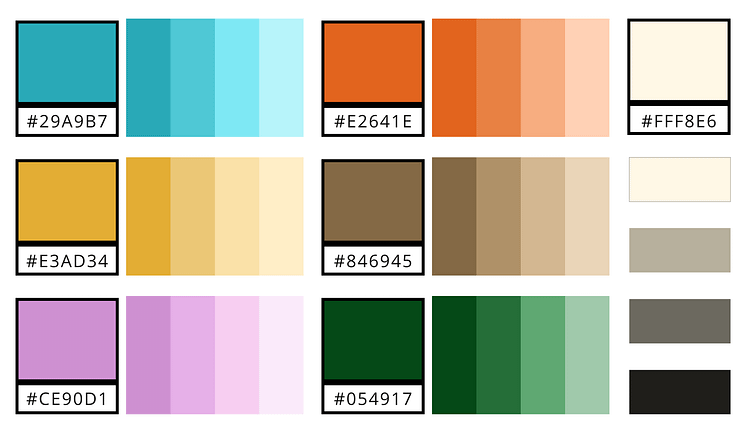
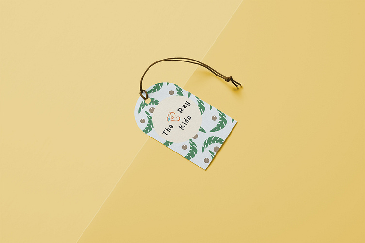
Logo and Color Palette
The Ray Kids is all about having fun, being free, the beach, innocence, and truly just being a kid. The color palette is meant to evoke a sense of warmth, excitement, fun, and vitality. The shades of each color are meant to be manipulated for illustrations and accessibility compliance.
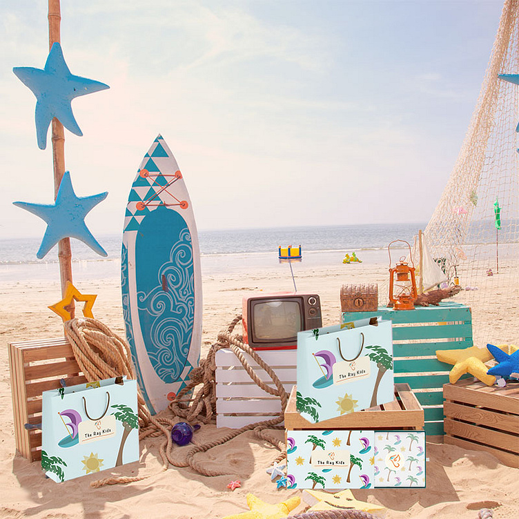
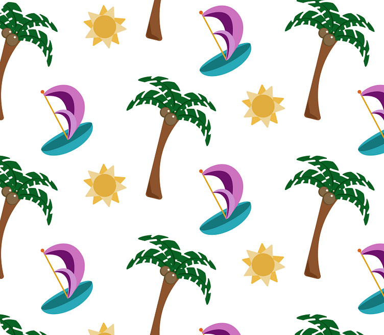
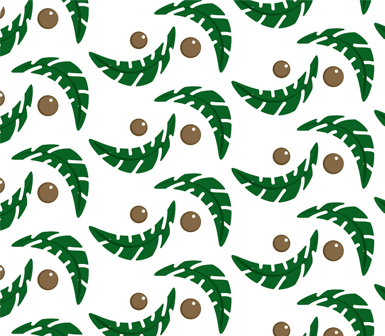
Packaging & Pattern Designs
I designed these patterns and illustrations to draw in with the theme of the outdoors and the beach. They are supposed to evoke a sense of play. To drive the theme home, I chose to use a cartoon-style illustration.
Thank you for viewing.
Portfolio: eugeniameccico.com
