Customer Feedback and Survey Tool Dashboard | UIUX | Web Design
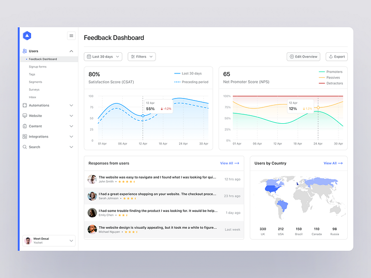
👋 Designing an analytics dashboard can be tough! There's a lot to consider, especially when it comes to making sure that everyone can access the information they need. That's why I've designed a dashboard for a customer feedback & survey tool that's both visually and informationally accessible!
📊 There are 4 key data points in this dashboard. First up is the CSAT score, which is crucial for understanding whether your customers are satisfied with your product. Next, we have the NPS score, which tells you whether your users would recommend your product to others. It's calculated using this formula: NPS = % of Promoters - % of Detractors
To calculate NPS, you first need to categorize your survey responses into three groups based on the rating scale (usually 0-10) that you're using:
Promoters: These are respondents who rate your product or service highly (usually 9-10).
Passives: These are respondents who give you a neutral rating (usually 7-8).
Detractors: These are respondents who rate your product or service poorly (usually 0-6).
Personally, I'm not a huge fan of the NPS score, but it's a good starting point for getting feedback.
🌍 The next two charts show you information about your users' countries and some of their responses. It's always interesting to see where your users are coming from and what they have to say!
🤔 So, what else could be added to this dashboard? Well, you could consider adding some more data points, like churn rate or user engagement. It's always good to have a variety of metrics to help you make informed decisions.
🎨 Overall, I hope you enjoy this beautiful visualization of data! Let me know what you think in the comments.
