XBlock - Web 3.0 Case Study
Hey everyone 👋
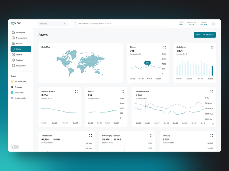
Arounda’s UI/UX design services for XBlock blockchain explorer led to an improved user experience and more convenient mobile and Web 3.0 interfaces. Check out the process that our team provided.
The client
XBlock is a block explorer launched in 2018 by developers from the US. It allows users to view and study blockchain data effortlessly, offering various analytics tools and a dashboard. This Web 3.0 case supports different chains and projects to accelerate crypto adoption.
Challenge
Improving the user experience while keeping the platform’s UI relatively unchanged was the main challenge during the XBlock redesign. Since this platform already had numerous users that got used to its crypto product design, our team had to tackle the UX issues without overly modifying the application’s architecture.
Our solution
Our main goals were to improve the UX, deliver consistent UI design of the platform, and work with color branding of each blockchain featured on XBlock. We offered the client several solutions to enhance the user experience, slightly modified the UI, and provided a non-trivial look of all chains on the light and dark platform themes.
Check the full case study on our website.
Press L → 💓 to support us
_______
📩 Interested in UI/UX Design for Web 3.0 product? Contact us on arounda.agency website.


