The Maze
"The Maze", an architecture and design company that is known for creating unique and innovative designs in Cuba.
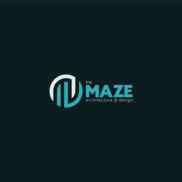
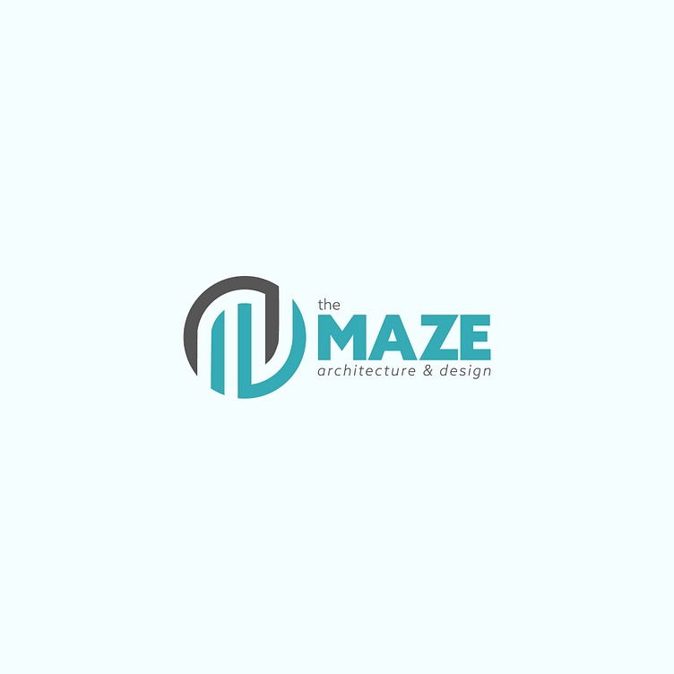
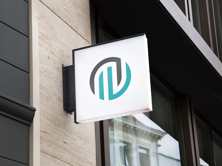
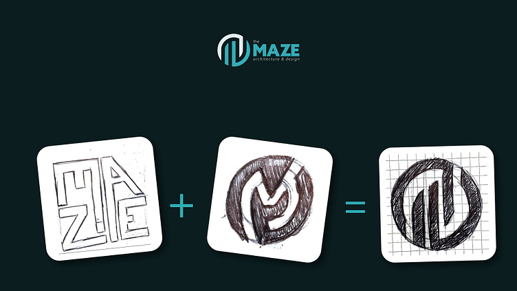
I worked closely with "The Maze" to create a logo that accurately represents the company's creativity and attention to detail. The logo features a circular shape with a maze inside it. The maze represents the intricate and complex nature of architecture and design, while the circle signifies the company's all-encompassing approach to their work.
he use of negative space within the maze creates the letter "M," which represents the name of the company. This clever design element adds an extra layer of meaning to the logo and makes it more memorable and recognizable.
The logo's color scheme was also carefully selected to reflect the company's values and mission. The shades of green and blue represent growth, stability, and innovation, which are all integral aspects of architecture and design. The dark gray color adds a touch of sophistication and elegance to the logo, which aligns with the company's commitment to producing high-quality work.
Overall, we believe that this logo design accurately captures the identity of "The Maze" and will serve as a powerful branding tool for the company. The combination of the intricate maze design, the letter "M" within the negative space, and the carefully chosen color scheme all work together to create a visually striking and memorable logo.