Fourfables restaurant logomark

In South West England, the Fourfables restaurant combines modern techniques with traditional European cuisine to create a unique and ever-changing seasonal menu. Unsurprisingly, this comes at a premium which needed to be reflected in the identity design.
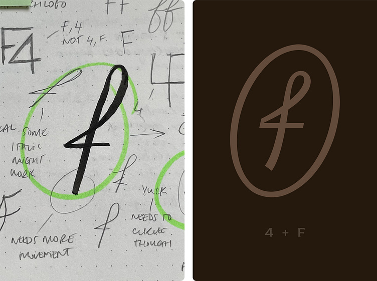
I was really excited to explore ways of combining the number four with an F letterform or 2 F’s coming together in an elegant fashion. After many failed efforts, I found promise in the idea of merging a script-like F with the number 4 hidden neatly in plain sight. Ensuring the design felt premium enough, I toyed with the thins and thicks of the letterform to make it feel almost calligraphic and rooted in heritage. I added an oval to surround the lettermark which gave the design the body it needed and made it feel like a seal of approval for high quality produce and technique.

Ready to create or refresh your brand's identity?