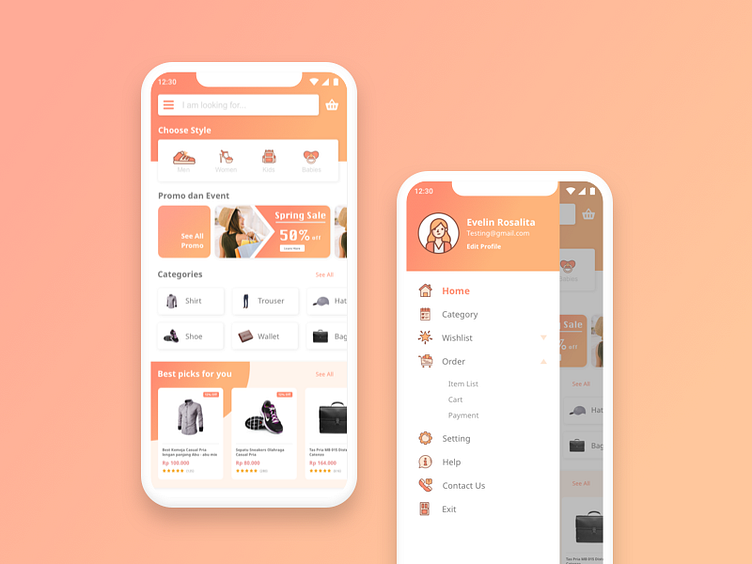
Logistics Mobile App design: iOS Android ux ui designer
Our interface design process has clear steps. It's the kind of digital production line comprised of deliverable requirements and instructions. Yes, every project is unique to us, but that doesn't mean we should re-build our production line every time. Quite the opposite, actually. We can guarantee the high speed and quality of our service because we have production procedures and principles in place.
One such predefined step on our production line is the "visual concept" stage. While layout and wireframes are more functional pieces of the user experience, visual style focuses on the emotional side of an experience. A combination of functional and emotional experiences creates the entire User Experience. At the visual concept stage, we choose 1-3 key product screens to explore a visual style. Usually, we create a few concepts to validate our style-hypothesis. At the beginning of each project, we define (together with a client) what adjectives should align with how a user "thinks" and "feels" when he or she first sees the interface. We then test our visual concepts to validate if the presented style evokes the desired feelings.
What are the first three adjectives that come to your mind when looking at this visual style?
