Nurturing Creativity in Design Systems - A Case Study
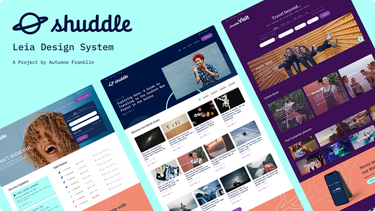
This case study documents the process of creating the Leia Design System for Shuddle, a fictional interplanetary travel company dreamed up by Dan Mall for the Dribbble Scaling Design Systems course.
Overview
Project Brief
The Interplanetary Travel Syndicate (IPTS) is launching three unique offerings:
ipts.org: an informational website containing the latest IPTS news and happenings
IPTS Travel: a site enabling browsing and bookings to destinations within our galaxy
IPTS Rail: a real-time web app where you can view lines, routes, and times for various commuter lines
My Role
I was responsible for designing the UI for these three products from scratch with only a company logo to build on. Since this was a capstone project and the timeline was only two weeks, I only needed to design three comps containing 5 components each, a published design system in Figma, and a reference site for the design system.
Getting Started
Our instructor told us well in advance, that there would be a change midway through this project, so I knew I needed to make things efficiently so that they would be easy to update later. Of course! The whole point of design systems 🤓 I also had a really tight schedule during this part of the course and needed to work quickly and make fast decisions.
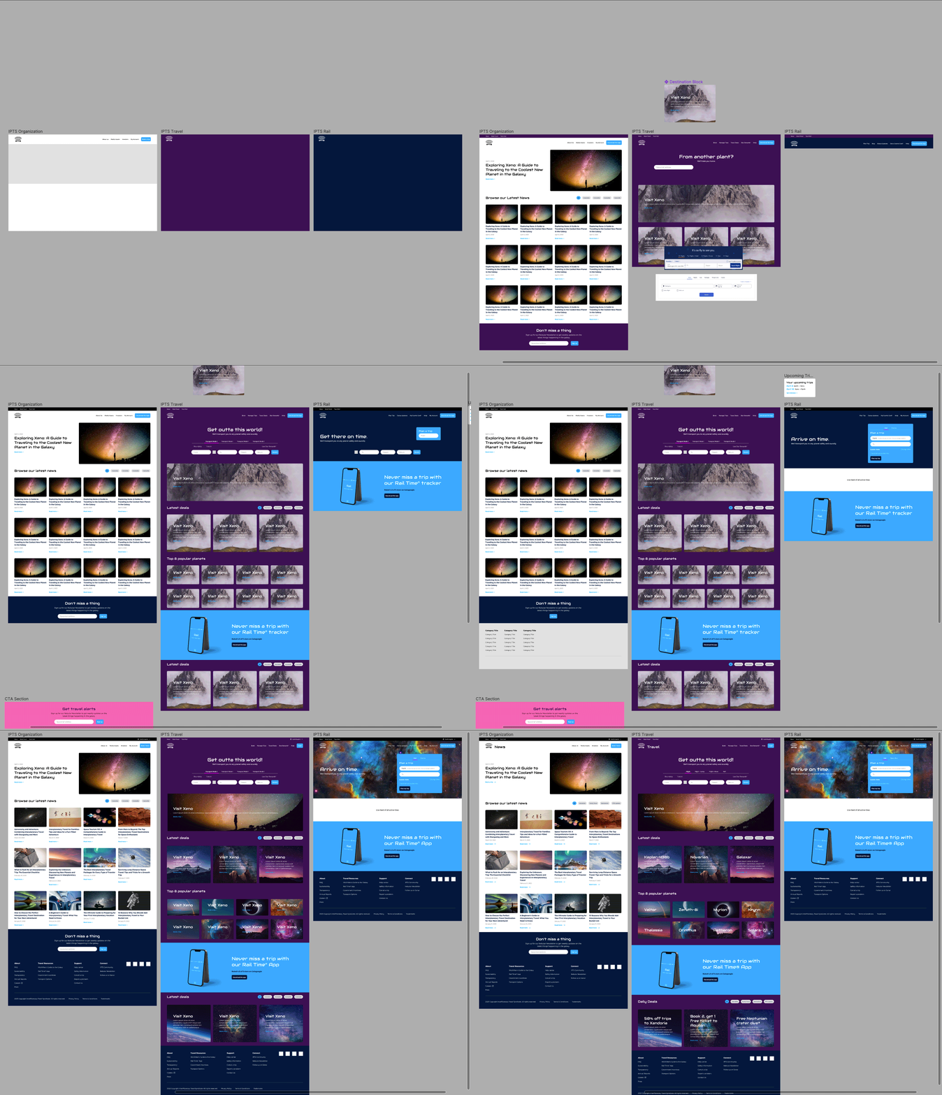
I started by doing a high-level competitive analysis. I scoured and screenshot sites like Airbnb, Jetblue, and Skiplagged to get a feel for the shared visual language for travel sites and user journeys for booking trips versus getting to know more about the company. I noted similar components, language, and structure across 17 different competitors in the Figma file I set up for the project.
Working with AI
After noting all of the essential page elements and components, I started conceptualizing the branding. The logo was pretty stiff for my taste, but I tried to spruce it up with a fun supergalactic color palette. In an effort to get more familiar with AI and to save time and mental capacity, I used ChatGPT throughout the project for help with content and colors. Chat GPT came up with the perfect color palette for the company, (which was a time save later 😉).
ChatGPT also wrote the news article titles, back-dated them, and came up with fictional names and descriptions for the planets that IPTS services.
While my AI did the heavy lifting, I looked for other space-related visual inspiration to help with photography and typography. I found a spacey-looking display/heading font on Google Fonts and ChatGPT selected the font-pairing for the other text.
Laying the Foundation
As we decided on core elements, I started to create styles in Figma to make my life easier. Even when not working on a full design system, I use styles and components a lot because they become helpful in repetitive elements.
Starting the Build
As I mentioned, I was pressed for time, so I did a not-so-great thing and mostly skipped over low-fi wireframes. I just started building all three pages at the same time, section by section, component by component - reusing things across pages as much as possible. I thought of this as the UI designer’s version of getting into software as soon as possible - just start building!
I got these pages to a pretty good place. I had decided to make my navigation and footer global and I created components for cards, a hero banner, buttons, inputs, and a title section. I still had one major component missing for the Rail site - the actual tracker! But I was ready to rest. Then, the change came!
Introducing our New Brand
IPTS became Shuddle, a much more fresh, young, and vibrant brand than before. The color palette was vibrant and the imagery was fun and inviting. This was a great improvement and thankfully did not mess up visual direction too much. You’ll see my before and after comparisons a bit later.
Navigating the Change
I stopped any forward progress on the designs and focused on updating the existing/in-progress design systems with the new colors and fonts. Figma makes this SO easy. I updated the system directly, instead of creating a new one and switching it over. In hindsight, I think I may have taken the approach of switching to the new library rather than editing the existing one because I like how it preserves the old library and perhaps could allow the old library to stay in production while things slowly transition perhaps for larger projects.
The color palette was similar but limited, so I kept some of my extended colors because they were cohesive. The logo was better, but still a bit awkward, so I tweaked the layout to better fit into our existing design system. This was one of the only issues I had with the switch. The new light blue color was a bit too bright to be used where I had the previous blue, so I made some tweaks across the sites, but there were minor and quick thanks to the design system components 😀
Finishing touches
I designed the tracker for the, now, Ride site and finalized the designs for all three sites. I had already started documenting the design system in ZeroHeight, but making the switch with the new components was easy because I updated the previous design system. Refreshing the Figma link in ZeroHeight was a breeze! I added a note on things that were new to the system, like colors, and the typography completely changed. I also noted things I plan to add in the future, like layout guidelines.
Et voilà!
An easy-to-use system of design elements for anyone to create a product for Shuddle and stay within guidelines, save time designers and engineers time and maintain happy users.
Taking away key lessons
I learned so much throughout this project and this course. I was new to Design Systems as a practice, and now understand the value of design systems across all kinds of use cases, but especially digital products. Some highlights for me:
📔 Documenting as you go is really challenging, but it’s so worth it.
Don’t be like me and try to remember everything you did for the past 2 weeks when putting together documentation for a teammate or client or your Dribbble case study 😅. Write notes as you go and reflect right after finishing a session so you don't lose anything.
🎨 Creativity can (and should) thrive within a structured system.
Creating parameters, guidelines, and documentation didn’t stifle my creativity, but gave me bounds to work within and find ways to creatively flex within them. I personally like structure and order because I find that without it, I lack direction and am LESS creative in disorderly environments. Your design system can be that direction that allows your team to thrive creatively.
🤖 AI has your back… really.
ChatGPT was my MVP pick for this project 🏆. I didn’t expect it to help me as much as it did. I didn’t realize how much creative and mental energy was expended by thinking of things to put into the comps other than Latin text or fiddling in the color tool trying to get your pinks and purples to look good together. Chat GPT saved me at least a couple of hours on this project and I plan to use AI more in the future so I have more time to focus on what I’m actually good at - designing.
I hope you enjoyed!
Here are links to my creations:


