Hotel Booking App → Case Study
Role: Product Design
Responsibilities: UX Research • Accessibility • Usability Test • Visual Design
Timeline: Jan - Mar 2023
Project Type: Mobile App Design
Tools: Figma
Project Overview
I embarked on this project with the primary objective of gaining a deeper understanding of how to enhance the user experience for individuals seeking to manage their hotel bookings and attain remote access to their rooms. This project was completed during the beginning stages of my Product Design career.
The Problem
One of the core challenges I encountered was devising a user interface (UI) solution for the locker button that would strike a balance between intuitiveness and visibility, ensuring that users could interact with it effortlessly.
The Scope: UI vs. UX
While this project primarily focused on UI, I worked alongside my mentor, who provided the initial UX wireframes. My goal was to translate UX principles into a tangible UI design, considering layout, shapes, colors, accessibility, and the overall user experience.
Ensuring Inclusivity & Accessibility
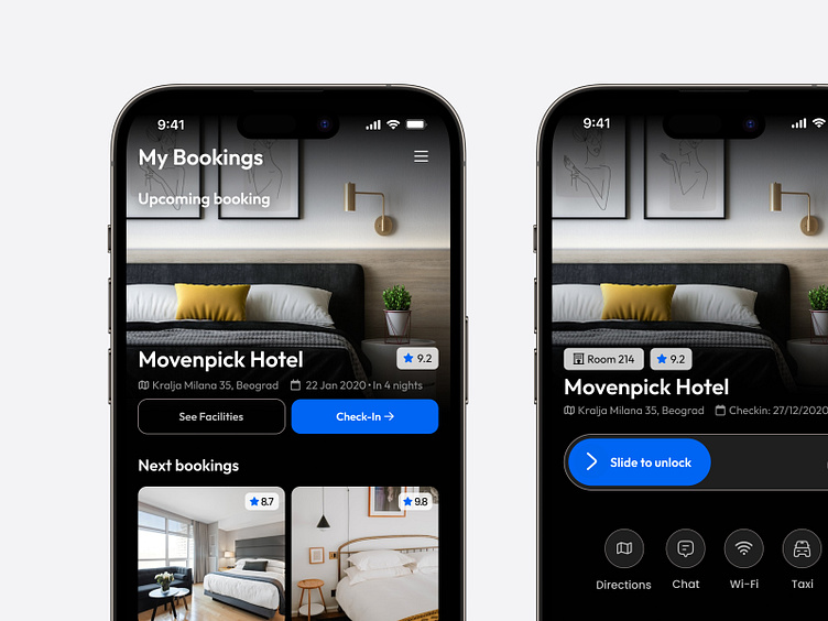
When addressing the UI design, I carefully considered the accessibility aspect. It was crucial to account for the impact of different hand sizes and finger dimensions on the user experience. As a result, I positioned the unlock button at the center of the screen, enlarging it and making it more prominent. This decision aimed to enhance accessibility, ensuring that users of all hand sizes could easily access the most critical feature: unlocking the room.
UI Design Exploration
Exploring The Design Concepts
Throughout the project, I explored various UI concepts before ultimately settling on a darker, more professional aesthetic. While working on this darker UI, I had to make adjustments to the visibility and layout of elements on the screens to ensure cohesiveness and user-friendliness.
Final Design
In the final design of the two screens, I opted for a simpler and modern look with a dark mode UI style. This change aimed to make the app more user-friendly. I adjusted how elements were arranged on the screen to ensure they were easy to see and use. The key part of this design was putting the unlock button right in the center of the screen, featuring a larger size and a prominent blue color. This color choice not only optimized user interaction but also simplified room access for all users, regardless of hand size or finger dimensions.


