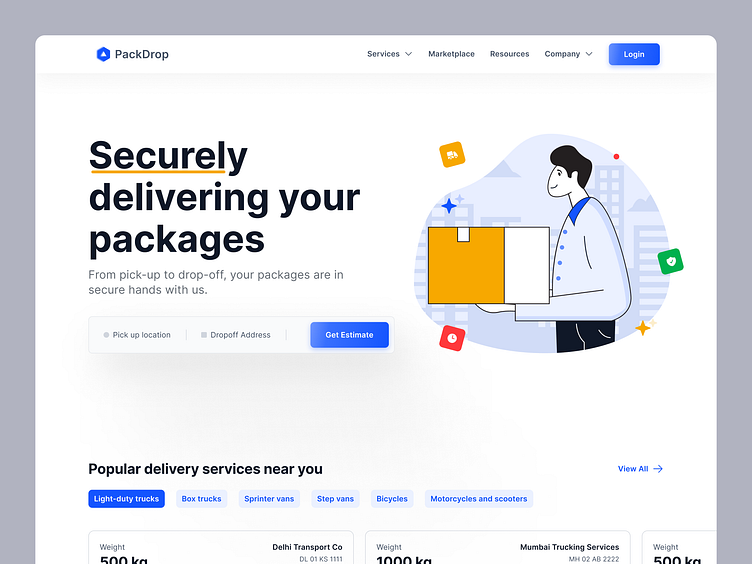
Transportation Delivery Website Landing Page | Web Design | UIUX
🚚 I was checking out a few transportation websites today and thought of conceptualizing a beautiful landing page for such websites.👀
Most Indian transportation startups lack a clean and modern user interface for their website. While the target audience may be more focused on usability rather than aesthetics, I believe that every target audience deserves to experience a beautiful interface. A well-designed interface can affect the mood of your users and increase trust in your website.
🎨 For the hero section, I decided to use an illustration instead of a real image, as I'm a big fan of illustrations. However, a real delivery person image could also have worked just fine. I chose blue as the primary color and used other colors to make the UI feel beautiful and secure.
💼 The second section consists of UI cards, truck cards with weight, location, and company name information of nearby transportation services.
🌟 I hope you like my efforts in designing a beautiful landing page for transportation services.
Don't forget to like and comment your feedback!✨👉


