Creating the "Paradigm" Design System

I've enrolled in Dribbble's first ever cohort of "Scaling Design Systems" Course!
With over 10+ years professional experience as a visual designer, I found myself moving from a pharmaceutical marketing agency to one of the world's largest engineering consultancies, Hatch Ltd as their first UX/UI designer on the newly formed Digital Products team. Though it was slightly daunting to move from an mature team with multiple design teams and designers, to a brand-new team with no other designers (yet), I took the risk as I was ready for a change and drawn to the exciting mission of Hatch - tackling the world's toughest challenges. Hatch is well known in the engineering & consulting space, but not so well-known in the digital space; and the team is looking to change that.
As a Senior UX/UI designer, I help work on the creative strategy and User Experience of the suite of tools that combine decades of engineering expertise with AI to help our client's solution important issues like water management, climate change, emissions monitoring etc., which we are working towards bringing to market.
Though these products can achieve amazing things, they all have their challenges. As some are legacy and some are brand new, they have many design inconsistencies and various development frameworks which we are working on improving. On the UX side of things, one of the major things lacking across all of these products is a connected design system. I have been tasked to lead the charge in creating and implementing a design system that can elevate and power all of our products and help designers innovate and developers work more efficiently. Since I'm not exactly an expert in this space, I knew I needed some additional training under my belt.
Throughout Dribbble's "Scaling Design Systems" course, we learned a great amount about design systems; how to successfully implement one from scratch across an organization, and the value they bring to power digital products - at scale. This case study outlines the process of our capstone project.
Capstone Project Brief:
"You’re the Head of Digital for the newly launched IPTS: the Interplanetary Travel Syndicate, a bustling transportation network that shuttles people from world to world within our galaxy."
Your leadership has decided to launch with 3 unique offerings:
IPTS.org, an informational website where you can find the latest news and happenings with the IPTS
IPTS Travel, a website where you can browse and book travel to and from multiple destinations within our galaxy. Like Expedia for space.
IPTS Rail, a real-time updated web app where you can view lines, routes, and times for all the different commuter lines. Think NYC subway or the London Underground, but for interplanetary travel.
Your job is to create all three websites. Each website has to be at least 1 page, but each page you make has to have at least 5 components on it. A design system will likely help you with this effort, so you decide to make one in the center of all this to help power all three.
We were supplied with only the logo's above, and given two weeks to complete everything. I had just a bit of work to do.
Step 1: Getting my [competitor] ducks in a row
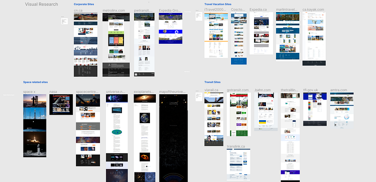
When there's so much to do, one of the most stressful parts of any big project is not knowing where to start. I know I needed to first establish what the main purpose and offering of each of the three products was, and then begin the research phase.
I collected samples of various travel, rail sites, and space related companies' websites to gather inspiration, and note the commonalities to determine what the fundamental pieces of content I should include on each were going to be.
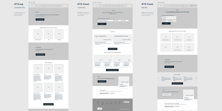
Step 2: Let the wireframing begin
I created wireframes for each product homepage to visualize content heirarchy and placed realistic copy in places to indicate what each image or CTA's purpose was.
Step 3: Setting up some base styles
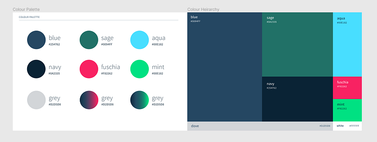
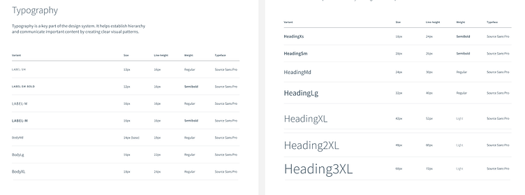
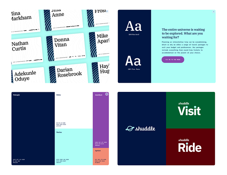
The discovery phase concluded, and I was ready to jump into some color and design. I started with getting a color palette and some type styles together of what I envisioned the brand voice my interplanetary travel company would have.
After landing on a palette that worked together and hit all the right tones for me, I defined Figma styles that would help me work faster and more efficiently in designing the look and feel for each site.
Step 4: Ready, Set, Design!
I was finally set up for the fun part, design all the things! Staring with IPTS.org, I began collecting some initial free stock photography for most of the content areas which required imagery, and inputting some realistic copy in.
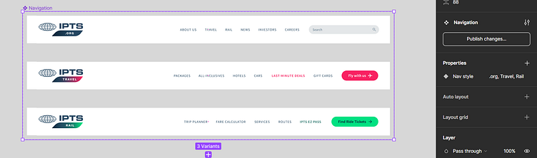
I moved on to replacing wireframe content in the top header navigation section and realized that this was the first opportunity for a shared component - the global navigation, which should have the same visual structure for all three.
Some branding work
When working out nav content and thinking about logo position, I realized that I needed a way to include "Travel" and "Rail" as word marks in new additional logo variations. As a graphic designer who majored in corporate design, I took some creative license and spent a bit of time altering the logo to give it a fresh feel and allow for the 3 variants of the business, ".org", "travel", and "rail" - without deviating too much from the original.
I altered the placement of the wordmark to be slightly smaller and in a horizontal orientation and added a graphic element to allow for the new division placement below the IPTS. I also introduced and designated two accent colors from my color palette to differentiate between the two divisions.
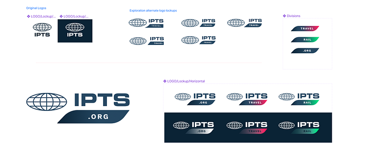
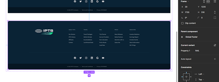
Once I was done with the 3 new logos, I was able to move on to getting the header navigation and footer components together. I created a variation for each site component, incorporated the logo and tailored the navigation items to suit each product. The global footer stayed the same except for the logo change.
Consulting my design partner, Chat GPT
It was time to get more realistic content in place, so rather than spend time brainstorming for copy ideas, I decided to consult my ever-so-helpful colleagues over at Chat GPT. I sought out suggestions for areas of my sites like featured travel packages, news articles, and enticing CTAs. There was no shortage of answers, and I was blown away at how realistic and spot-on the suggested content was... and what a time savings!
Building out additional shared components
After getting the bulk of the content in, there were a few elements that emerged which could be shared components across all 3. In addition to the logos, header and footer, I created a few variations of buttons for the CTAs, a search input, and 3 card styles.
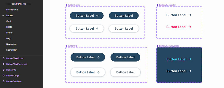
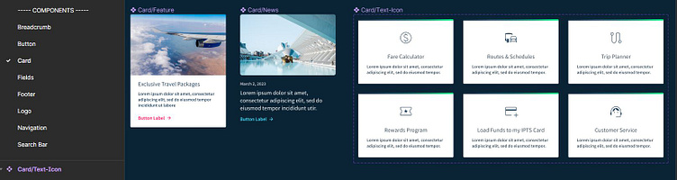
Throughout the design phase, I found I was often going back and forth revising the master components, and type styles to work better together across the three pages. After publishing changes, I found it helpful to zoom out before pressing "Update" in my design file and watching the components update together across the 3 pages.
My Design System Becoming a Framework
Up until this point, I had all of my styles and components in their own library file that was called "design system" which I was syncing to my IPTS design file. As this library was becoming more robust, I realized it was time to think about a proper name. I wanted to come up with something that reflected the basic principle of what the design system was set out to accomplish, as Dan Mall defines it:
.
I chose this name as the meaning of it hit all the right notes:
Paradigm:
A framework containing the basic assumptions, ways of thinking and methodology shared by members of a discipline or group
An example or model or pattern for others to imitate
A set of forms based on a single stem or theme
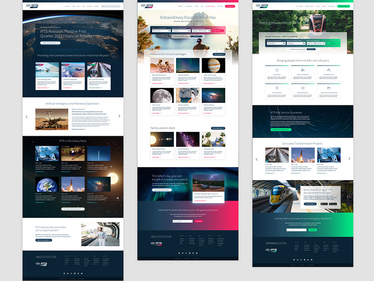
Final Designs
I was very happy with the outcome of each page. Together at a glance, they looked professional, cohesive and clean, and captured the brand voice for IPTS.
Time for a Rebrand!
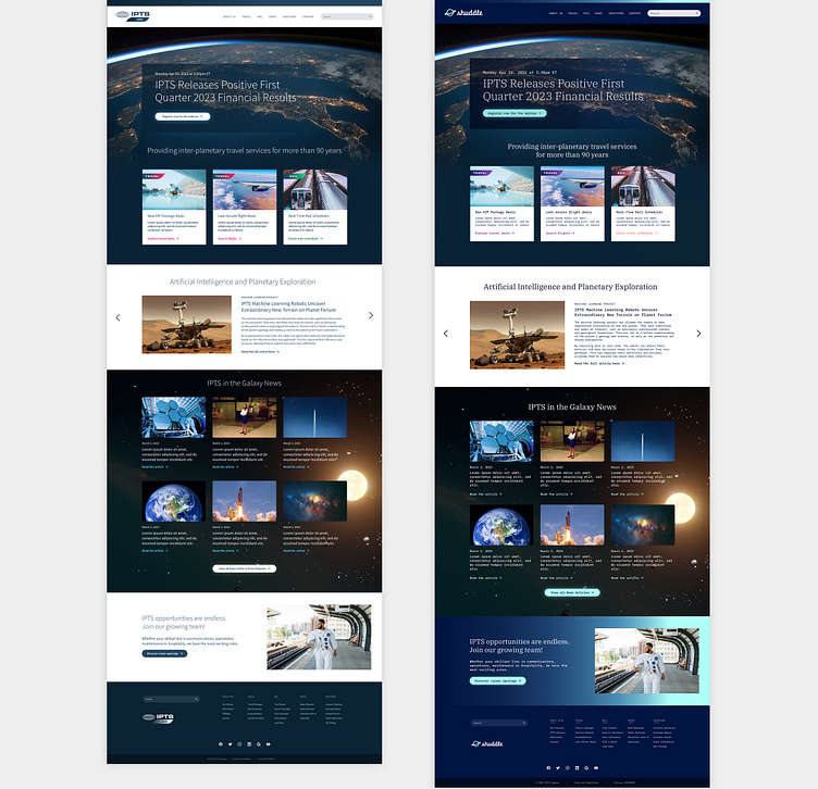
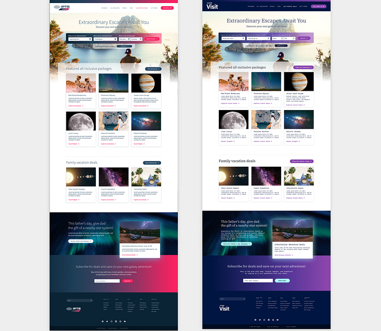
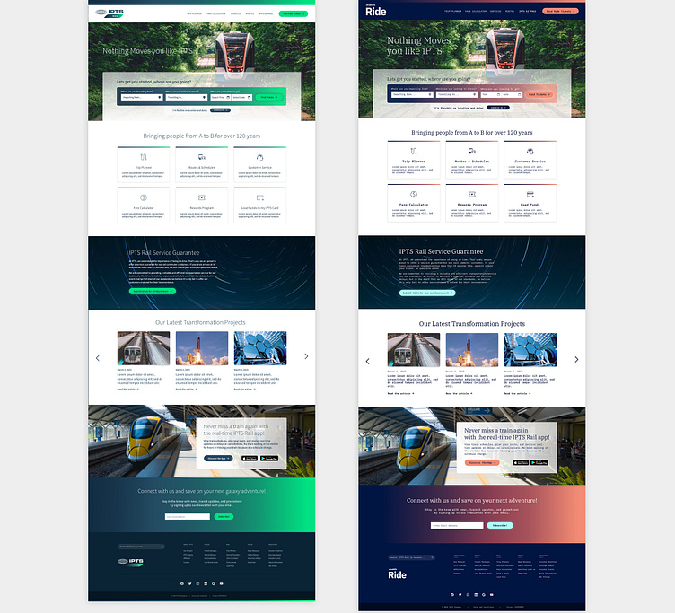
Design systems prove their value most at the times of change. Part two of our capstone project came with a twist; we were tasked to update our 3 Products to match the new rebrand. The goal was to see how easily—or not—we could update our products to accommodate that change.
The company name changed from IPTS to Shuddle, and new branding was introduced including a color palette, brand font, and logo.
Forntunately, the colours were fairly similar to my palette I had started with, so my thinking was that it would be straightforward to switch over the base colours.
Adapting the Paradigm System
Before switching everything over, I saved versions of my figma files as "Pre-Rebrand" as implementing the new styles would overwrite everything I currently had, and also in the event I needed to refer to the old designs.
Since I had Figma styles in place for most elements, rebranding the three products was relatively straight-forward and didn't take too long to implement. I switched all the colours and typography styles over, replaced the IPTS logos with the new shuddle logos and altered my components where needed. The colours I already had in place were similar to the Shuddle rebrand, so the designs didnt end up looking too different.
I faced a couple minor challenges along the way. Since the new logos supplied were reversed out, I needed to change my header navigation to a dark mode. As for the typography, the new body font "IBM Plex Mono", when I updated the designs with the updated type styles, alot of my content ran over their bounding areas and I needed to adjust. This meant my card components became longer, as well as navigation elements like in the header and footer. Otherwise it was just a matter of going through each page design and adjusting where needed.
The Outcome
Implementing updates from the rebrand was quick and relatively easy. I am very happy with the outcome of the designs. The paradigm design system proved to be an efficient way to design across multiple products and handle the rebrand curveball. The before and after design layouts below for each product illustrate how implementing a design system can be such a powerful way to produce an elevated and cohesive visual experience for any brand.
It has been quite the rewarding exercise!