Payment Method Settings 💳
Hi Guys! 🏀
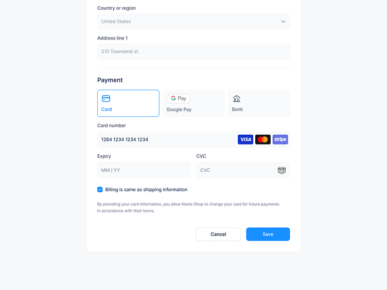
A good UX solution for payment method should focus on providing a seamless and secure payment experience to users. Here are some key aspects that can make the payment process more user-friendly: Clear and Concise Payment Options: Display all available payment options (e.g. credit card, PayPal, Apple Pay, Google Pay) in a clear and concise way so users can quickly select the option that suits them best. It's important to ensure that the payment options are easily accessible and visible throughout the checkout process.
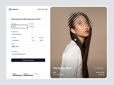
Contact Information: Collecting contact information is crucial for delivering the product or service to the user. Make sure to only ask for necessary information and use autocomplete or autofill to minimize user input. Additionally, it's a good idea to provide a progress indicator so that users know how far along they are in the checkout process.
Shipping Information: Provide an easy way for users to enter their shipping information, including address and delivery preferences. Offer options for different shipping speeds, and provide estimated delivery dates to manage user expectations.
Secure Payment: Provide a secure payment process by integrating with a trusted payment gateway. Ensure that the payment process is encrypted and the user's payment details are protected.
Hope you like it and feel free to leave comments and feedback.
Don't forget to press "L" if you enjoy watching this ❤️.
Thanks for checking it out!
If you have comments, let me know!
Say hello at 📧
ux.sergushkin@gmail.com
Visit my Website 🌎
dmitrysergushkin.com
For more inspiration, visit my profiles ✨

