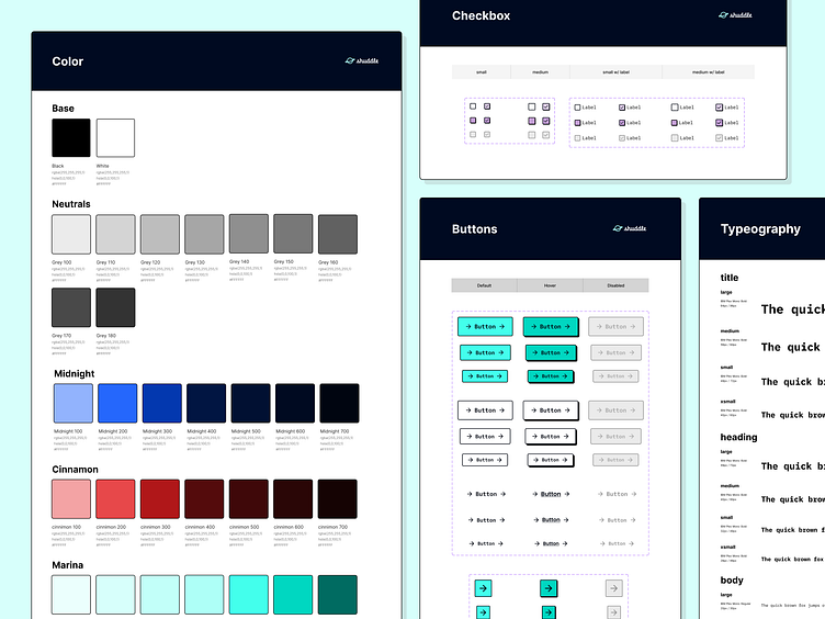
Shuddle Design System
Project Overview
This project was a part of the 'Scaling for Design Systems' course and was entirely fictional. In this project, we assumed the role of the Head of Digital for the newly-formed interplanetary travel organization called ITPS. The company has established an extensive transportation network that facilitates intergalactic travel within our galaxy.
My role
As the head of digital for ITPS, my responsibility was to develop fresh and innovative product experiences, while also implementing a competent and highly scalable design system that could support the company's growing interplanetary transportation network.
The Products
The leadership team at ITPS, decided to launch with 3 unique offerings:
ITPS.org: an informational website where you can find the latest news and happenings with the IPTS.
IPTS Travel: a website where you can browse and book travel to and from multiple destinations within our galaxy.
IPTS Travel: a real-time updated web app where you can view lines, routes, and times for all the different commuter lines.
Where to begin?
Prior to taking this course, I had the misconception that a design system was simply a UI kit or a collection of components that could be created or built without any foundational work. However, I soon came to understand that the most effective design systems were usually not developed entirely from scratch, but rather were derived from pre-existing designs and functioning products already in use within the company. Therefore, to develop a valuable design system, it was crucial to first establish the product and then identify common patterns and styles that could serve as the foundation of the system.
Research
Rather than simply diving headfirst into the design, I recognized the importance of analyzing similar product offerings and experiences out there. This approach allowed me to gain valuable insights into the features and experiences that were currently being offered in the market. This was an essential step in informing the design decisions of our ITPS products, enabling me to create solutions that met the needs of our users.
Wireframes over branding
Once I had gathered sufficient inspiration and ideas, I was ready to begin designing. To start, I created wireframe prototypes for the three products, which served as initial pilots for analysis. My primary focus at this stage was on identifying common UI patterns and determining what elements needed to be included in our design system. I recognized that this was a crucial step in creating a cohesive and effective design system that would work across multiple products and platforms. Therefore, I chose not to get bogged down in specific details such as colors and typography, as these could be refined and adjusted later in the process. By focusing on the core elements of the design system at this stage, I was able to create a solid foundation that would inform and guide the development of our products moving forward
Starting my collection
With my pilots in a good place, it was time to start analyzing each product and collecting common UI patterns and components. To begin, I focused on the elements that appeared most frequently in the designs, such as buttons and cards. Additionally, I gathered other common UI elements that, while not primarily used as much as buttons and cards, still appeared frequently enough to warrant inclusion in the design system. These included elements like tabs, checkboxes, input fields, and navigation and footer components.
By collecting these elements, I was able to gain a deeper understanding of the components that needed the most attention. This process also helped me identify inconsistencies within some of the elements, allowing me to refine and standardize them for greater consistency and usability across multiple products.
Overall, this stage of the process was essential in improving consistency and increasing the quality and effectiveness of the system.
ITPS Design system 1.0
Version one included:
Typography styles
Color styles
Buttons
Cards
Input fields
Tabs
Checkboxes
Accordion
Footer
Navigation
Out with the old in with the new
Before I was able to move forward with branding my system, the IPTS leadership team hired the prestigious branding firm MegaBrand to do a rebrand of the entire organization.
MegaBrand discovered through focus groups that the IPTS name and logo felt very ominous, like it was cold, faceless corporation that was always watching. (“The eyeball-shaped logo doesn’t help,” said one candid participant.) In addition, the IPTS wants to appeal to a younger demographic.
After weeks of research and exploration, they’ve settled on the new name “Shuddle”, which "feels more like a cool, new startup".
New product names
With the rebrand also comes new product names.
ITPS.org is now "Shuddle World"
ITPS Travel is now "Shuddle Visit"
ITPS Rail is now "Shuddle Ride"
Updating the system to "Shuddle"
Although I needed to add new color styles and adjust some text styles to ensure accessibility with the new font, the changes were relatively minor. Overall, updating my components went perfectly smoothly and required minimal adjustments
Putting the system to use
After putting the finishing touches on the updated system, it was time to put it to good use on our brand new products.
"Shuddle World" Before & After
"Shuddle Visit" Before & After
"Shuddle Ride" Before & After
Conclusion
Undoubtedly, this project posed a significant challenge, but I found it to be a valuable learning experience. As mentioned earlier in this case study, my initial understanding of design systems was dead wrong. I discovered that they are far more complex than they initially appear. This course has instilled in me a newfound appreciation for the process of creating design systems and the dedicated individuals who work tirelessly to improve them for our benefit. While I know there is much more to learn, I am eager to continue exploring more about this topic.
Links
Final products : https://www.figma.com/file/6fAyFxRopup5YksHRvXeQB/Shuddle-Design-System?node-id=29%3A5486&t=bP2fSW1RpChIyb2r-1
Shuddle Design System :
Reference sight :


