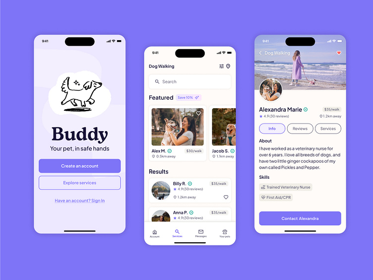
Buddy Dog Walking App
🐶 Project Overview
Sometimes dog owners need a little help caring for and walking their dogs. The goal of this project was to create a service to connect dog owners with dog walkers, whilst considering how we can help dog owners trust their dogs are in safe hands. This included having options to allow the user to book walks, arrange doggy day care and pet sitting services via the app.
🪄 My Role
User research was conducted via Zoom and in person with dog owners at a park.They were asked a number of questions based around whether they currently use a dog walking service, and if so, what they liked and disliked about the service.
🫶 Understanding the user
User research was conducted via Zoom and in person with dog owners at a park. They were asked a number of questions based around whether they currently use a dog walking service, and if so, what they liked and disliked about the service.
Below is the 3 main pain points that were identified from the user research interviews.
🔍 Market Research: Wag vs Rover
Two of the leading dog walking apps in the market were analysed with a focus on what worked and what didn’t.
I downloaded both apps and went through the full onboarding process to feel the pain points faced by the user.
This included signing up, adding a pet, searching for a service such as dog walking, and booking the service.
✨ User Persona
After analysing the user research and market research, I created a user persona to help visualise the characteristics and needs of our target customer.
🔥 User Flow
A user flow was created to map out the journey that a user would need to take to sign up, add a pet and book a service. In the below flow, users have the option to:
Find pet care and explore services without having to create an account first
Select a dog walker of their choice, as opposed to being automatically matched
These two features counteract the main dislikes of the Wag app which I explored in the user and market research stages earlier in the project
✏️ Ideation & wireframing
Next I explored planning the content and early layouts on wireframes.
I started with hand sketched ideas on Figjam which is a quick and easy way to get multiple ideas down in a short amount of time
After identifying which layouts worked best from the sketches, I then moved onto creating high fidelity wireframes in Figma
🔥 Scaling The Design
Below is an example of the designs for the sign up onboarding process and the dog walking search and profile pages.
✨ Creating Components & Variants
After scaling the designs and getting a feel for which elements worked across the different pages, I then created components of these elements.
There are many variations of each component, which is illustrated below. Components help to speed up the design process. If a master component is changed, these changes will cascade throughout the design where the variants of the component are used, which means making changes to a design is a lot quicker than changing every element manually.
🖥️ Landing Page Design
The app can also be accessed via the Buddy website. I designed a landing page that emulated the sign up section within the app.
To maintain consistency, I used the same purple background colour and pattern, along with consistent fonts and buttons.


