UI: Redesign Yoshi-Meat-Su Ordering System Application
Role: UI/UX Designer
Why need to Redesign?
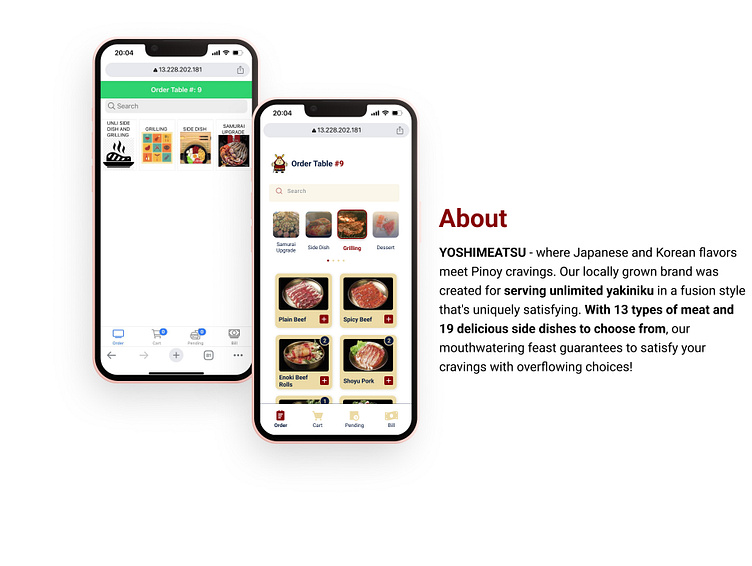
During my recent visit to Yoshimeatsu, I was pleasantly surprised to learn that we could order our food via their app, rather than needing to call over a waiter. However, upon opening the app, I found that it was not very user-friendly and lacked a visually appealing design. As a designer with a keen eye for detail, I felt compelled to redesign their app to improve the user experience.
Prototype
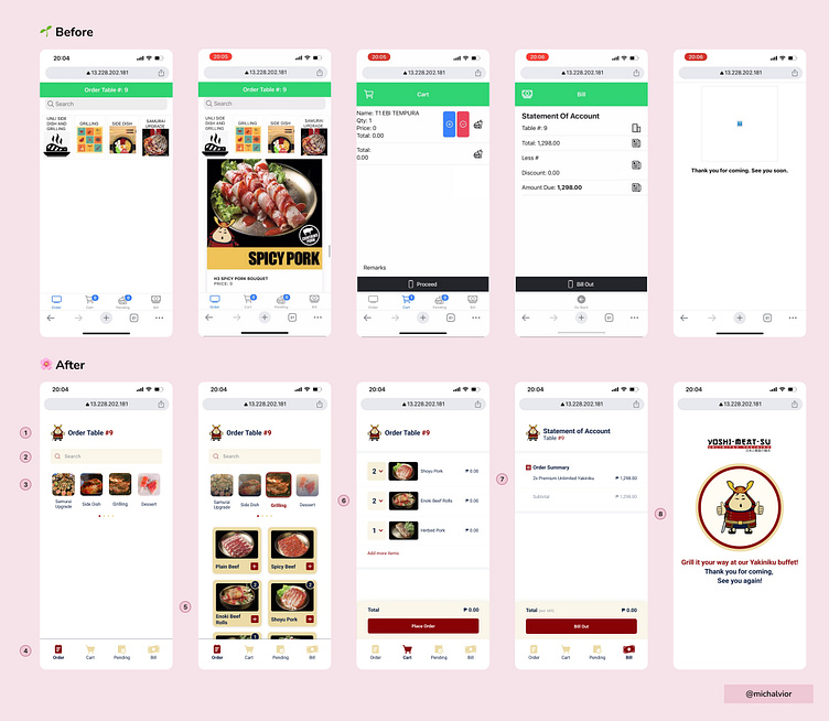
Changes Made
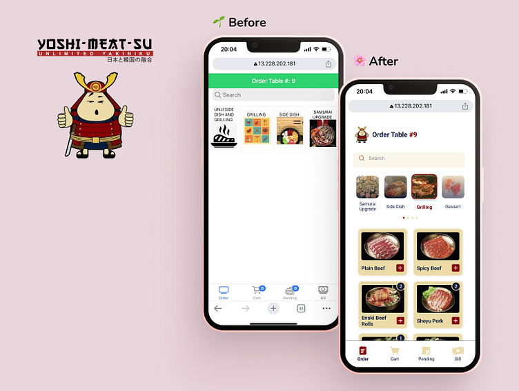
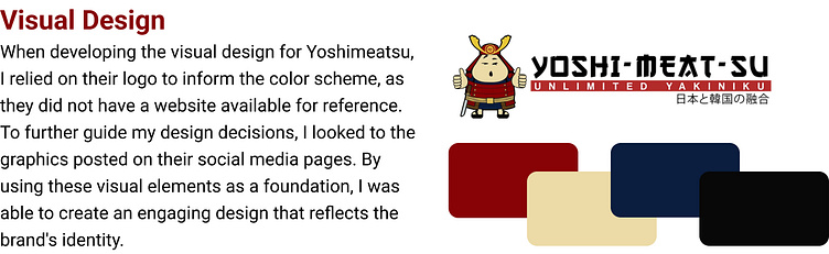
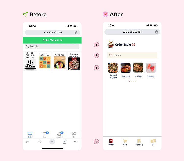
1.) I added their brand icon to provide consistent branding throughout the user experience. This helped to maintain the brand's identity. Additionally, I made it clear that the user was ordering for their specific table, which helped to streamline the ordering process and reduce confusion for both the user and the restaurant staff.
2.) To improve visibility of search-bar. I added spacing around it and incorporated the brand's color scheme. This helped to make the search bar stand out and draw the user's attention, making it easier for them to locate and use
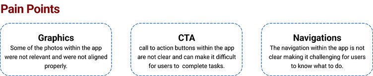
3.) I noticed that there was a lot of clutter and confusion at this part. Some of the photos were not relevant to their respective labels, and it appeared that the images were simply grabbed from the internet.
Additionally, the photos were not aligned properly, and there were more options that is necessary, which is forgotten by the user. To address these issues, I decided to use existing photos of Yoshimeatsu to match their respective labels, making the app feel more original and personal. I also aligned the photos and added proper spacing to improve the visual appeal and make it easier for users to navigate. Finally, I included a navigation guide to inform the users that there were more options available to them.
4.) I added clearer navigation menus that indicated which page the user was currently on.
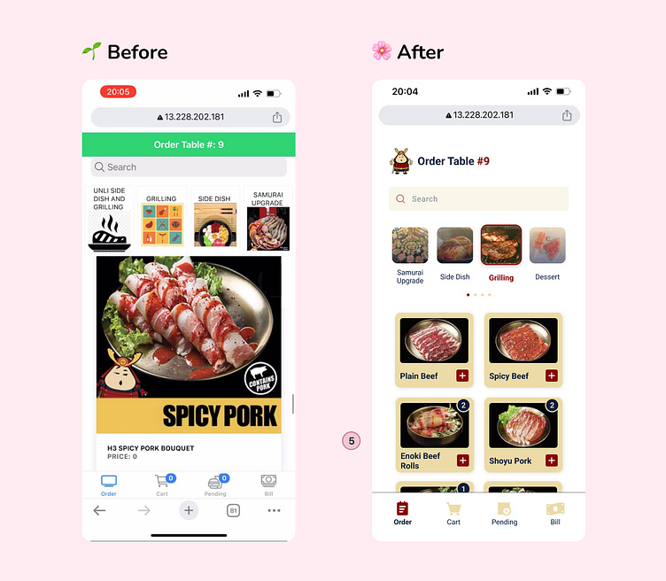
5.) I added two columns to ensure that the photos of the menu items were not cut off while scrolling and that users could easily see all the menus without any issues. Additionally, I made the text more readable, so that it was easier for users to understand what they were ordering. To make the ordering process more streamlined and efficient, I added a '+' button for each item so that users could easily add items to their cart with a single click. I also included the number of items already added to the cart, so users could keep track of their orders and avoid accidentally ordering the same item multiple times.
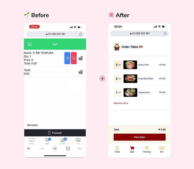
6.) I added a quantity dropdown for each menu item, so that users could easily edit the number of items they wanted to order. I made the call-to-action (CTA) button more clear and prominent on the cart page.
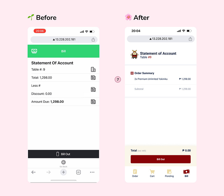
7.) I made changes to ensure that users could easily understand what they had ordered and what they were paying for. Instead of just providing the total amount, I made sure that the items included in the order were clearly stated and listed out for the user to see. I detail each menu item ordered, the quantity of each item, and the total cost per item.
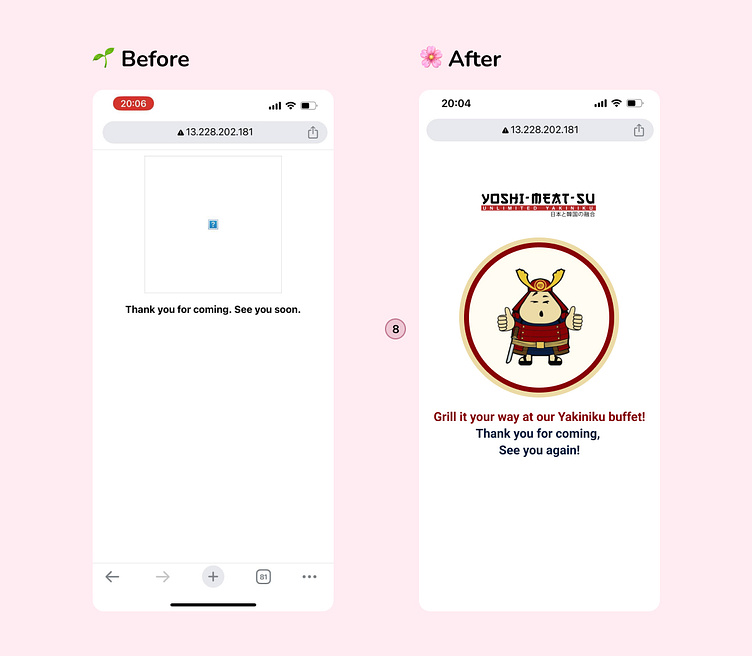
8.) As a final touch, I added a tagline to the Yoshimeatsu app to provide a memorable experience for customers. I included a message at the end of the checkout process to express my hope that they had a good experience. I also expressed my desire to see them return again in the future.
Takeaways
Upon seeing the Yoshimeatsu app, my designer instincts immediately kicked in. Without hesitation, I began to redesign the app to make it more minimalist, visually clean and user-friendly. I carefully balanced all the elements and created a hierarchy while keeping their branding in mind.
My hope is that Yoshimeatsu will consider investing in a redesign of their app interface in the future. By doing so, they can provide a more welcoming and friendly experience for their customers. I believe that by creating a more user-friendly app, Yoshimeatsu can increase customer satisfaction and ultimately, their success as a business.
Disclaimer: I am not affiliated with Yoshi-Meat-Su.I am here to improve my skills and help in creating better products.