Sovremennik. Website for the theater
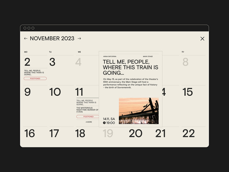
In 2021 Sovremennik celebrated its 65th anniversary. Besides the new graphic identity, we designed a convenient, clear and visually pleasing website that makes you want to visit the theatre.
We needed to introduce visitors to Sovremennik’s atmosphere while preserving the graphic identity’s gentle tone. To keep our communication delicate, we used a minimalistic layout and made focus on typography.
It was essential to find a balance between emotional and customer experiences. That’s why from the start, we highlighted these features: functional mobile version, customizable seating chart, easy access to the programme and tickets.
We created a user-friendly configurator in which an editor can make the proper seating arrangement for any type of event. Even a stage director can create a custom seating plan for his play. An administrator will still easily relate any seat to the one in the standard ticket system.
Learn more about the project on our website.
Follow ESH gruppa to learn more about our work:
| ESH gruppa | Instagram | Behance | LinkedIn | Twitter | Pinterest |
