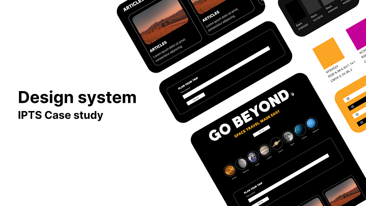
Design system | IPTS Case study
Timeline March 20th - March 30th
Role UX Designer and System Designer
Company IPTS
Tools Figma + Zeroheight
Goal
Design a Design system that’s consistent, reusable, and obtainable for an IPTS space travel website. The Design system will contain, a Design token, typography style, colour style, and reference site.
Problem
The main problem revolved around producing IPTS components in order to solve this issue. I developed a Design system to save cost and time efficiency in the long term.
Solution
Build a Design system with the following items:
Use the hot potato method
5 reusable Components
A reference site to share how to use the components.
Approach
Step 1
Utilized the hot potato method to break down repetitive elements and components I might come across all 3 products.
Step 2
The next step I took was listing out common components to build out first + doing some background research on little details like button size, font size, and the overall component practice for future coders and Designers.
Step 3
I began to work on Zeroheight, the reference site to provide more detail on how to use particular components, where the components can be used on the website by displaying examples as well.
Step 4
I decided to show various examples of all the complete components in a website format in Figma. I approached it this way to visually communicated how they can be used.
What I learned
Based on my observations, trying to utilize the hot potato method, I still have the tendency of researching and preparing. Although it’s helped me produce material more quickly. Question: Do I use the %20 and %80 methods? 1 component make from scratch and apply 4 existing components? I wanted to define and explore the common components theme while implementing the hot potato method which helped immensely in the process.


