Omega Astro - Design system

This case study documents the process of creating Omega Astro: a design system in support of the digital products of Shuddle, an interplanetary travel company.
Role
Sole Designer
Timeline and Tools
2023 | FigJam, Figma, Zero height
Launch
April 2023
The Details
Project Brief
As the Head of Digital for the newly launched IPTS: The Interplanetary Travel Syndicate, I have been tasked with creating 3 unique offerings:
ipts.org: an informational website containing the latest IPTS news and
happenings
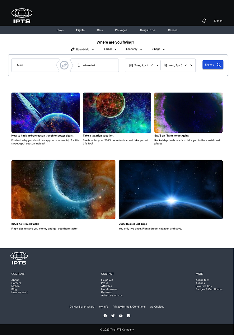
IPTS Travel: a site enabling browsing and bookings to destinations within our galaxy
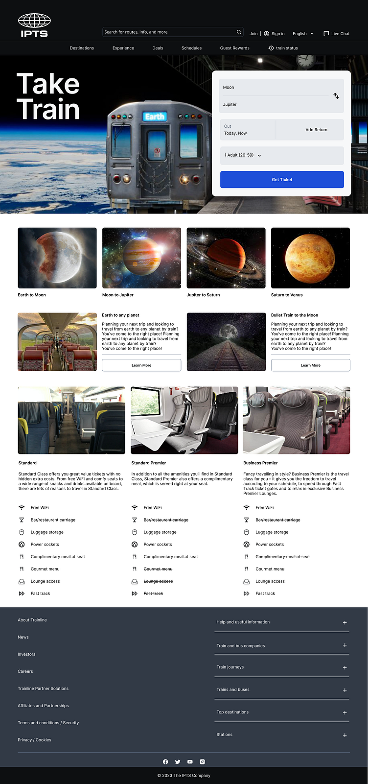
IPTS Rail: a real-time web app where you can view lines, routes, and times for various commuter lines
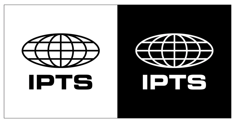
I have been provided IPTS' logo, but no other brand assets.
Overview
Problem
IPTS recently launched three products, namely IPTS Org, IPTS Travel, and IPTS Rail websites. However, due to a lack of collaboration, the three products lacked consistency and had repeated work. Moreover, during the website creation process, the Head of Digital decided to rebrand IPTS to Shuddle, resulting in significant manual changes and longer execution times between the designers and front-end engineers.
Solution
The Omega Astro Design system has proved to be a game-changer for Shuddle, saving the company valuable time and money by codifying design decisions that can be easily replicated at scale. In addition to cost savings, the system has greatly improved the overall customer experience by ensuring consistency, familiarity, and accessibility at every touchpoint.
Project documentation file:
Design documentation: Documentation containing both the versions, pre-branding (V1.0) and post branding (V2.0)
My Role
I was excited to take on this challenge and worked diligently to create a design system that would meet the needs of the project and beyond. The design system would not only ensure consistency and coherence across the three products, but it would also allow for efficient collaboration with other designers and developers. By establishing a set of guidelines, principles, and components, it saved time and reduced the risk of errors caused by inconsistency.
The Process
Research/Competitive analysis
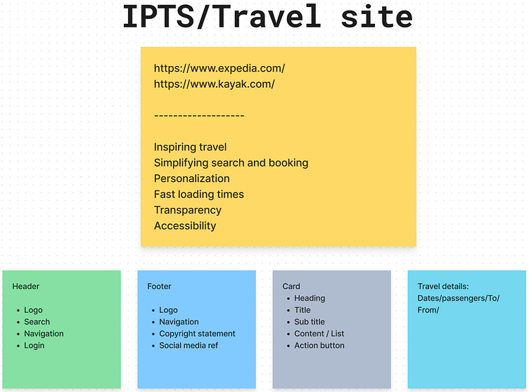
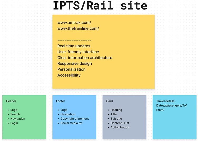
For IPTS design, I conducted research on news, travel booking, and rail sites to identify trends in content, structure, and visual style. This helped me create wireframes that met the client's goals and user needs.
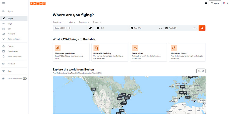
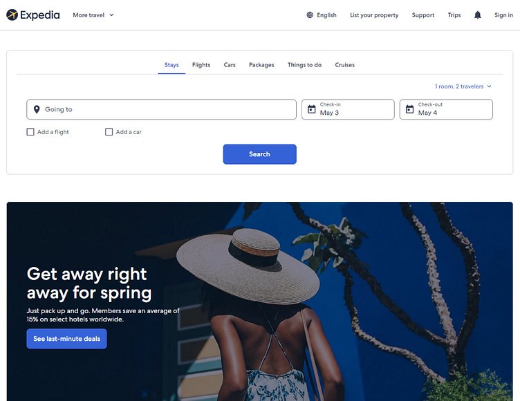
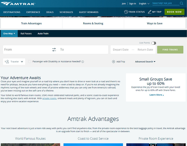
I mainly studied following sites for the respective products:
News
Travel
Rail

Research/Competitive analysis
Findings
I identified required content and common design elements for three sites during the wireframing stage. This allowed me to prioritize consistency, achieve client goals, and establish a cohesive brand identity, ensuring future scalability.
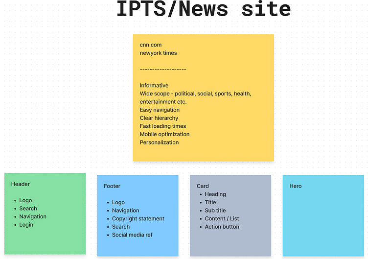
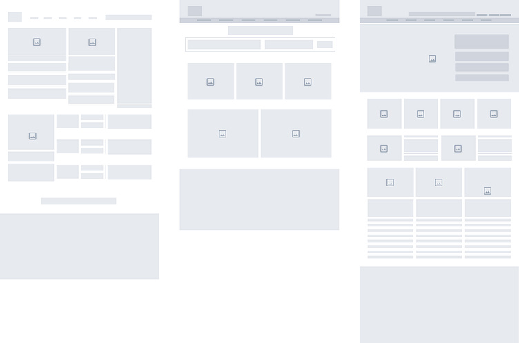
Lo-Fi Wireframe
I identified required content and common design elements for three sites during the wireframing stage. This allowed me to prioritize consistency, achieve client goals, and establish a cohesive brand identity, ensuring future scalability.
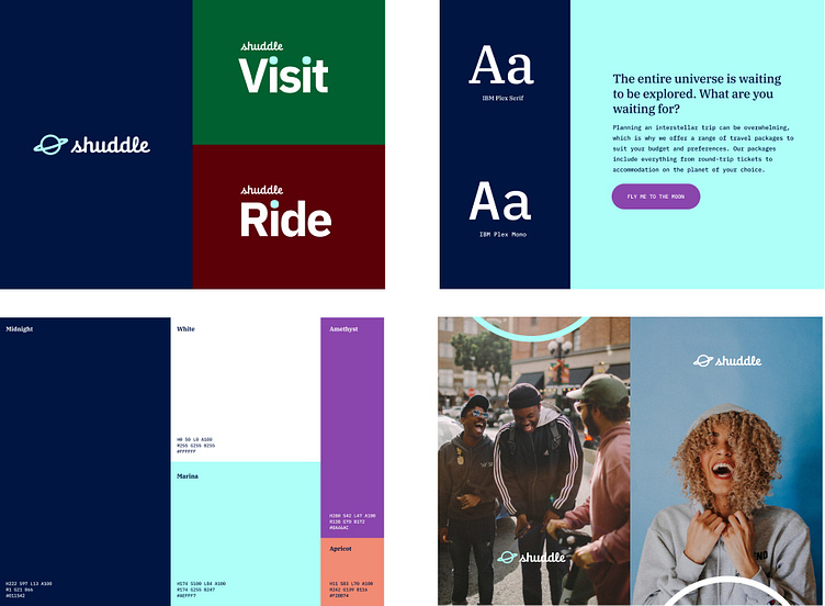
Style Exploration
Here is a glimpse of my design kit used for the 3 products. Its designed to enhance Usability, Readability, Accessibility, and Hierarchy within the interface keeping industry standards into consideration.

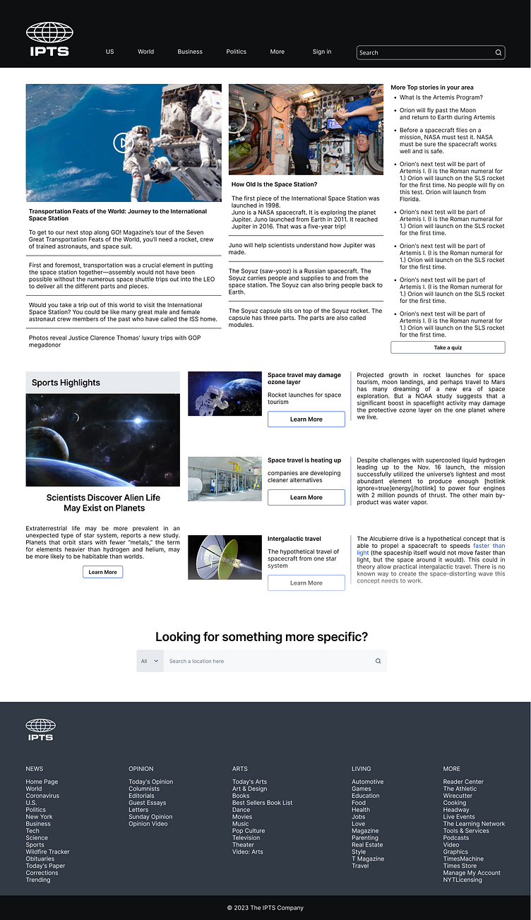
Hi-Fi Wireframe
With clear framework with structure, content, and style, guided me to design the 3 products here...
Design System Emerged
Repetitive pattern identification
A key step in developing a design system is to identify common UI elements that can be shared across different products or interfaces while keeping their structure and meaning into account. To achieve this, I conducted a visual inventory of all the design elements, grouping them into themes and ranking them in order of frequency. Based on this analysis, I began by creating components for the most common elements, and then worked my way down the list, creating multiple components for each theme. This approach allowed me to establish a consistent set of design patterns that could be reused across multiple projects, improving efficiency and consistency.
I created master components with variants for:
. Cards
. Footer
. Buttons
. Tabs
. Search
. List
The Twist
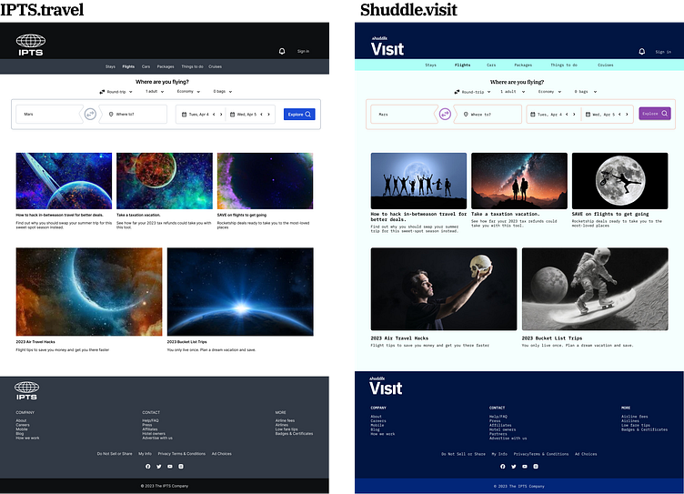
IPTS rebranding
IPTS leadership introduced BIG change and introduced rebrand of the entire organization. IPTS name and logo were updated along with typography and color palate. IPTS is now Shuddle.
Smart move
The scenario was highly practical and convenient. During the design process for these products in Figma, I had created components for various elements, which made it a breeze to follow the same process for the redesign. However, as it was not clear whether the leadership intended to update the existing branding all together or not, I decided to maintain the original components and instead re-designed the new ones within the Figma library. That makes the migration process smooth for all stakeholders even though I will have to maintain both the versions.


Documentation
A comprehensive documentation is an essential component of any design system. I used zeroheight for Omega Astro design system documentation. Version 1.0 covers general principles, color, typography, and grid system. It has component documentation and case studies that demonstrate how to use the system. Its targeted for designers, developers, content writers, and design managers basically for all who are part of Shuddle products.
Design System, the saver
Design system helped to share vocabulary across products, reuse common functionality, categorization, established rules that promotes cohesion, consistency, enabled faster production and trust with users.
It creates relationship between product and users.
Next Steps
Testing
In order to make Omega Astro easy to use I will continue to test it across product teams.
Hosting workshops involving more and more dev teams from various products to showcase design system and to get their feedback on the components
Standardization of SCSS/CSS architecture and standards across products and agile teams based on usability testing
Updating the documentation based on feedback so that its understandable and accessible for all stakeholders.
Version 2.0 and Beyond
Next steps include animation guidelines to build a brand image. The design system will evolve constantly with the product, the tools, and the new technologies.