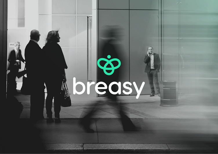
Logo | Brand identity | UIUX for BREASY
BREASY is a broker company that simplifies the process of finding the right solutions for its clients. The name Breasy is a combination of 'BR' for broker and 'EASY' for the seamless and hassle-free workflow that they provide.
The brand identity of Breasy is designed to be minimal yet memorable, with a focus on simplicity and ease of use. The concept vision behind the brand is to create a reliable and trustworthy partner for clients who are seeking guidance and support in their respective fields. Breasy strives to be a leader in the industry by providing exceptional customer service, innovative solutions, and a commitment to delivering results.
Concept behind the logo
The Breasy logo concept draws inspiration from the intricate and interconnected world of bees. Bees are an essential part of the ecosystem, and their organized and efficient workflow ensures the survival of many plant and animal species.
Similarly, Breasy's workflow is designed to simplify and streamline the process of finding the right solutions for clients. The logo features a one line and minimal shape with an abstract form to represent the smooth workflow, necessity ecosystem by creating a bee from all topics connected. The use of a bold, rounded modern font and vibrant colors symbolizes the brand's forward-thinking approach to the industry.
The logo design is a reminder of the necessity of Breasy's work, much like the vital role that bees play in the natural world.
Visual concept below:
This project is done by TROKIT Agency Creative.
Proud to have been part of it as Lead Brand & Advertising Designer.


