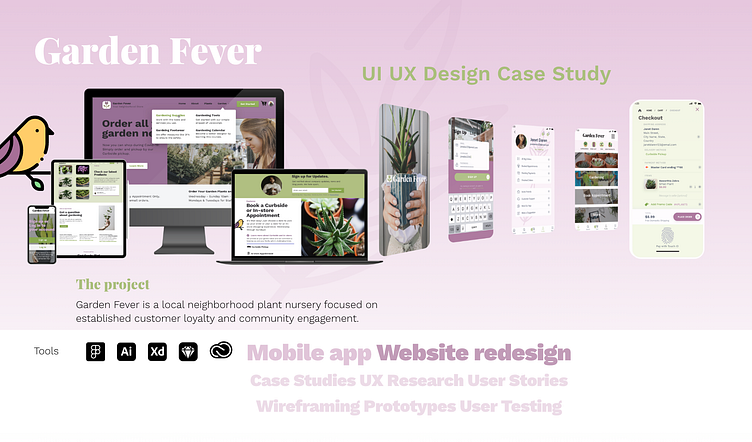
GARDEN FEVER UX Case Study
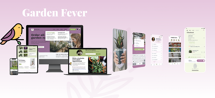
THE PRODUCT
Design a responsive website and mobile app for local nursery that enables customer easy online shopping, purchase, deliver and pickup options due to Pandemic.
THE GOAL AND SOLUTION 😊
• Build mobile app experience with product inventory and user shopping experience streamlined with new company Covid-19 rules.
• Improve user experience and online company presence with interactive design prototype.
THE PROBLEM
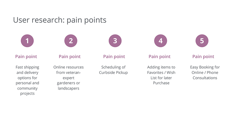
Defining your Users problems and Pain Points 🥴
Customers expected to easily navigate the Garden Fever website and order online products.
Because New Covid-19 shopping rules slowed process and the shopping experience, users could not pay online and pickup as usual.
Customers wanted simple way to pickup purchases and book consultations.
PROJECT DURATION
2 months, 09-2021 to 11-2021
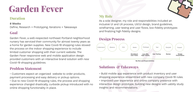
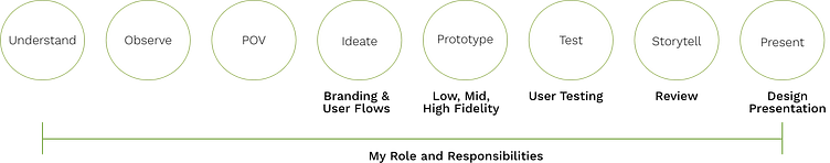
MY ROLE
Lead UX Designer and UX Researcher
EMPATHIZE AND DEFINE
The UX Design Approach consisted of choosing methodologies to further understand the User and User needs to define design iterations based on User Research and User Testing.
The UX Design Approach
Knowing, defining, and empathizing with your Users.
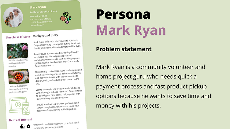
The first step was to know the customer and empathize with their user experience with the GardenFever app and website. First defining the customers using empathy maps across demographics, creating personas, then developing user journeys, from problems statements, user statements and user stories. These steps and tools helped to identify, define, and understand the users pain points and begin the design journey to solve their problems.
User Journey Maps, Personas, User Flow Diagrams, Problem Statements, Empathy Maps
With the goal in mind, a User Flow Diagram was developed for the User to illustrate navigational flow of the Garden Fever Mobile App. Starting with the Home Screen through several alternative screen options through the Payment Process screen to the Delivery screen. This specific User Flow Diagram focuses on a customer who wants to add their viewed products to Wish List or Favorited Item option.
The User Journey Map revealed both the goals and frustrations of the User illustrating both the negative and positive experiences. Close attention was given to move the User from the negative frustrations into the positive experience of using the Garden Fever app. In addition, I analyzed the customers’ experience based on the Persona demographic using pain points to define and evaluate both a Positive and Negative User Journey using the Garden Fever app.
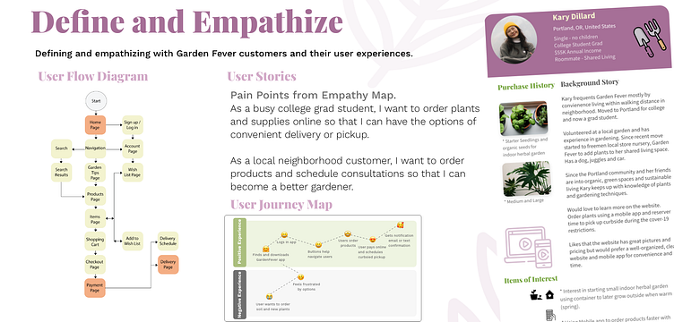
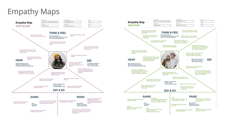
Empathy Maps, Personas, and Pain Points
The Empathy Maps and Personas I developed to focus on specific User pain points, goals, needs, and expectations of their User Journey using the User Stories. Then the Problem Statements were created to further define the user experience.
Problem Statements
Using the 5 W's and H, Who, What, When, Where, Why and How, I was able to define user Problem Statements to understand and empathize possible design solutions as well as Users' Pain Points in the Define Stage of the UX Design Process.
Competitive Audits and Analysis, Storyboards, and Site Map
During the Define and Ideation process a competitive analysis and audit was performed to understand the competition and market trends. This data further helped to create UI branding, sticker sheets, and specs for the design process.
Focusing on Competitors, Marketing Trends and the Users' Product Experience
Competitive Audit + Analysis
A Competitive Audit Analysis was conducted to
provide a real-time snapshot lens of local direct
and indirect competitors’ strengths and
weaknesses, their value proposition, unique
features and services, market trends, and
customer needs, and expectations.
Gaps and opportunities were evaluated using
SWOT metrics and analyzing research findings
to gauge how Garden Fever website and app
could benefit in the design elements, content,
and trends.
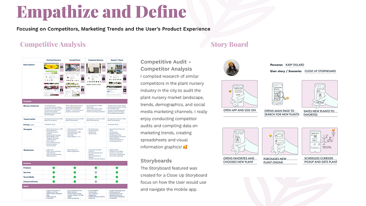
Storyboards
Storyboards were developed using scene by scene visual elements from the Persona, Kary D. to illustrate how she might use the Garden Fever Mobile App to search for a plant, purchase her product, and schedule a curbside pickup. Using the Kary Dillard Persona and Problem Statements, I focused on the Close Up style of Storyboard aiming to show and tell how this user would experience the Garden Fever app navigation.
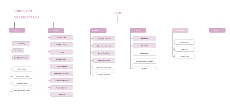
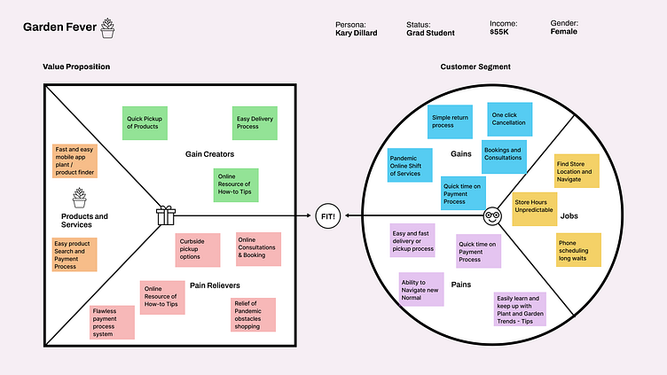
Sitemap + Value Proposition
The Site Map was created for a responsive Website and acted as an iterative blueprint to construct the navigation menu and pages of the Garden Fever website for sorting of needed content and page hierarchy.
Value proposition was determined
and defined analyzing user pain
points to summarize why a
customer wants or needs the
Garden Fever products and services.
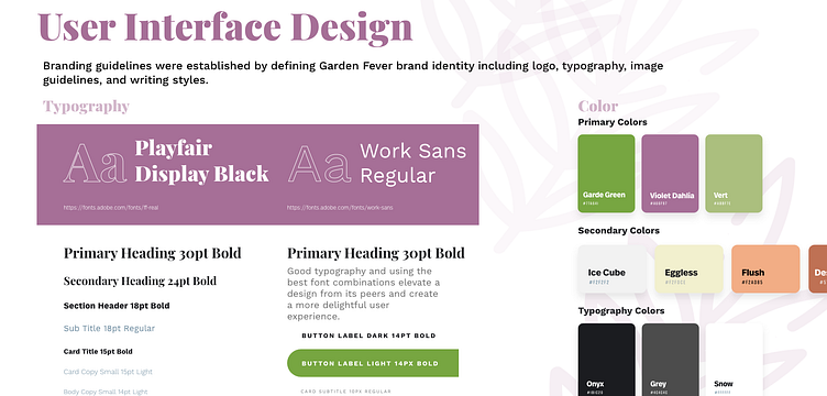
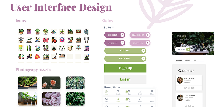
UI Branding + Design Systems
Branding guidelines were established by defining the Garden Fever brand identity to include a new logo, typography, colors, elemental hierarchy, image guidelines, icons, and styles as a sticker sheet.
Starting the Design Iteration Phase
Wireframes, Digital Wireframes, Low-Fidelity Prototypes and Usability Studies
Ideate + Prototype
Iterations and designs based on testing.
Brainstorming ideas involved asking "How Might We" questions with the User in mind to consider how Users might approach problems. Looking at problem statements, establishing goals, benchmarks, and constraints the ideation continued with rapid Wireframes. Paper wireframes were used in this process, including using competitive audits and report data to establish elements of design for the user.
Then I begin setting up my research format and materials: scope and goals, participant recruitment, spreadsheets, interview questions, and participant data capture. The Usability Studies allowed for the iteration and prototyping phases to be tested through the design process.
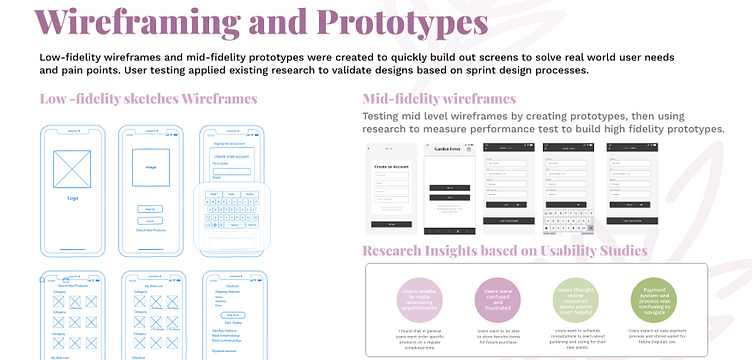
Wireframes
Finally, a quick sketch and low fidelity wireframe was created after the initial Define, Empathize, and preliminary UX Research steps.
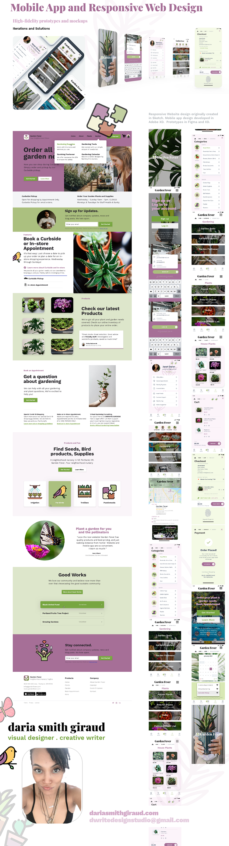
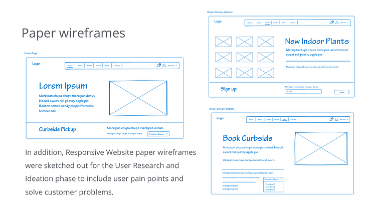
Mobile App paper wireframes sketched out for the User Research and Ideation phase showed what the Garden Fever Mobile App might look like, what important elements were needed.
In addition, Responsive Website paper wireframes were sketched out for the User Research and Ideation phase to include user pain points and solve customer problems.
Next Phase in The UX Design Process
In the following phase of the UX Design Process, was the start of the Usability Studies to take the brainstorming of designs and iterations into the Testing phase to see how users respond to elements of the mobile app and website design.
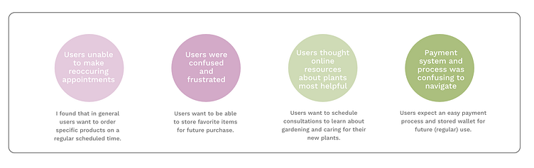
Using Insights form the Usability Study major findings included frustrations, needs, confusion, and specific tasks to solve in the subsequent prototype design iterations.
User Research Insights and Observations
User Research Summary
Usability Study included 5 participants, unmoderated, 25-30 minutes, 6 prompts, and 10 questions, and feedback.
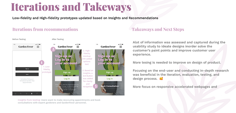
Insights from Usability Study included customers needs and frustrations using the mobile app, task prompts with ease of navigation. Customers pain points included scheduling and booking options for delivery during the purchase process as well as initial appointment for in-store shopping due to Pandemic regulations.
Digital Wireframes + Low-Fidelity Prototypes
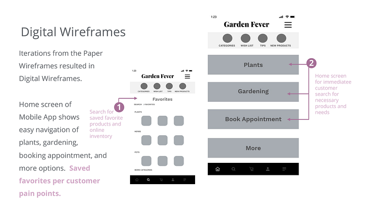
Iterations from the Paper Wireframes resulted in Digital Wireframes.
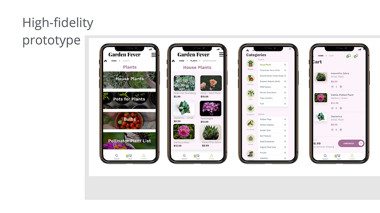
Home screen of Mobile App shows easy navigation of plants, gardening, booking appointment, and more options. Saved favorites per customer pain points.
Usability Testing + Findings
Findings
The first Usability Study focused on Mobile App design while the second Usability Study looked at website functionality, pain points, and user insights design testing and iterations.
Round 1 findings
Confusion saving viewed products to a favorite screen or category.
Frustration resulted from inability to store favorite items for later purchase.
Booking appointments and pickups during Covid new normal shopping.
Round 2 findings
Unable to navigate menu easily to Book Curbside or Consulting Appointments.
Basic navigation menu was confusing.
Website buttons for Curbside pickup not available.
Refining the Design
Ideation based on User Testing from Usability Studies
In this phase Testing from the Usability Studies were used to define the Ideation of Designs. From Low-Fidelity Mockups to High-Fidelity Prototypes each decision was based on testing parts of the design element.
For instance, after the Usability Study customer insights were used for iteration of designs. This iteration illustrates what specific changes were made in the design to solve the user pain points and test design.
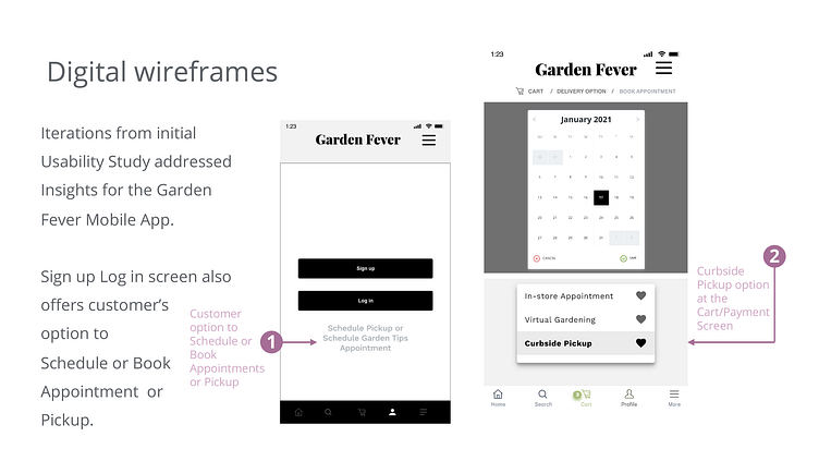
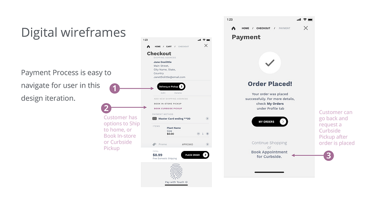
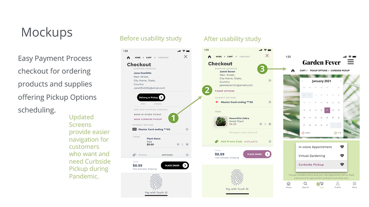
On Login/ signup screen customers have option of Booking Appointment for their needs. For customers who want to shop in-store.
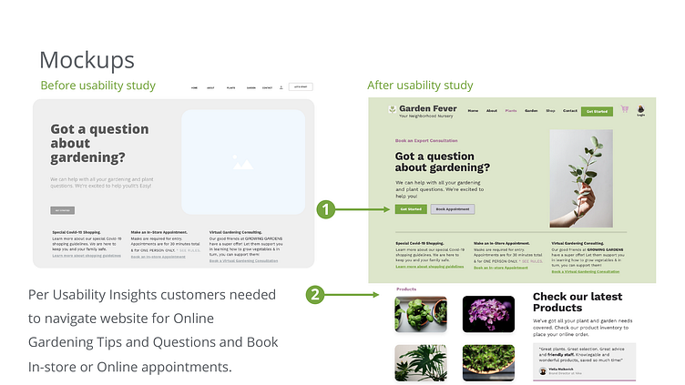
While in the Responsive Website Design iteration illustration, the following was discovered in the design approach.
Per Usability Insights customers needed to navigate website for Online Gardening Tips and Questions and Book In-store or Online appointments.
High-Fidelity Prototypes + Takeaways
What I learned 🥰
More Testing and Conclusions. Does it actually work?
Testing continued during the prototyping and ideation phase. Usability studies provided the strongest data to improve design features, hierarchy, accessibility considerations, insights and recommendations.
Takeaways & Tips for Improvement
I learned so much from this project and truly enjoyed working on it. Particularly the essential steps in the UX design process. Learning to solve problems and brainstorm various solutions is something I continue to learn and improve upon in my design process. Testing and validating prototypes is also part of process I am learning as I continue to build my design skills. 😇
A few tips for improvement are:
Enhancing prototyping and interactions
Using P0 ( highest priority) to P2 (least priority) updates
Showing different design options
Next Steps in the UX Design Process
Before Testing + After Testing. 🥳
Why were changes made? Solving Challenges and Pain Points through the design iteration process.
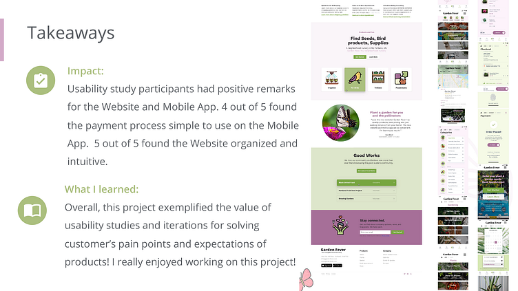
Impact:
Usability study participants had positive remarks for the Website and Mobile App. 4 out of 5 found the payment process simple to use on the Mobile App. 5 out of 5 found the Website organized and intuitive.
What I learned:
Overall, this project exemplified the value of usability studies and iterations for solving customer’s pain points and expectations of products! I really enjoyed working on this project!