Logo design, package design

Design for a new packaging for milk that is both functional and visually attractive can pose several challenges: Balancing form and function, standing out from competitors, choosing appropriate materials, understanding the target audience, developing a solution into a series that caters to the specific preferences of the target market.
Balancing form and function
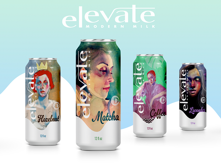
I chose to use metallic cans because it was different from the usual way we think of milk packaging and it is visually appealing to the target audience. It is also be practical and functional as well as refreshing to the eye.Enter your text here...
To stand out from competitors I chose to use my original artwork
By using original artwork, the packaging design becomes unique and exclusive, which can be particularly attractive to consumers who are seeking something special and out of the ordinary. The portraits of women can also convey a sense of empowerment and beauty, which may resonate with the target audience.

addressing a new distinct audience.......
Incorporating art into packaging design can elevate the product and increase its perceived value. It can also make the product stand out on store shelves, drawing attention and creating a memorable impression on potential customers.
Let's work together! Contact me at julia@juliasolo.com