Building Orbit Design System
Hello, Dribbble Community!
As a part of the Dribbble Scaling Design System course, I had the opportunity to work on the final capstone project of it. The idea is to apply all the knowledge we learned through this 8-week course and build a Design System for Shuddle — formally known as The Interplanetary Travel Syndicate (IPTS) —, a newly launched bustling transportation network that shuttles people from world to world within our galaxy.
👩💻 Role: UI designer
⏰ Timeline: Two weeks
✍️ Deliverable: Three websites, a reference website and a design system.
Overview
This capstone project consists of two phases. In phase one, we have to design three different products and create a design system for ITPS. Meanwhile, in phase two, we need to update each product with the new branding called Shuddle. For both phases, we had to chronicle our process on ZeroHeight and publish a Case Study in Dribbble.
By the end of this project, we will have created a design system that helps us build a consistent and quality user experience through our different ecosystems.
The Challenge
For phase one, our challenge was creating three websites and ensuring that each page needed at least five components.
Meanwhile, in phase two, our client IPTS hired the prestigious branding firm MegaBrand to rebrand the entire organization. After weeks of research and exploration, they settled on the name Shuddle.
So our main challenge for this capstone project is rebranding IPTS to Shuddle to prove the power and value of the design system we created in phase one.
The Process
We started phase one by learning more about our client, The Interplanetary Travel Syndicate (IPTS). Through this understanding phase, we found out that they only had a logo to work on and a brief description for each of their offerings.
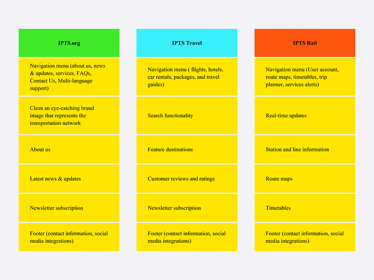
IPTS offerings:
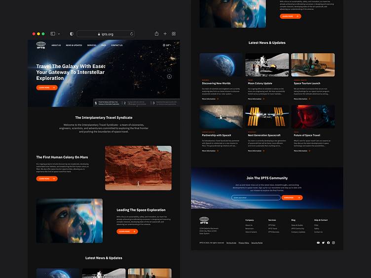
IPTS Org is an information website where users can find the latest news and happenings with The IPTS.
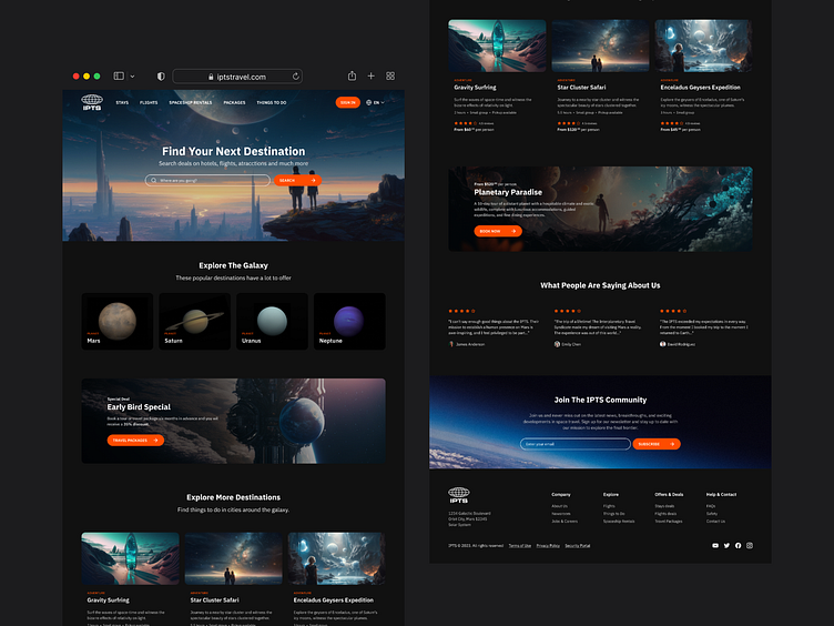
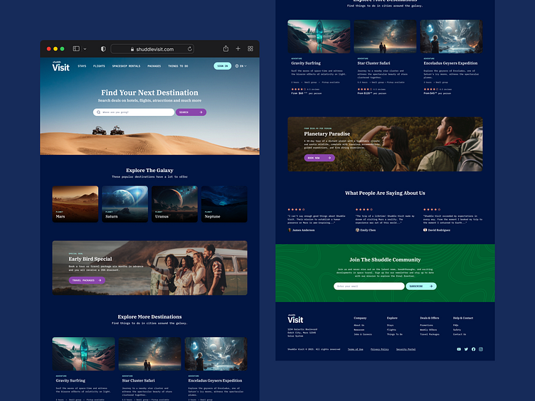
IPTS Travel is a website where users can browse and book travel to and from multiple destinations within our galaxy.
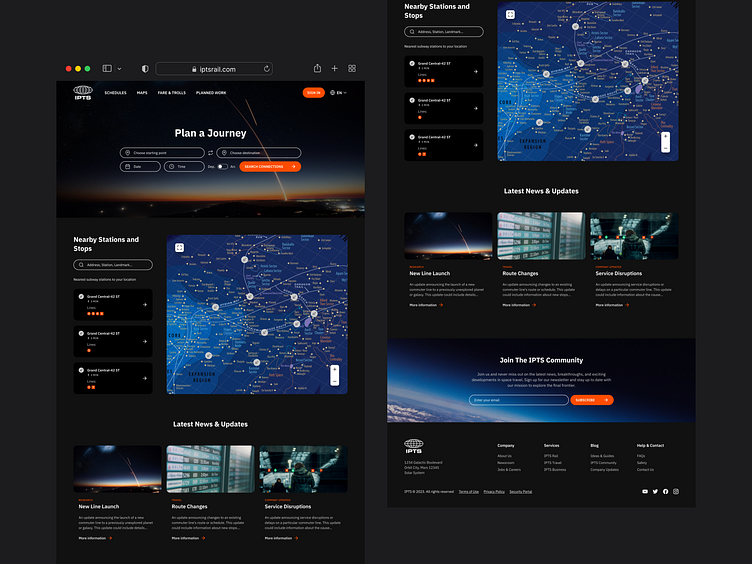
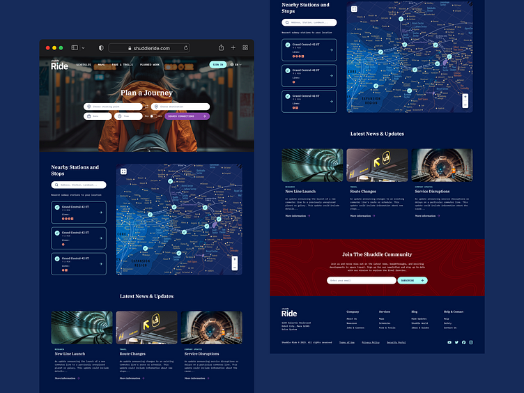
IPTS Rail is a real-time updated web app that views lines, routes, and times for different commuter lines.
Once we understood our client’s needs, we put the Hot Potato Process learned in the course into practice by passing ideas quickly back and forth from designers to developers and vice versa to create IPTS products. Since this was a solo project, I used ChatGPT to support me.
Enter your text here...With a much clear vision of what we needed for each product, we took the results of the Hot Potato process and kept updating them until we got these versions:
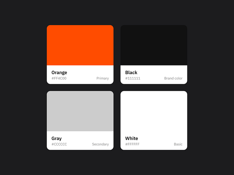
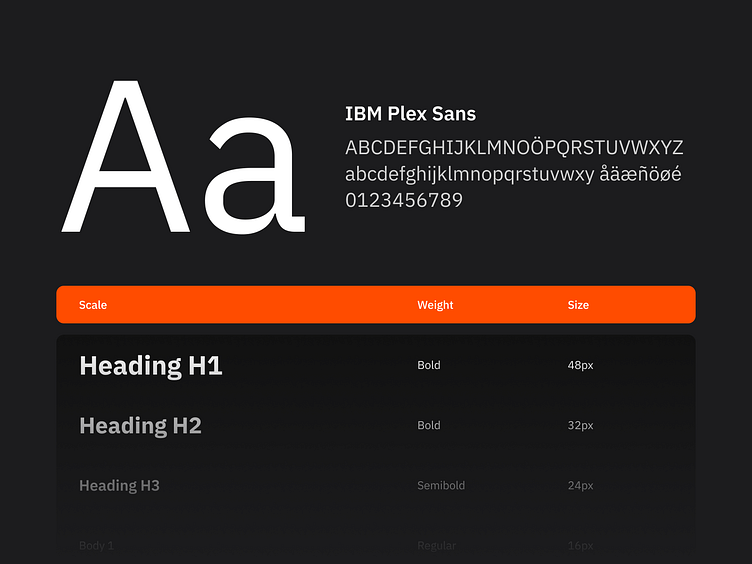
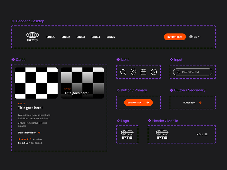
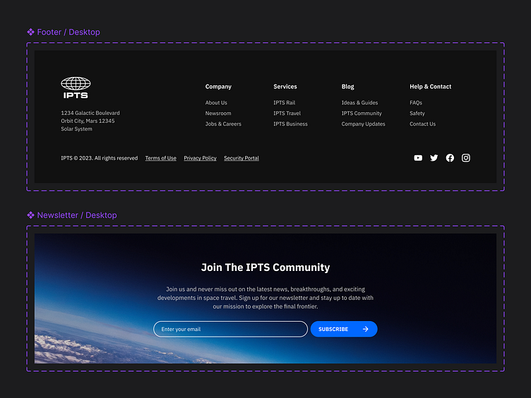
With all of The IPTS products built, we identified similar components used across the products. So, our next step was to extract all these share components (logo, colour palettes, typographies, cards, headers, footer, input fields, buttons and more) and create our Design System for IPTS.
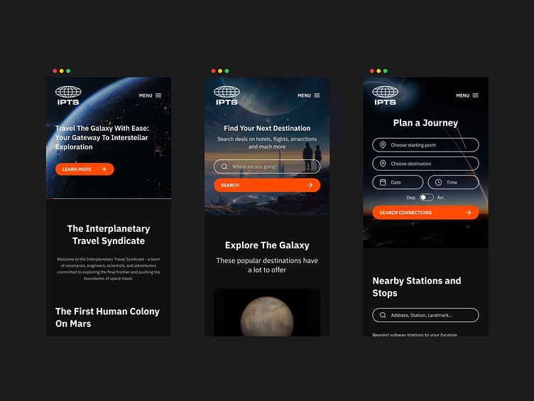
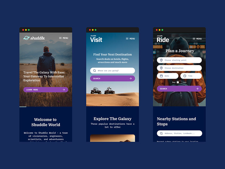
Before we completed phase one, we also wanted to prove how flexible our components were, so we created a mobile version of each product because most of the ITPS users are mobile users, so we wanted to give a better user-friendly experience to them.
Phase Two
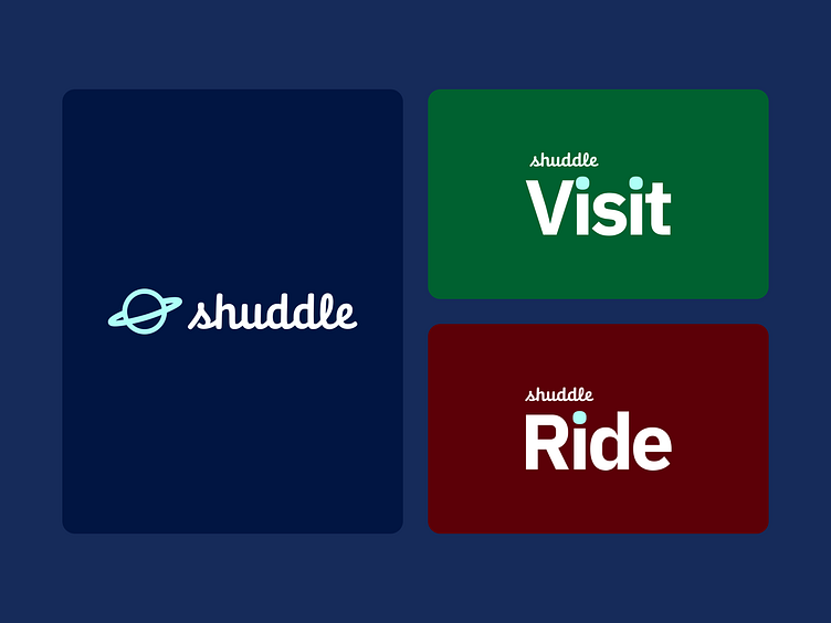
For this phase, our client hired the prestigious branding firm MegaBrand to help them rebrand IPTS since their younger audience felt that the name was ominous, faceless and cold. So, after weeks of research and exploration, they have settled on the new name Shuddle, which feels more like a cool and new startup.
They also renamed the three main products to make it feel like a family of products instead of independent offerings, so from now on:
IPTS Rail is now Shuddle Ride.
IPTS Org is now Shuddle World.
IPTS Travel is now Shuddle Visit.
Phase Two
For this phase, our client hired the prestigious branding firm MegaBrand to help them rebrand IPTS since their younger audience felt that the name was ominous, faceless and cold. So, after weeks of research and exploration, they have settled on the new name Shuddle, which feels more like a cool and new startup.
They also renamed the three main products to make it feel like a family of products instead of independent offerings, so from now on:
IPTS Rail is now Shuddle Ride.
IPTS Org is now Shuddle World.
IPTS Travel is now Shuddle Visit.
For us, this change means we had to update all the products we built before with this new logo, colour and typographic palettes, but since we already have a design system, updating the products will be easy. So we will share the final version of this capstone in the next section, The Outcome.
The Outcome
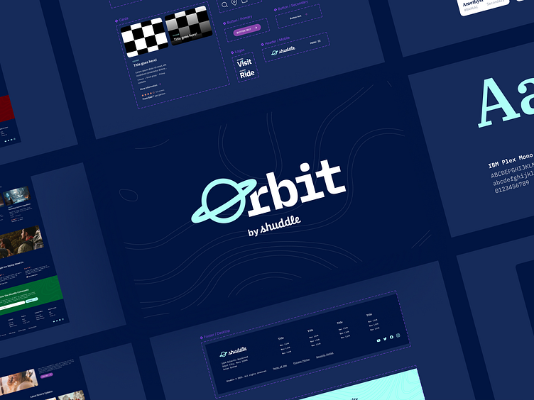
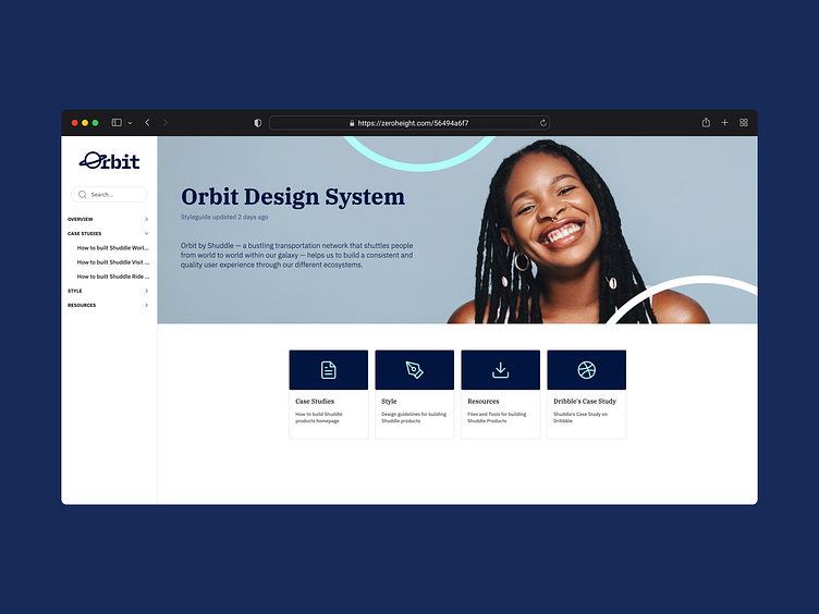
Through this capstone project, we built Orbit, a design system for Shuddle — formally known as IPTS — that works through Shuddle’s different ecosystems. This design system will help us to ensure that all Shuddle products and experiences have a cohesive look and feel, and it will also work as a source of truth for design assets and code components for future ecosystems.
Inside the Orbit Design System, you will find Shuddle’s colour palette, typographies, logos and all the components used in their ecosystems.
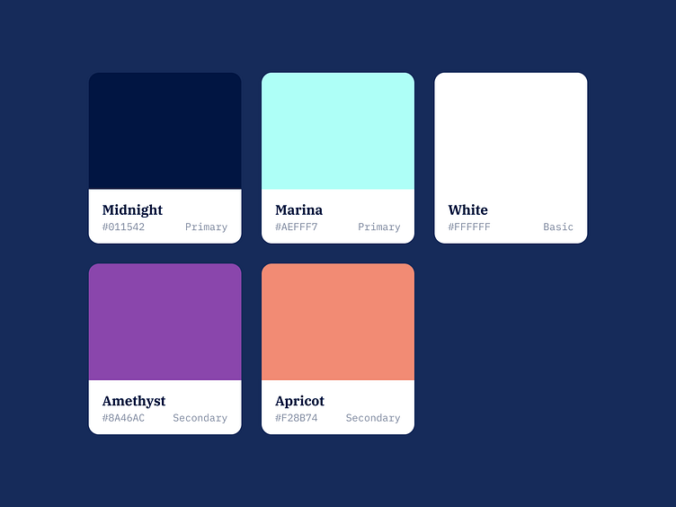
The Colours
Shuddle’s colour palette is fresh and vibrant. The primary colours are Midnight, Marina and White. In addition, we used Amethyst colour for buttons and Appricot for small details like icons.
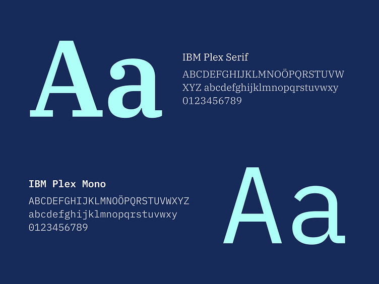
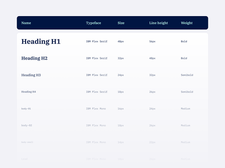
The Typography
Shuddle’s typography relies heavily on the IBM Plex superfamily to give a wide range and make everything familiar. We used IBM Plex Serif for headings and IBM Plex Mono for body content.
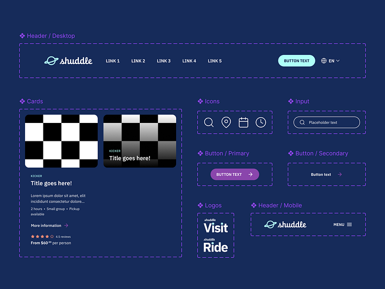
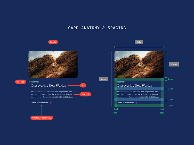
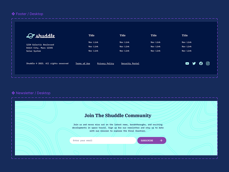
The Components
You will find a wide range of components in The Orbit Design System, for example, headers, footers, cards, layouts, inputs, icons, buttons and more.
The Final Products
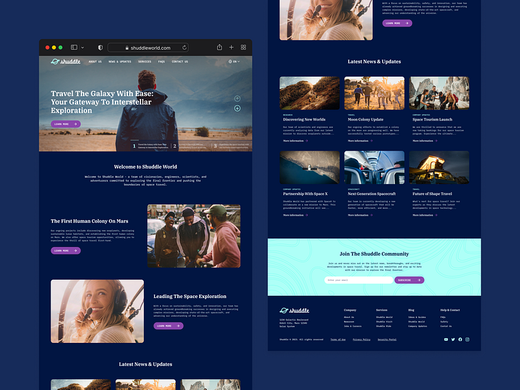
We also create a reference website on ZeroHeight for those who want to learn more about the Orbit Design System, its principles, style guides, and how to build the Shuddle’s homepage of each product.
For us, this change means we had to update all the products we built before with this new logo, colour and typographic palettes, but since we already have a design system, updating the products will be easy. So we will share the final version of this capstone in the next section, The Outcome.
Resources
Orbit Design System - Figma Library