UUX Design System case study
Welcome to Shuddle, the new face of IPTS.
In this case study, we will walk through the process of developing the IPTS design system and its rebranding and how establishing the UUX (Universal User Experience) system helped me make this change smooth, fast, and accessible.
Challenge
As the product designer for this project, my responsibility was to create three cohesive and consistent websites that contribute to building trust in this new form of travel. Delivering completed designs to the development team was crucial for the organization's success.
Stage 1
First, I was tasked with creating 3 websites:
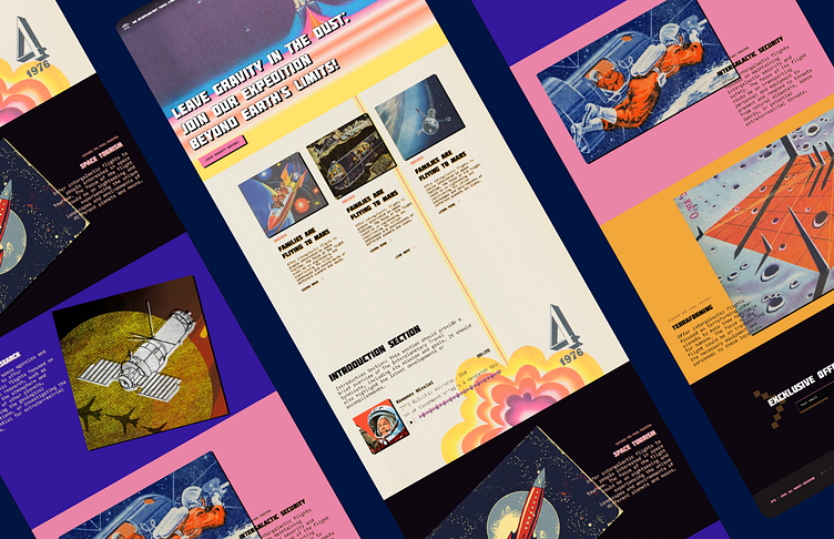
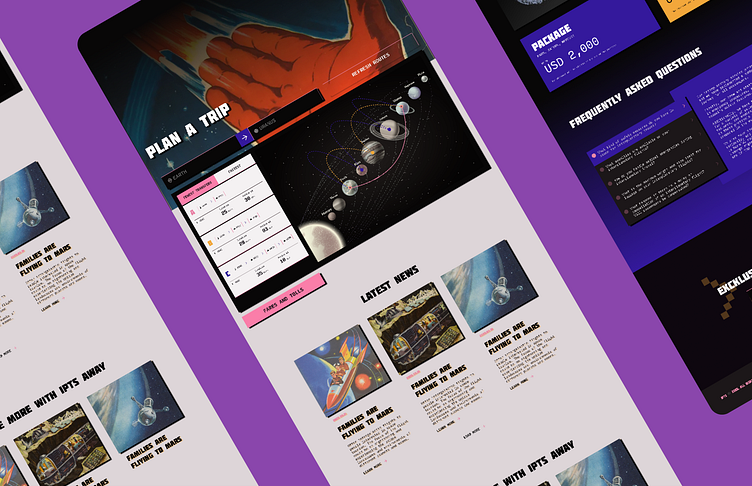
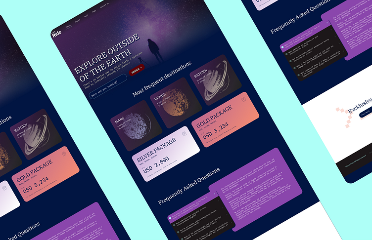
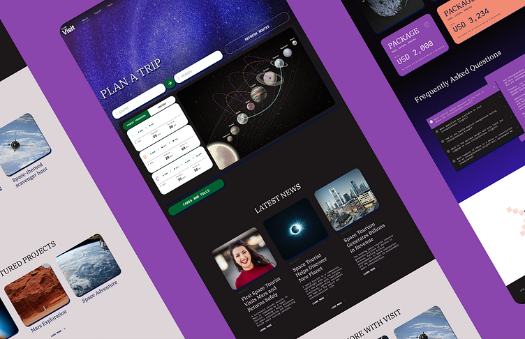
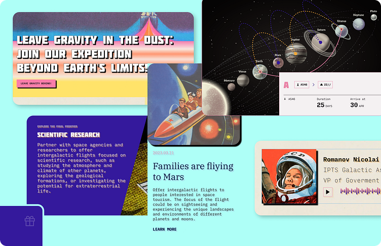
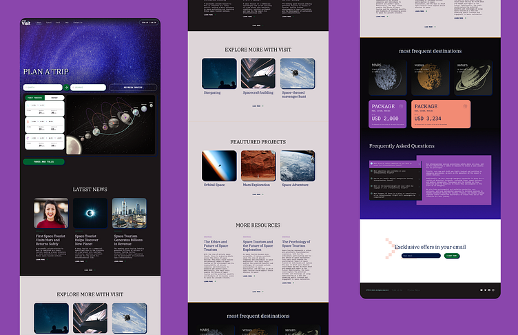
ipts.org, an informational website where you can find the latest news and happenings with the IPTS.
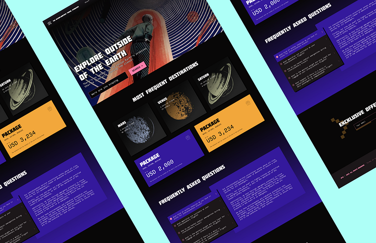
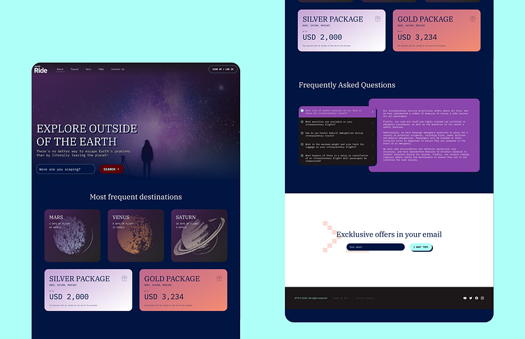
IPTS Travel, a website where you can browse and book travel to and multiple destinations within our galaxy. Think of Expedia for space.
IPTS Rail, a real-time updated web app where you can view lines, routes, and times for all the different commuter lines. Think NYC subway or the London Underground, but for interplanetary travel.
My job was to create all three websites. Each website has to be at least 1 page, with each page requiring at least 5 components on it.
Stage 2
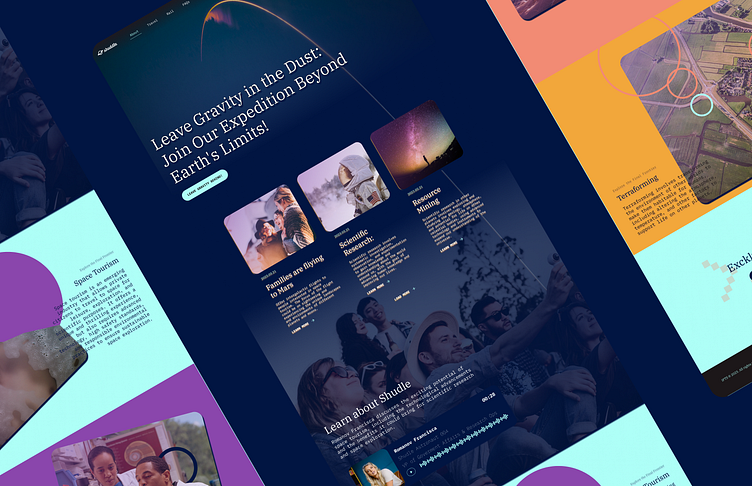
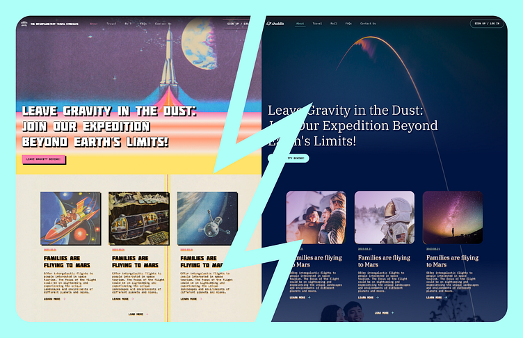
My leadership at the IPTS—the Interplanetary Travel Syndicate—just hired the prestigious branding firm MegaBrand to do a rebrand of the entire organization, and there are a few things that’ll affect the three products you’ve been working on.
MegaBrand discovered through focus groups that the IPTS name and logo felt very ominous, like it was cold, faceless corporation that was always watching. (“The eyeball-shaped logo doesn’t help,” said one candid participant.) In addition, the IPTS wants to appeal to a younger demographic.
After weeks of research and exploration, they’ve settled on the new name “Shuddle,” which feels more like a cool, new startup.
So my task here was to update my designs to this new branding. Also to update my reference site to reflect the new brand, both in design and content.
Process & experience
Discovery
I already felt familiar with this industry as I had to design a very special app at work where we are sending Bitcoin to the moon.
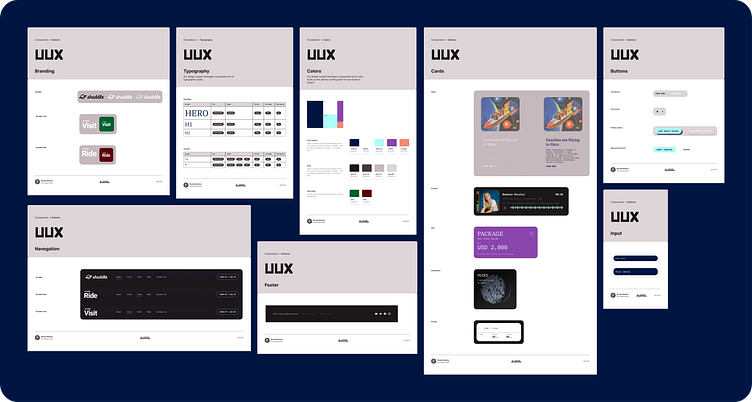
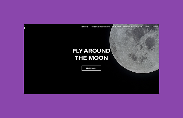
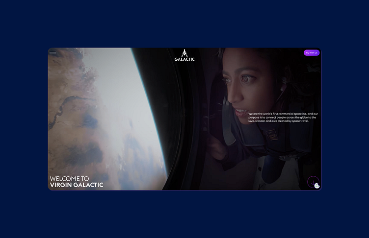
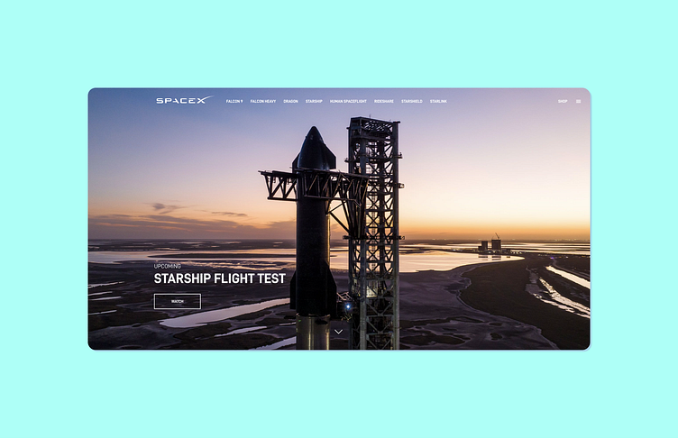
In this exploration and discovery phase, I took the time to observe other products and analyze the recurring components of each one: header, buttons, headings, cards, and forms, studying which characteristics they had in common and which ones they didn't.
Working software
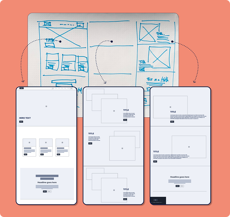
Structure
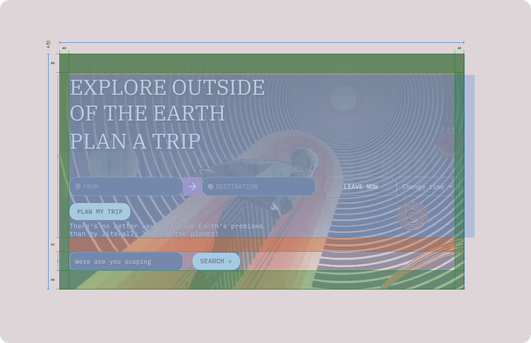
The first thing I did was create a general structure for each page to define the content. I developed the system of the three products simultaneously and thus have cohesion in the project.
Design
Before designing components, I started with the definition of Levers (Global Settings) and Dials (Granular Design Decisions). I took these definitions from the book The Expressive Design Systems by Yesenia Perez-Cruz. I found it very helpful, especially in the initial stage, as they narrow the options and help inform quick decisions.
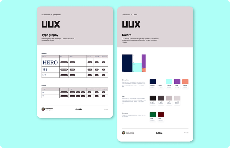
Then I defined a color palette and typography.
These initial decisions were not set in stone as I adjusted them as I worked.
Discovery
Okay, so I already felt familiar with this industry because I had to design a very special app at work where we will send Bitcoin to the moon.
In this exploration and discovery phase, I took the time to observe other products and analyze the recurring components of each one: header, buttons, headings, cards, and forms, studying which characteristics they had in common and which ones they didn't.
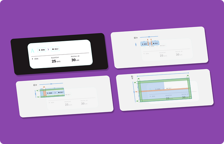
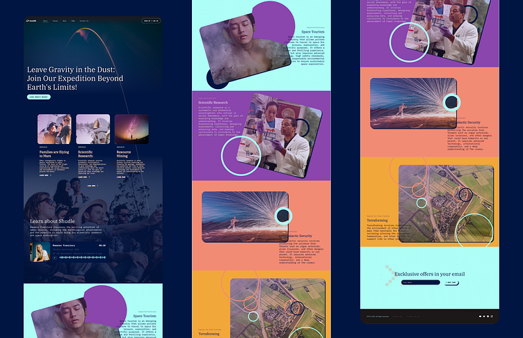
Components
The work of external components has many paths. I like to create them in context and then extract them from the library. This process is essential because it allows me to adjust the same product, and once I see that they work well, I can bring them to the library.
At this stage, I put into play all the design decisions I defined in the initial step:
Levers
Size
Scale
Density and weight
Dials
Type
Spacing
Color
Final updates
Final round
When the project was practically ready, I was informed of a radical change in the brief, and I was asked to update the project for a new brand with a new focus. Basically, the logo, colors, typography, and visual language changed.
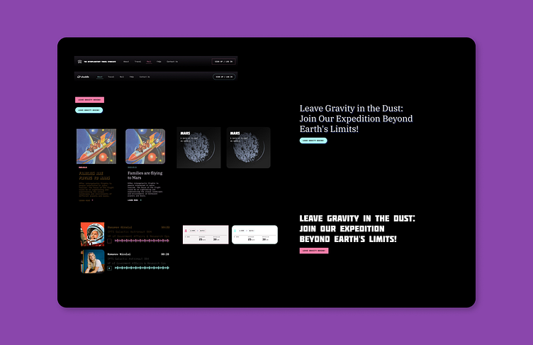
In a situation like this, the design system plays a fundamental role since having everything centralized in a library makes it very easy to make global adjustments and then implement them in a design associated with that library.
The outcome
The result was interesting. If the original design took me 10 hours, the final update took me 1 hour. I think it would have been even better if I had implemented Design Tokens, as it would have given me even more control. The process is fundamental, and starting the project with a flexible mindset is very important.
Key takeaway
As a UX/UI Designer, my role was instrumental in making our design system cohesive and consistent across all products and services. Leveraging my expertise in UX/UI design, I created a visually unified and easy-to-use design language for this project.
To begin, I established a set of design principles, color palettes, typography, and imagery that were used consistently throughout the system. This cohesive design language ensured that our users had a seamless experience across all touchpoints.
I also identified and defined reusable patterns for common design elements, such as buttons, input fields, cards, and navigation. This approach ensured consistency and reduced design effort.
Overall, my role as a UX/UI Designer was crucial in creating a cohesive and user-friendly design system that delivered a consistent experience to our users.