Rebranding IPTS / Shuddle with Design Systems
Project Overview
The Interplanetary Travel Syndicate (IPTS), an intergalatic transportation network, has (3) unique offerings:
1/ ipts.org - an informational website for the latest news and events within IPTS
2/ IPTS Travel - a website for browsing and booking travels within the galaxy
3/ IPTS Rail - a website to view real-time updates on routes and times for different commuter lines
Tasked with the responsibility as "Head of Digital" (aka. sole designer) of this space extravaganza, the goal is to design all (3) websites, while accounting for scalability and future-proofing for changes.
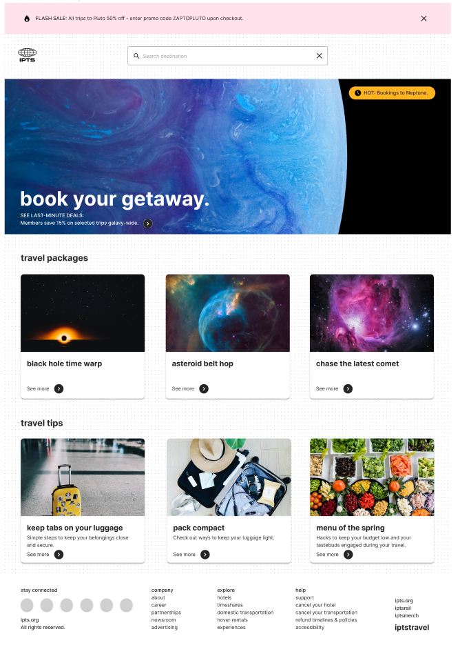
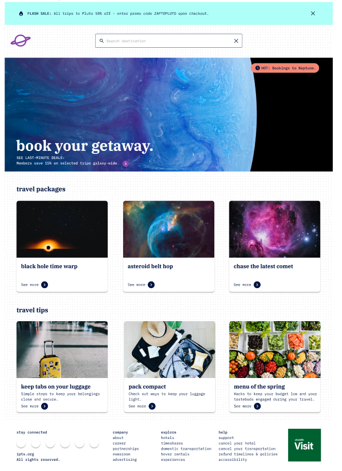
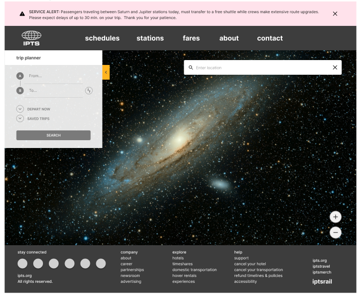
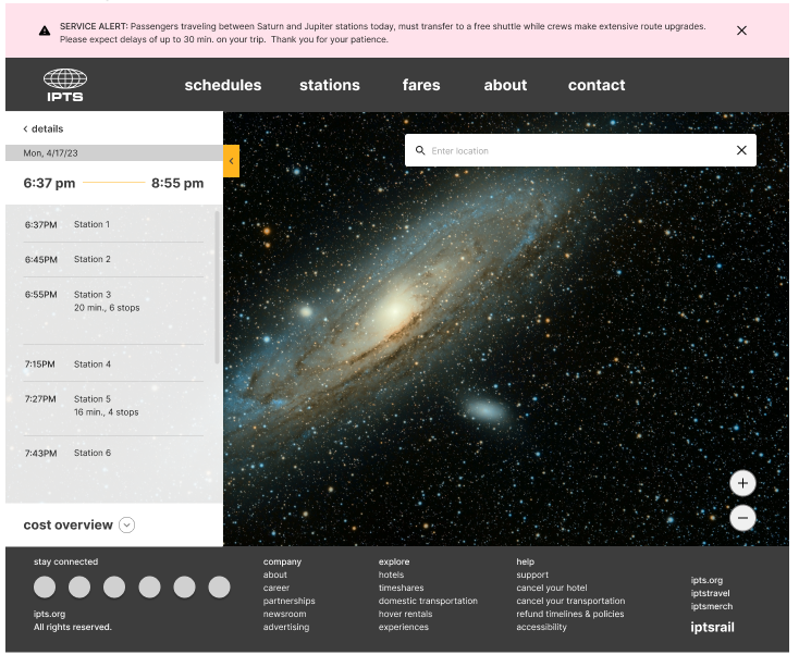
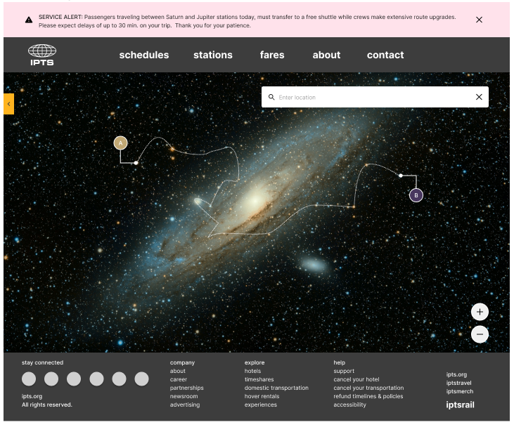
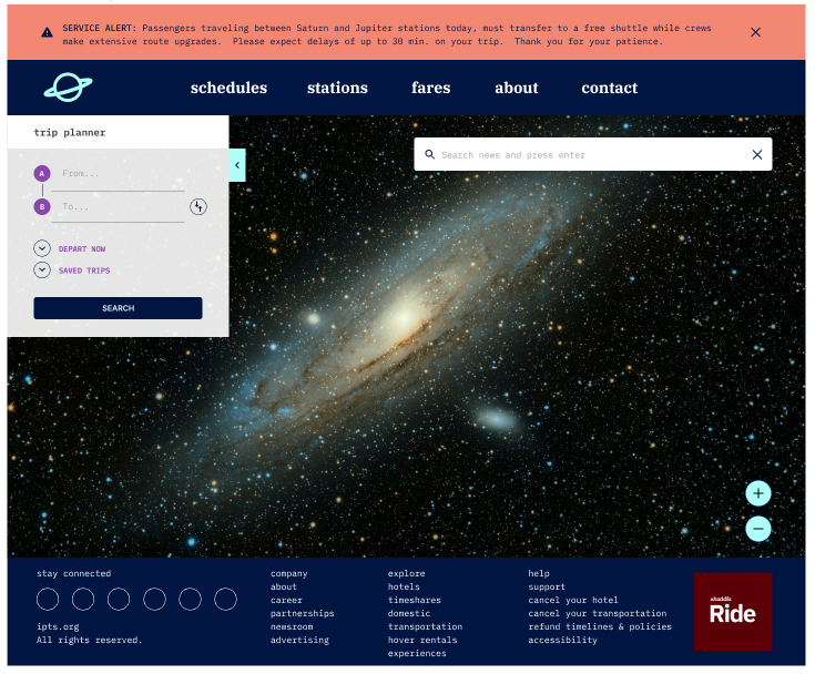
Above: Desktop design for IPTS Travel and its rebrand, Shuddle Visit.
Approach
My high-level strategy begins with i) research and ii) decide on an organizational framework to plan and execute this scope of work.
The researching phase involves the collection and analyses on a sample of precedents and competitor websites to have a better understanding of the kinds of products being offered in a similar space. During this process, I consolidated my findings into wireframe sketches.
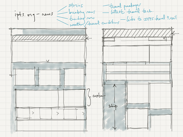
Above: Initial sketches of layout studies for ipts.org (desktop and mobile).
I chose to focus my studies on the following areas:
Functionality
Action: Proposing a list of functionality from a MVP perspective and evaluate that list against what is available on competitor websites.
Layout
Action: Balancing the page real estate: what we can do (because we can) vs. what is needed to accommodate the minimally required content from the previous proposed list.
Patterns + Components
Actions:
1/ Aggregating page elements that can become more generic, reusable components.
2/ Mentally and visually constructing and deconstructing these components to examine which parts could turn into variants if the components were to be reusable and separate others so that the Atomic Design model of the structures would align at the same levels in design and in code.
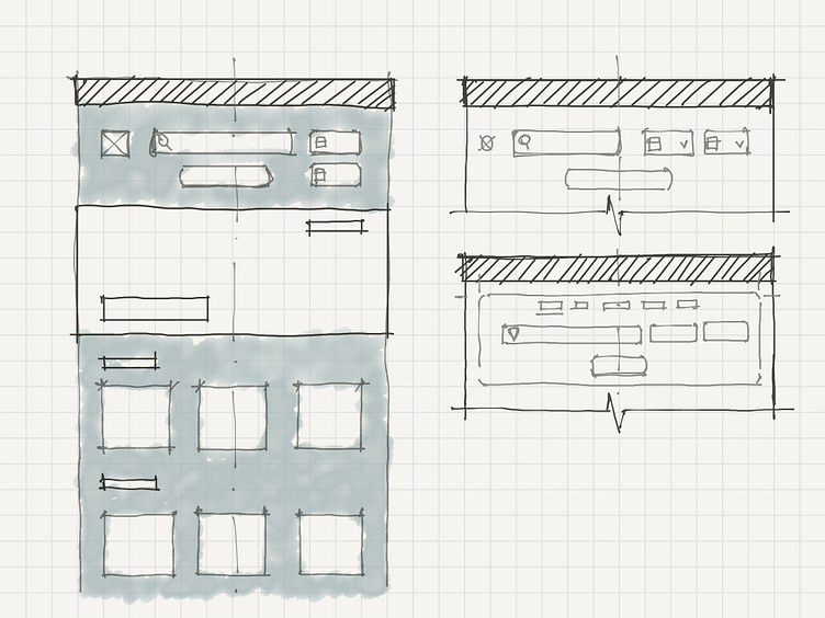
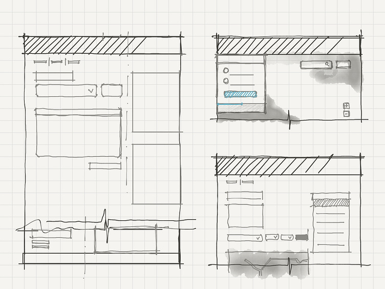
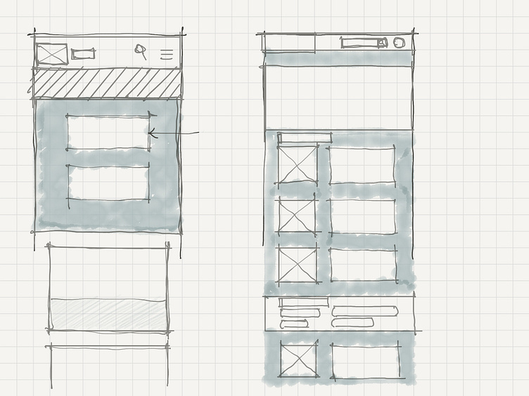
Above: Wireframe sketches for IPTS Travel and Rail, respectively.
Several signals from this project brief indicate that the work would be best supported by having a design system in place. Design systems are known to be well-suited for undertaking the creation of multiple surfaces and endure change. Therefore, design systems are set up in a way that is flexible to anticipate a bit of shake ;) Because of this way of working, design systems also help to streamline the workflow between designers and engineers beyond the lifecycle of any one project.
After the analyses and initial designs are complete, I started laying out properties in a style library that could be turned into design tokens when needed.
Above: Desktop design for IPTS Ride.
Style Library
I see the style library as a palette that I can use to create my component library with. The universal properties that I chose to outline were:
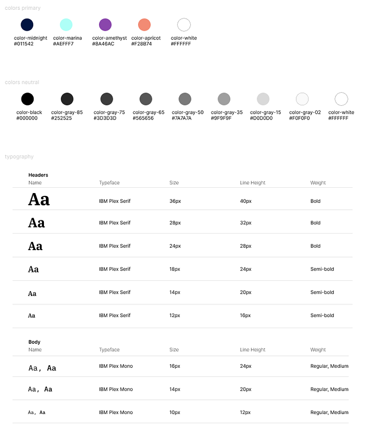
Colors
Typography
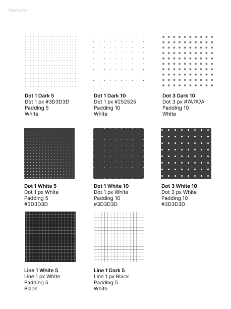
Textures
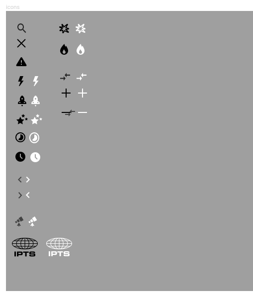
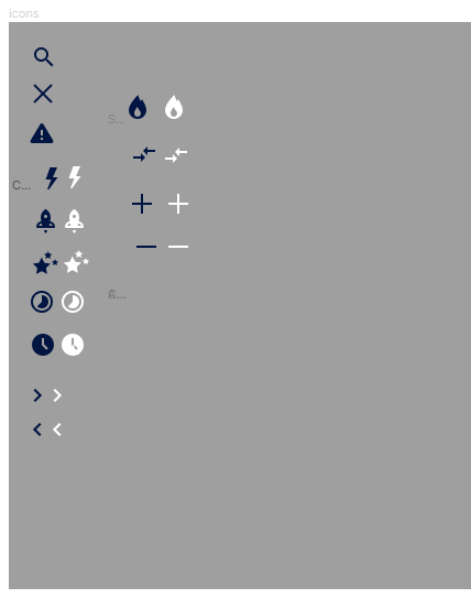
Icons
v1 - Original branding
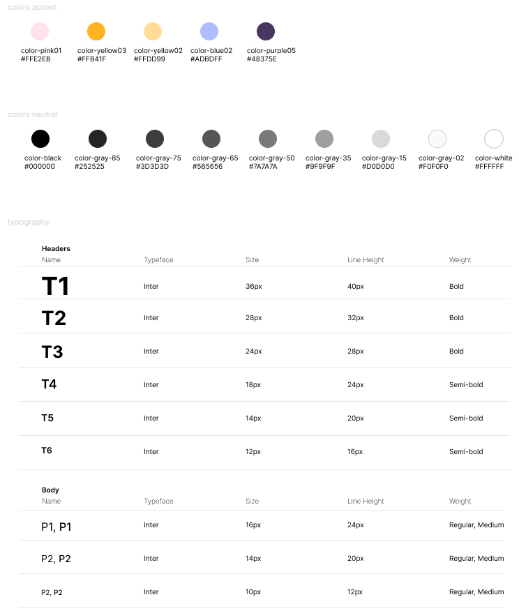
v2 - Rebranding
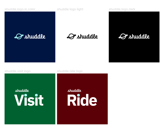
Above: Desktop design for IPTS Ride rebrand, Shuddle Ride.
Component Library
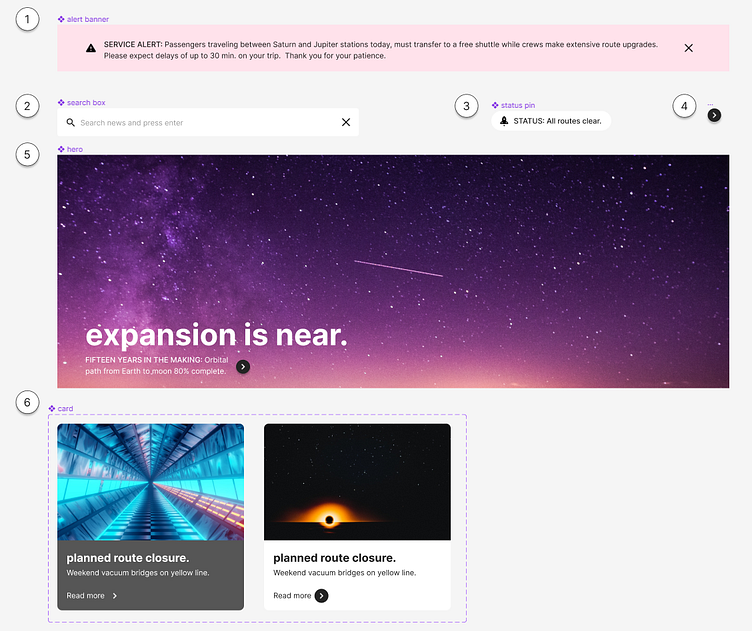
1/ Alert Banner
To be placed at the top of the page, above the navbar
Serve as notification of important or urgent info to all users
Honor high contrast between background color and font color
2/ Search Box
Can be positioned inside the navbar, centered aligned vertically, or right-justified at the top of the Hero component
Functionally act as the entry point to the app’s search engine
3/ Status Pin
Serve as real-time notification of route conditions
Honor high contrast between background color and font color
To be placed to the upper right corner of the Hero component
4/ Forward/Backward Button
Border and fill optional
Serve as CTA button to redirect link or send an HTTP request
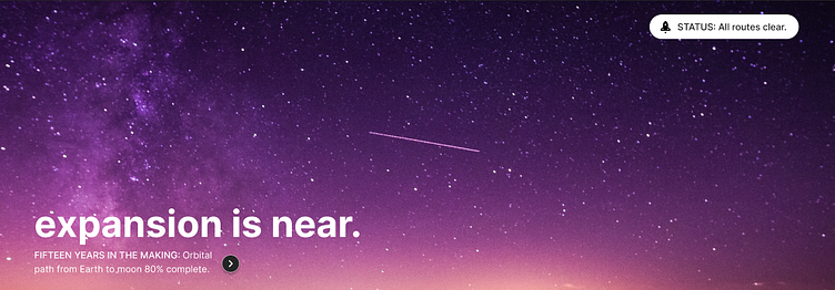
5/ Hero
Usually the largest graphics area, should draw users attention when they first arrive on the page
Choice of graphic should be loud, bold, and be the visual backbone for the website
6/ Card
When clicked, it routes to a new page to be opened on a new tab
Text provides the title and caption displays a short sneakpeak of the content/article
Custom components
Design systems can be thought of as “systems of systems” and as such, they are not meant to insist on 100% usage exactly as they're designed. In fact, design systems usually allow some breathing room. Applying the 80/20 rule, I left room to express the individuality of each offering and to account for the different purpose that each product is serving.
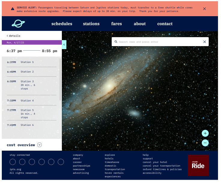
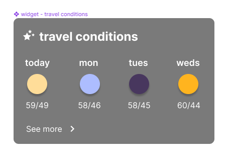
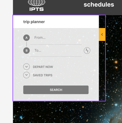
For example, the Widget component is unique to ipts.org and shuddle.world. And the Drawer component for the Trip Planner functionality is particularly designed for IPTS Rail and Shuddle Ride.
Examples of variations
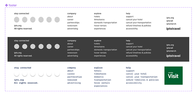
Something that I’ve come to appreciate more is the design of the component architecture. The Footer component, for instance, holds different variations in the style and content past color and font.
Takeaways
Design systems is a team sport
The importance of documentation and doing regular audits - key for knowledge transfer
Design and maintain for flexibility, allow for evolution as directives change
Some points of discussion for you and your team:
What is the North Star of your design system?
What does success look like when your design system is working as you’ve envisioned?
I'd love to hear your thoughts about design systems!
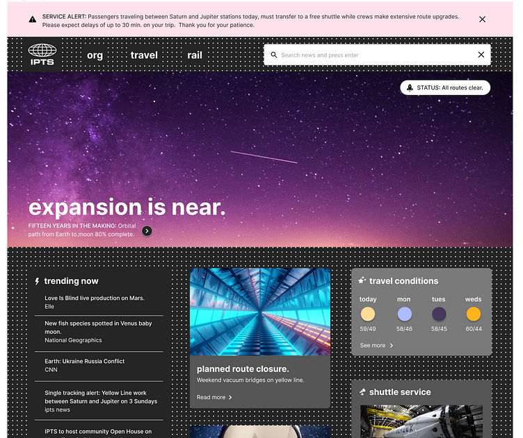
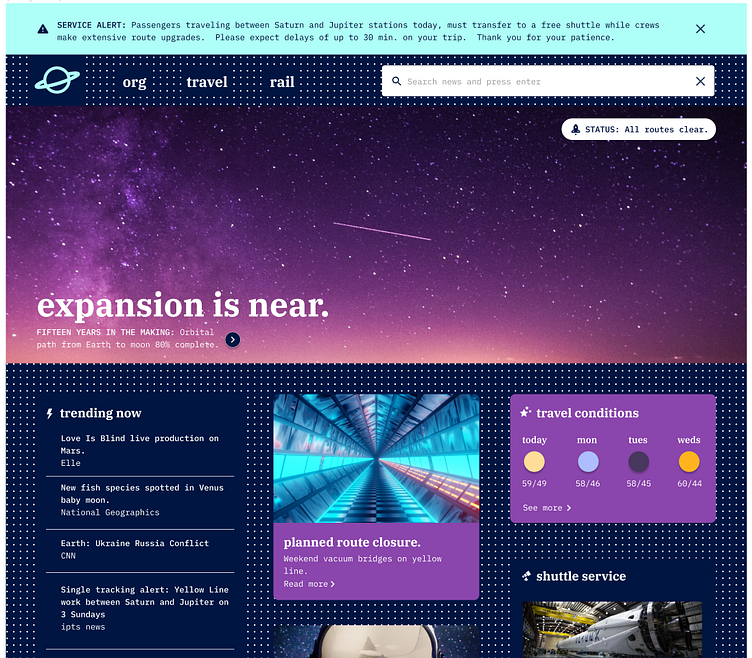
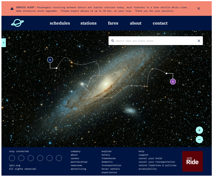
Below: Desktop design for ipts.org and its rebrand, shuddle.world.