Magazine Layout - YOMOGI .01 (6 & 7)
Programs:
Adobe Photoshop & InDesign
Magazine Layout - YOMOGI .01 (6 & 7)
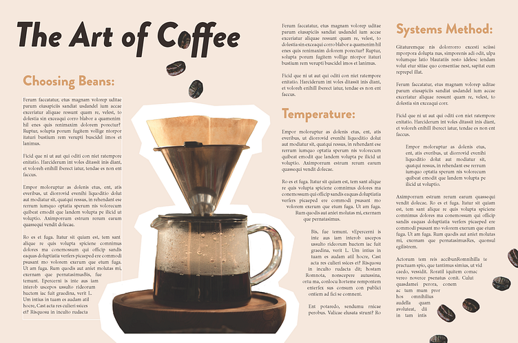
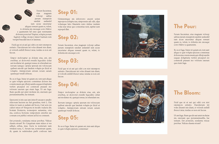
A camp & outdoor magazine spread design, titled "Yomogi".
Featuring mock articles made by me, with stock photos from Pexels.
Thoughts:
I aimed to style the article with a retro feel, creating white framing for the photos reminiscent of polaroid film. Warm neutral beige & browns were sampled from the coffee as well.
I had a lot of fun with this spread. During the designing process, I whimsically decided to try use photoshop to cut out and place coffee beans on the edges of the pages. While playing around with the placement, I happily found that the coffee bean and the "o" in the "coffee" title overlapped perfectly. With this, I quickly began adjusting the font sizing to match.
The title font is Brandon Grotesque, with black & black italic as the variations. The body is Minion Pro throughout the whole magazine.
This was an exciting project that helped me grow in InDesign. I saw improvement with each page I designed, and am glad I put in the time to try something different.
I look forward to doing further design research for the next pretend volume!
🌱
As always, comments & feedback greatly appreciated! Thanks for stopping by, and tune in for more designs to come!
