Magazine Layout - YOMOGI .01 (4 & 5)
Programs:
Adobe Photoshop & InDesign
Magazine Layout - YOMOGI .01 (4 & 5)
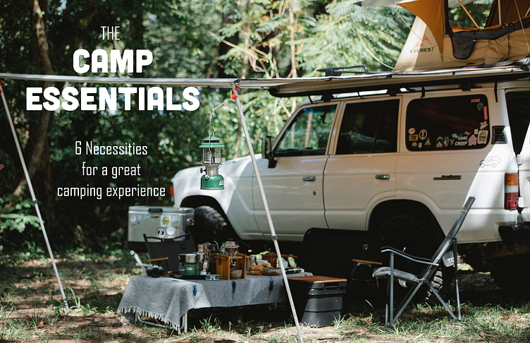
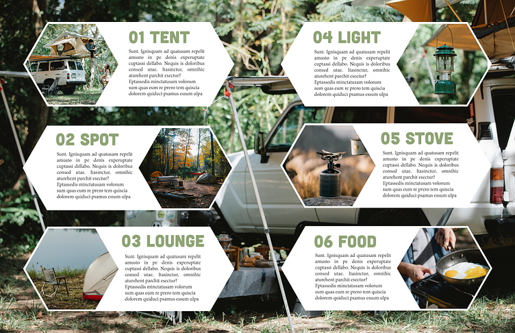
A camp & outdoor magazine spread design, titled "Yomogi".
Featuring mock articles made by me, with stock photos from Pexels.
Thoughts:
I focused on geometric shapes for this spread, utilizing the theme colors and fonts (Cubano & Agency FB) from the cover page. The body is Minion Pro throughout the whole magazine.
Geometric shapes were used to frame the photos and text, lightly reminiscent of the forms used in outdoor patches. The initial drafts of this spread had text and 10 photos to feature. However, I soon realized that this was too much information on 1 spread. By focusing on selecting only 6 instead, I was able to avoid overcrowding and the final version resulted in a more organized look.
With this in mind, I look forward to doing further design research for the next pretend volume!
🌱
As always, comments & feedback greatly appreciated! Thanks for stopping by, and tune in for more designs to come!
