Magazine Layout - YOMOGI .01 (2 & 3)
Programs:
Adobe Photoshop & InDesign
Magazine Layout - YOMOGI .01 (2 & 3)
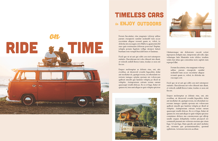
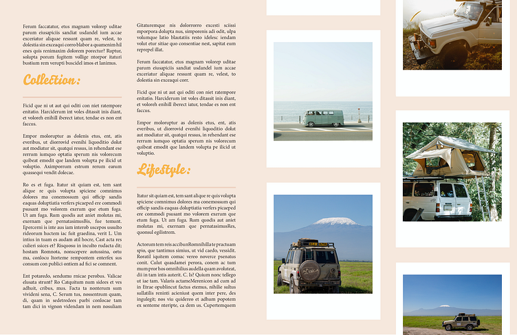
A camp & outdoor magazine spread design, titled "Yomogi".
Featuring mock articles made by me, with stock photos from Pexels.
Thoughts:
I aimed to style the article with a retro feel, using sandy beach inspired colors and included white framing for the photos reminiscent of polaroid film.
I kept the thick title font, Cubano, and utilized a script font, Bello Script Pro. The body is Minion Pro throughout the whole magazine.
This was the 1st practice article of this magazine set, and I found the balancing of negative space on the left page to be particularly a challenge. However, the spreads hereafter felt more comfortable, and I could see myself growing page after page.
I look forward to doing further design research for the next pretend volume!
🌱
As always, comments & feedback greatly appreciated! Thanks for stopping by, and tune in for more designs to come!
