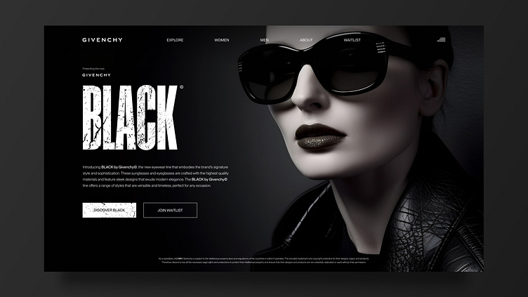
Givenchy Eyewear Campaign AI Hero Images & Landing Page
Black by Givenchy Eyewear Campaign AI Hero Images & Landing Page UI Design
For this project I was inspired by different black textures - both in surfaces & materials but also graphical textures (as I ended up using for the main Logo & CTA) which resulted in prompts centered around fashion campaigns, black acetate sunglasses & black leather to induce a feeling of a timeless & nonchalant cool.
Black by Givenchy was the fictional campaign that came as a result - a study in all things black. Black shiny acetate meets matte black gradient backgrounds paired with black textures and dark overlays in the UI.
All Imagery is made in Generative AI with a strong focus on light, camera lenses & art direction to get the desired result. Paired with a sleek and minimalistic UI in tonal black, grays, and crisp whites.
Note: All imagery is AI-Generated and all eyewear present in this project is completely fictional and only serves as a conceptual exercise in Art Direction, Hero Image generation, Landing page layout, and Web UI Design.
I created two fictional pieces of eyewear for the campaign.
The first was the subtly cat-eyed shape Nero - here shown as a sleek 360-degree rotatable 3D overlay.
And the second is the more straight and square shaped Angelina.
Full-screen views of the designs


