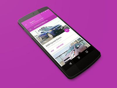
Material Design Exploration
Playing around with how Google's Material Design style could be applied to the Getaround Android app. In this case, the Search screen. This exercise was purely about the visual design and disregarded a lot of important UX considerations.
Also worth nothing, my first Dribbble tilted mock. I had to try it once.
More by Lokesh Dhakar View profile
Like

