ELVTR: UI/UX for Gaming
The project was developed over a seven-week learning period. The course focused on the art and critical thinking skills necessary for proficient UI/UX design in gaming. Minecraft Dungeons was selected for review and iteration.
*Titles highlighted in pink contain links to project files that can be viewed under greater magnification.
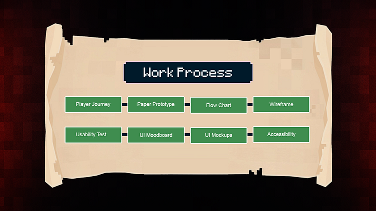
Player Journey
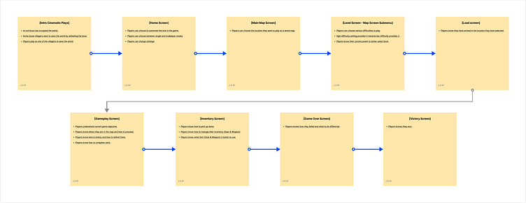
In phase one of the project, the goals are to track the player experience with respect to game designer intentions, provide constructive feedback, and map out each step of gameplay.
Paper Prototype
During phase two of the project, the focus was on organizing gameplay options and player behavior into various categories, based on narrative lines.
Flowchart
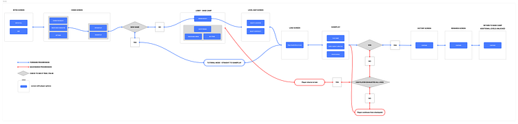
Stage three involved structuring these options and events into a flowchart that outlines player choices and events based on the in-game screens. Branching paths were formed based on player choice and outcome.
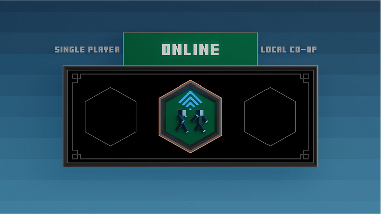
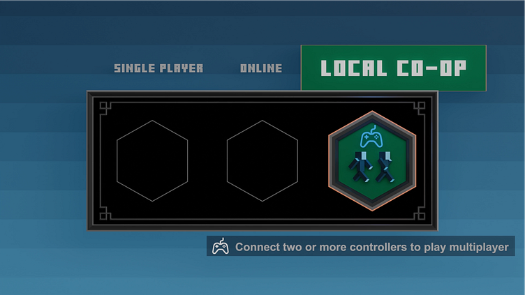
Wireframe
The purpose of the fourth stage is to visualize information on the screen for its intended purpose, undergo evaluation, and be elaborated upon. Wireframes are visual prototypes that prioritize layout for player interaction over high-quality graphics.
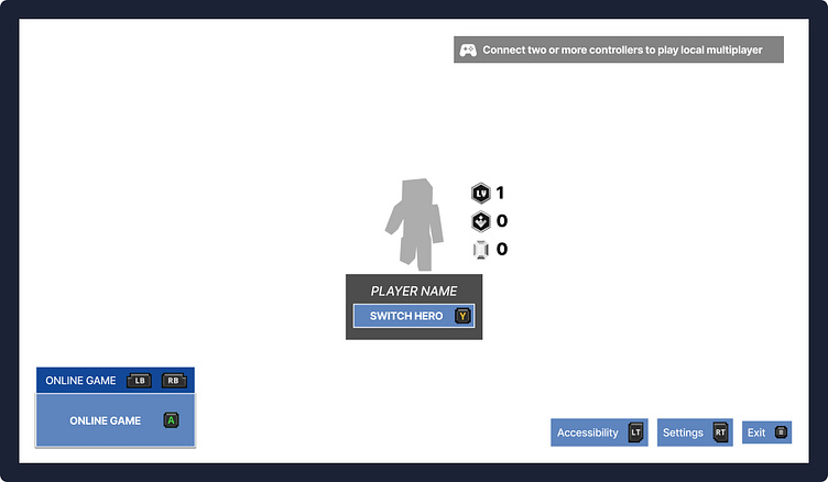
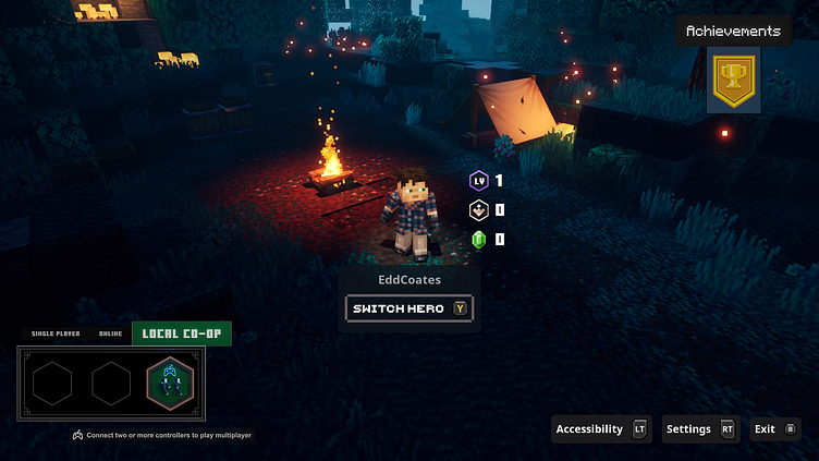
Wireframe Home Screen
Usability Test Results - Homepage Results
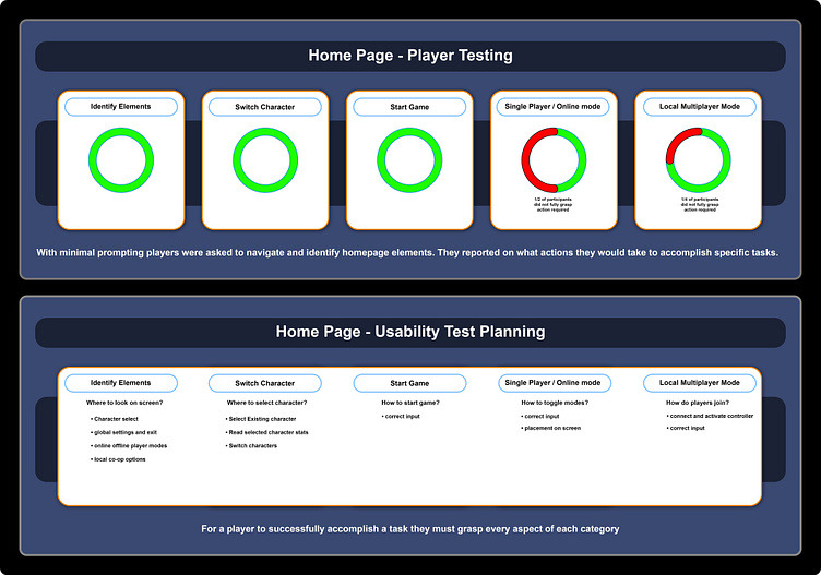
Usability Test Results - Homepage Summary
The tests were conducted among my classmates. I polled a small sample size to assess their ability to navigate the menu effectively. I discovered that there was some confusion over how to toggle between game modes, as well as whether local multiplayer could be played in conjunction with online multiplayer.
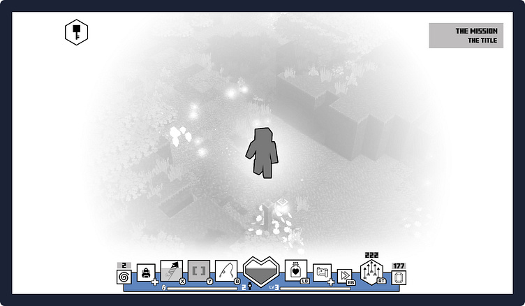
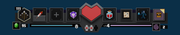
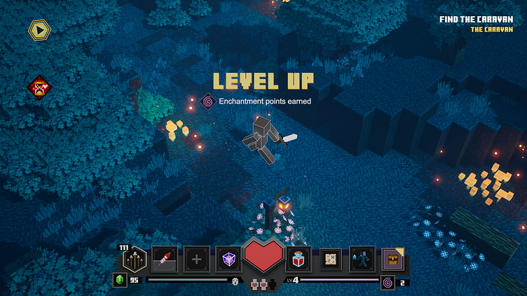
Wireframe Gameplay Screen
Usability Test Results - Gameplay Screen
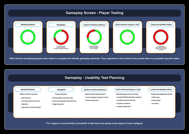
Usability Test Results - Gameplay Screen Summary
During my work on the wireframes, I realized that some icons were unclear in their meaning. For example, the key icon did not effectively indicate a direction for the player to pursue. Furthermore, the meters located below the heads-up display and enchantment icons were either misunderstood or ignored.
Mood Board / Mock ups
I attempted to capture the instant comprehension conveyed by pedestrian crossing signs through some of these designs. Drawing on my experience in animation and 3D modeling.
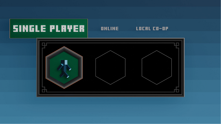
Consolidated Game mode select options on the home screen.
I wanted to show the sequence:
> leveling up
> getting enchantment points
> indicator of where to spend the newly acquired points (inventory menu)
Placing the arrows to the left means they might not be as obvious but hopefully the outline on the hexagon and the emeralds call attention to them as well.
character selection on home screen animation:
To be triggered when player chooses option to switch hero.
My goal is to have the camera pan around the characters, highlighting the vastness and complexity of Minecraft environments through panoramic vistas whenever feasible. While not all UI details have been animated, I trust that the primary gestures I aim to convey have been adequately described.
While the characters move, it might be intriguing to have them positioned throughout the environment. As the camera approaches, they could pause their activities and assume a ready stance. Such immersive details add vitality to the narrative.
In the original Minecraft game, the characters on the selection screen would follow the cursor with their eyes. I aimed to replicate this behavior for the skulls on the difficulty select screen by modeling the heads and frames with this intention.
Inventory reveal of hover boots. Using the original art as reference I created a 3d version that spins.
UI Mock Ups
I placed the UI mock ups I rendered into the actual Minecraft Dungeons scene.
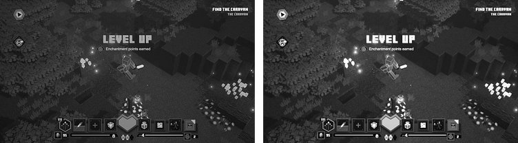
Accessibility
There are many gamers who experience various types of vision impairments, including Monochromacy or Achromatopsia. In order to enhance the visual quality of the game, I adjusted the contrast and exposure settings. The first example demonstrates a monochromatic version of the original, while the second example shows the outcome of my modifications. Ideally, players would have the ability to choose from a range of filter options or customize them to suit their own preferences.
Outcomes / As Results
Rather than departing significantly from the existing design concepts, I focused on recreating and refining various elements, which helped me gain a deeper understanding of the sound reasoning that informed them. I believe that given more time, I could have introduced more variations in the overall aesthetic of the HUD design, such as exploring asymmetrical layouts.
I utilized the mood board section to experiment with animation concepts that complement the UI elements. I hope these concepts do not appear out of place, but instead enhance the overall user experience.
