Logo Design (Esports Event)
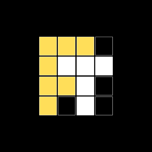
Traditionally in fighting games, players play until one reaches a predetermined number of wins, or known as "First To...". The ideal of FREETEKKEN is pitched as an event that invites all skill levels to play and compete in a social space. As I approached the logo design, I sought to make it as inclusive as the event itself. I drew on the popular Wordle theme as a reference to the social yet random aspects of a weekly meetup and seeing new faces and new challenges. With FREETEKKEN already sharing the abbreviated term of "First To...", FT, it was fitting to have the FT revealed in the blocks and forming the bug logo of the event.
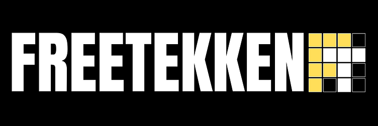
FREETEKKEN Twitter/Event Header
The typeset for FREETEKKEN is Anton as it provides a strong, blocky, and sturdy feel to the branding and works well with the block aspects of the bug logo. The color scheme if representative of the sense of warning or caution as an attention grabber and works well against most dark backgrounds, especially when place in-stream during the events streaming periods and overlays on event promos.
