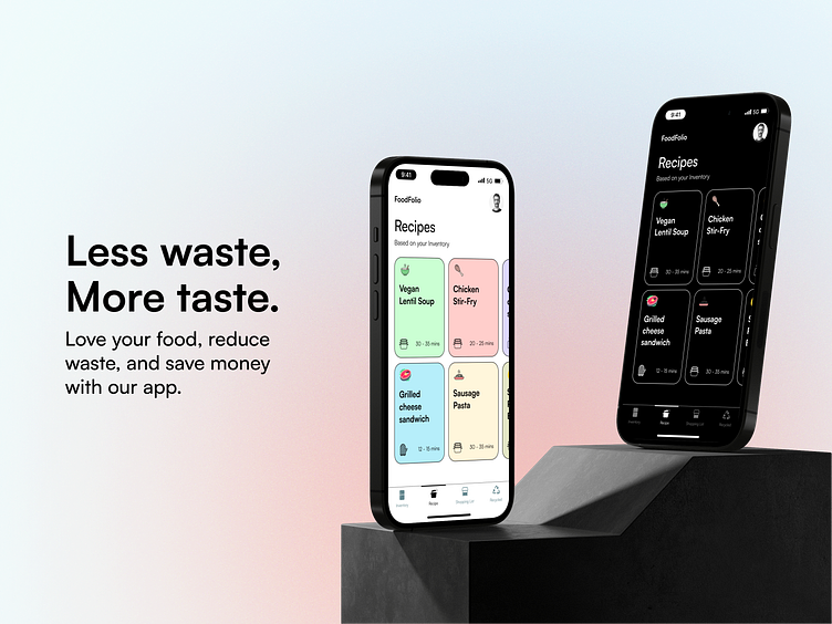
FoodFolio: The Ultimate Kitchen Efficiency App
Less Waste, More Money, Healthier Body
The idea behind FoodFolio was to create an app that addresses three key issues that many people face when it comes to managing their kitchen: saving money, reducing food waste, and promoting a healthier lifestyle. By providing users with a powerful tool to keep track of their ingredients and meals, we believe that we can help them achieve these goals in a simple and intuitive way.
With FoodFolio, users can easily track the items they have on hand and receive alerts when items are approaching their expiration date, helping them reduce food waste and save money by avoiding unnecessary purchases. Additionally, the app offers a wide range of healthy recipe options that make it easy for users to plan and prepare meals that are both nutritious and delicious.
By focusing on these three key issues, we believe that FoodFolio can make a real difference in the lives of home cooks, helping them create a more sustainable and efficient kitchen experience.ere...
Wireframing
Wireframing was a crucial step in the design process for FoodFolio. By creating a visual blueprint of the app's layout and functionality, I was able to ensure that the user experience was clear and intuitive.
FoodFolio was designed with the user in mind to solve the real-life issue of food waste. FoodFolio app empowers home cooks to reduce waste, eat healthier, and save money with an intuitive interface and powerful features.
Simple for a reason
The UX (user experience) behind FoodFolio was intentionally designed to be simple and easy to use. We wanted to make sure that users of all skill levels could navigate the app and find the information they need without feeling overwhelmed or confused.
To achieve this, we used a minimalist design aesthetic and made sure that all of the key features and functionality were clearly labeled and easy to access. We also conducted extensive user testing to ensure that the app's design was intuitive and user-friendly.
By keeping the UX clear and simple, we were able to create an app that empowers users to manage their kitchen more efficiently and effectively, without getting bogged down in complex features or confusing navigation.
Thank you for taking the time to read through the Foodfolio case study. I hope you found it informative and insightful. If you have any feedback or would like to learn more about the app, please feel free to reach out.
Contact me for your amazing projects:
Sobhanrabbani86@gmail.com


