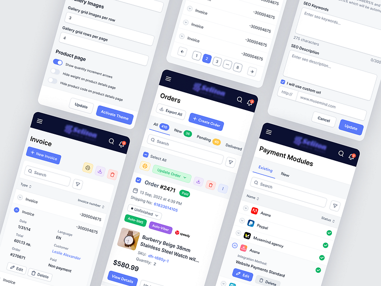
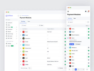
Ecommerce Web Application - Mobile View
Hello, Dribbblers!
These are some of the interface designs we created for one of our valuable clients! We carefully selected a dark blue and light blue color scheme on a white background to achieve a clean and polished interface. By using different colors to highlight key options, we were able to create an interactive and engaging design. We are pleased with the final result and excited to share it with you.
Also, welcome to check:
◉ Ecommerce Web Application - Sidebar Navigation
◉ Ecommerce Web Application - Sales and Order Details
◉ Ecommerce Web Application - Product Category
◉ Ecommerce Web App - Edit Product Category Details
◉ Ecommerce Web Application - Theme Management
◉ Ecommerce Web Application - Design Setting
◉ Ecommerce Web Application - Payment Modules
Revolutionize your online presence with our SaaS design expertise. Discover cutting-edge solutions from the top SaaS design agency.
We appreciate your interest, Dribbblers! 😍
Schedule a call at ☎️ 👉🏼 Calendly.com
Let's talk about your project..
✉️ hello@musemind.agency
Website 🌐 musemind.agency
Explore Our Design Case Study Featuring ➡️ Behance
Let's Check Our Others Dribbble Profile:
musemind saas • musemind mobile • musemind branding
Follow us to see more exciting shots and insights on:
Linkedin I Instagram I Twitter I Medium I Facebook I Webflow


