Foxn Design System

This is a case study on the Foxn Design System. The process undertaken to empower Shuddle's digital products with a scalable design system has been elucidated.
Project overview
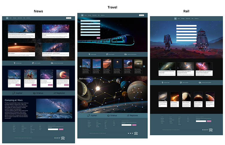
The Head of Digital for the newly launched IPTS: The Interplanetary Travel Syndicate, you have been tasked with creating 3 unique offerings:
ipts.org: an informational website containing the latest IPTS news and happenings
IPTS Travel: a site enabling browsing and bookings to destinations within our galaxy
IPTS Rail: a real-time web app where you can view lines, routes, and times for various commuter lines
Existing data
We have been provided only the logo for all the three different products.

My Role
As a sole designer, I need to understand the requirements for the design system creation including the rebranding efforts. I will be starting with the wireframes and then create components as per the use cases. I will be creating five components that has potential to be reused in multiple areas across products. The core of the design system will be tested by the smooth transition for the product rebranding.
The Process
Design tokens
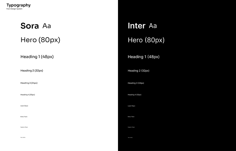
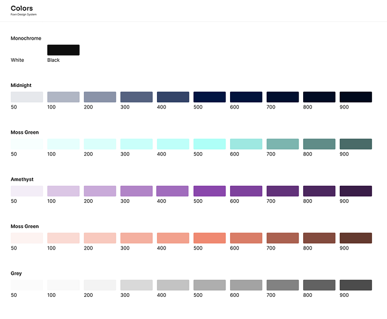
I started off by creating the design tokens for colours, typography, icons, and the logo. Since the colours, typography & icons will be used to create components, the design tokens will be essential when we have to make any high level changes for the entire product. The main advantage of creating design tokens at the beginning of the project is to keep the entire system stay connected. You make changes at one place and the changes will reflect in all other areas across products.

Wireframes
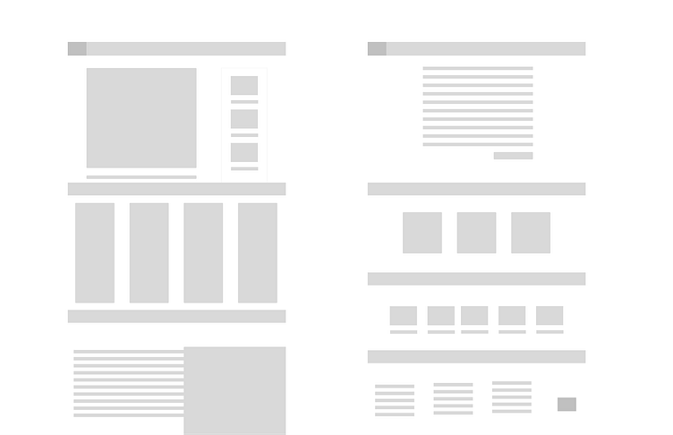
Creating a sketch: Begin by sketching out the rough layout of the page or app screen. This can be done on paper or using Figma.
Define the structure: Once I have a rough sketch, defining the structure of the wireframe by adding in placeholders for different elements, such as header, cards, images, buttons, and other user interface components.
Add details: After you have the basic structure in place, start adding more details to the wireframe. This might include things like font styles, color schemes, and other visual elements.
Default system: explorations
Since I created the default system with the design tokens, I started working on the human interfaces. Creating new styles using the components was easy to iterate and explore new options.
Components
Since the design tokens are created, I started working on the components. I made an audit to understand the use cases for all the three products. And identity the potential to reuse the components in multiple areas. The following are the list of the components I create to compose the product structure.
Buttons
Input groups
Cards
Divider
Footers

Results
Foxn design system
One of the biggest changes we've made is to our color palette. After extensive research and consideration, we have decided to shift towards a new color scheme that we believe better reflects our brand values and positioning.
Our new color palette is a combination of bold, vibrant hues and more muted, sophisticated shades. We've chosen these colors specifically because they convey a sense of energy and excitement, while also exuding professionalism and trustworthiness.

Revolutionary Rebrand
A significant change in its branding to better align with its values, vision, and mission. This rebranding strategy is typically implemented when a company feels that its current branding no longer resonates with its target audience, or it needs to differentiate itself from competitors.

Documentation
Design documentation encompasses all the essential information required to create, construct, evaluate, and sustain a design system. To document the Foxn design system, I utilized Zeroheight, which contains the system's principles and usage instructions. This documentation will facilitate quicker modifications across all three products for other designers and provide guidance for new designers who join the team.

What's next?
The second phase of a design system typically involves creating the design elements and components that will be used to build digital products or interfaces. This includes defining the visual language and guidelines for typography, color, spacing, and other design elements that will be used consistently across all products.
During this phase, designers may also create wireframes and prototypes to test the usability and functionality of the design components. The goal is to ensure that the design elements are not only visually appealing, but also easy to use and contribute to a cohesive user experience.
Overall, the second phase of a design system is focused on defining the design language and building the foundational components needed to create cohesive digital products that align with the brand's visual identity and user experience goals.
Thank you!