Case Study - IPTS/Shuddle Design System
A Dribbble Design System Course
The Project
This project was to design at least three pages for three separate products for a fictitious travel agency and then build a scalable design system that could be updated easily without breaking existing page designs. Once the pages and system were built, a “curveball” would be given to see how the design system could handle updates.
Project Goals
To create a scalable and useful design system that could handle simple to significant updates without causing major issues or breaking.
My Role
UX Designer, UI Designer, Design System Builder using Figma, Zeroheight and Miro
Ramp Up
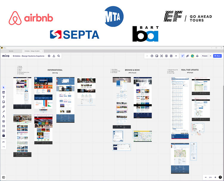
Because this was a capstone project and the time was extremely limited, I chose to research companies that would be specific to the three products I was tasked with designing from scratch - Informational, Planning and Real-Time Updates. Dribbble offered suggestions like local transportation, but I also knew travel agencies would help a lot with their processes of booking. I gathered numerous sites, organized them in Miro and then started documenting what patterns they had in common. This helped with knowing what I should focus on as well as how to implement patterns for my designs.
Competitor Analysis
UX Design
Since I didn’t have data or other information that I’d normally work with, I adopted the patterns from my research but added elements that I thought would benefit the fictional IPTS company. What would a user need if they were to travel beyond Earth and what information would they need before, during and after their trip?
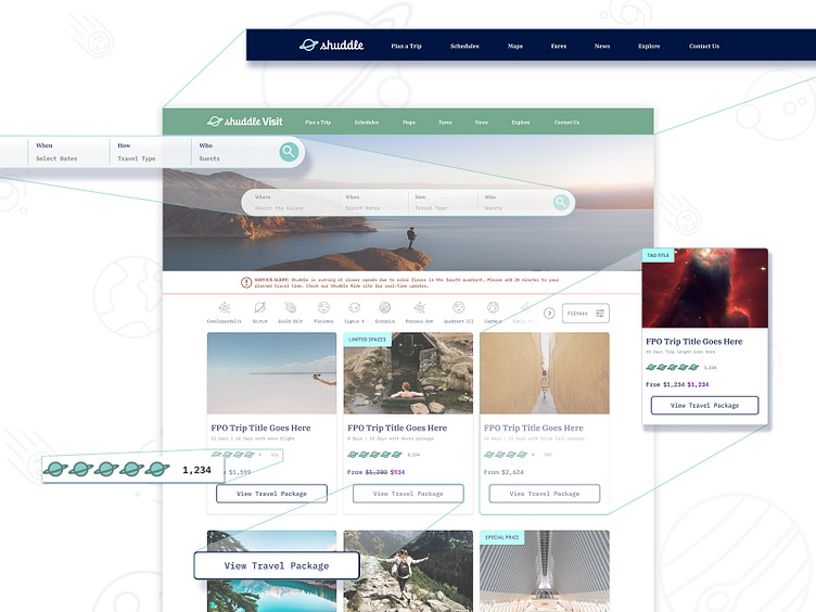
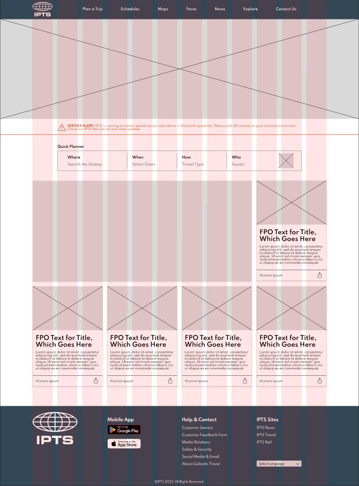
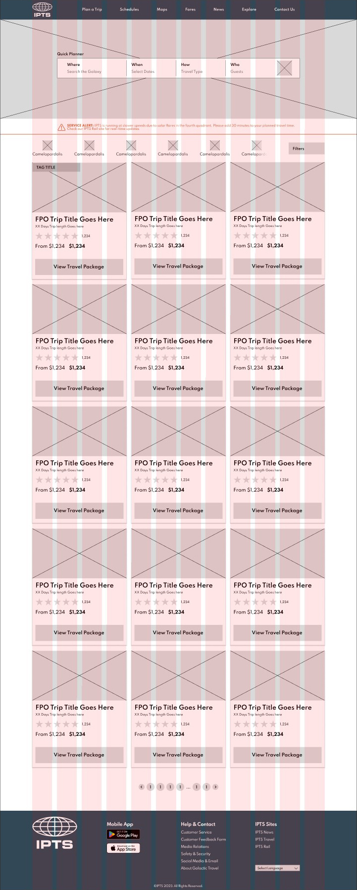
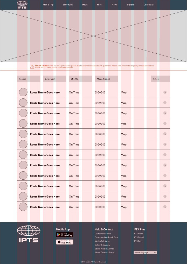
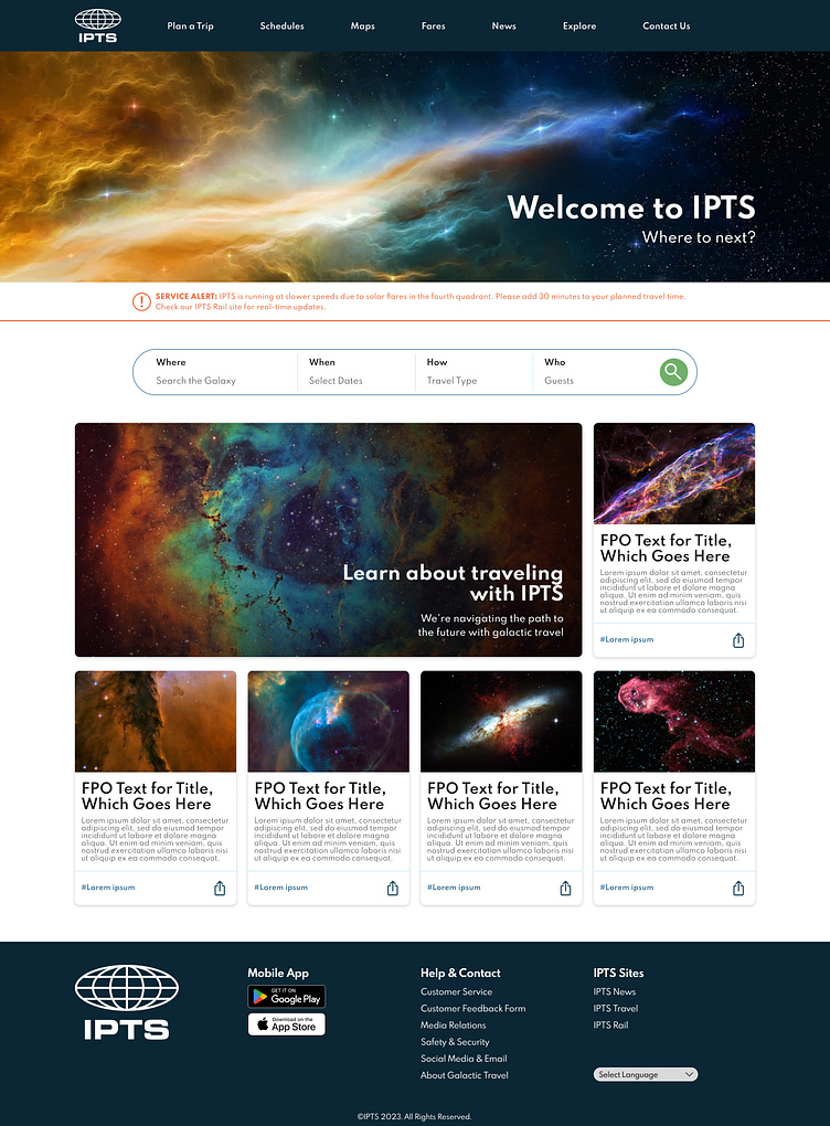
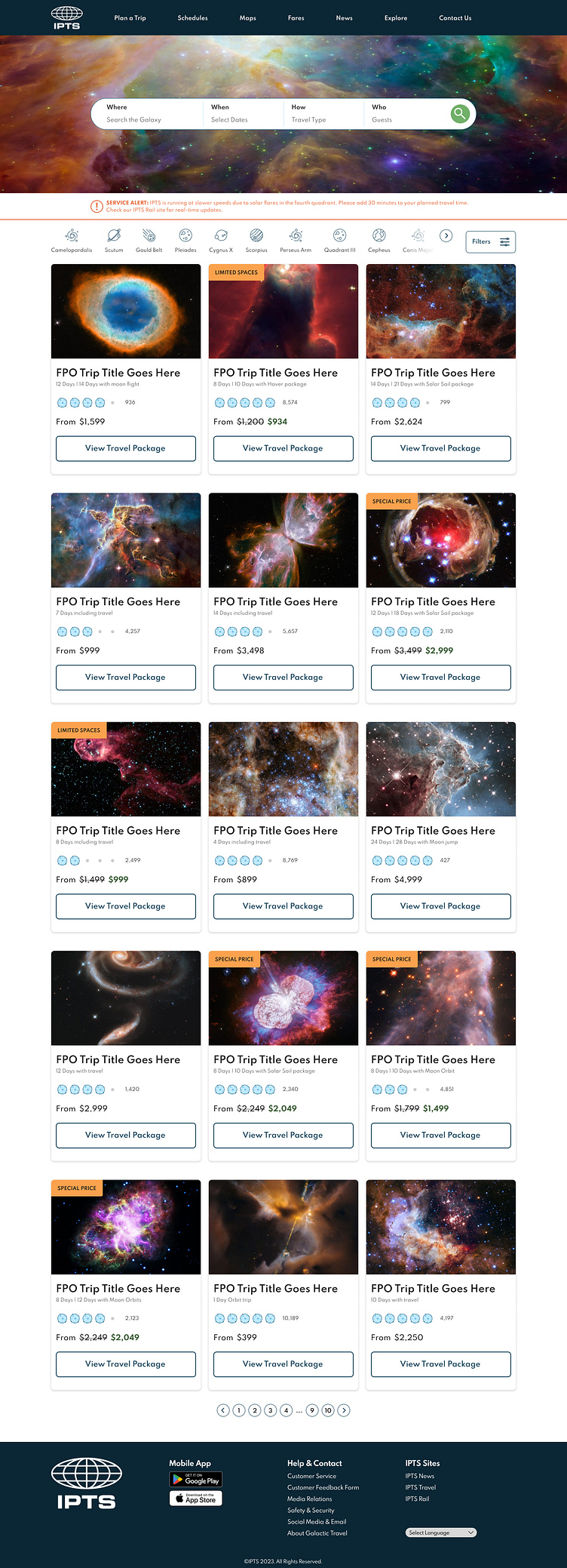
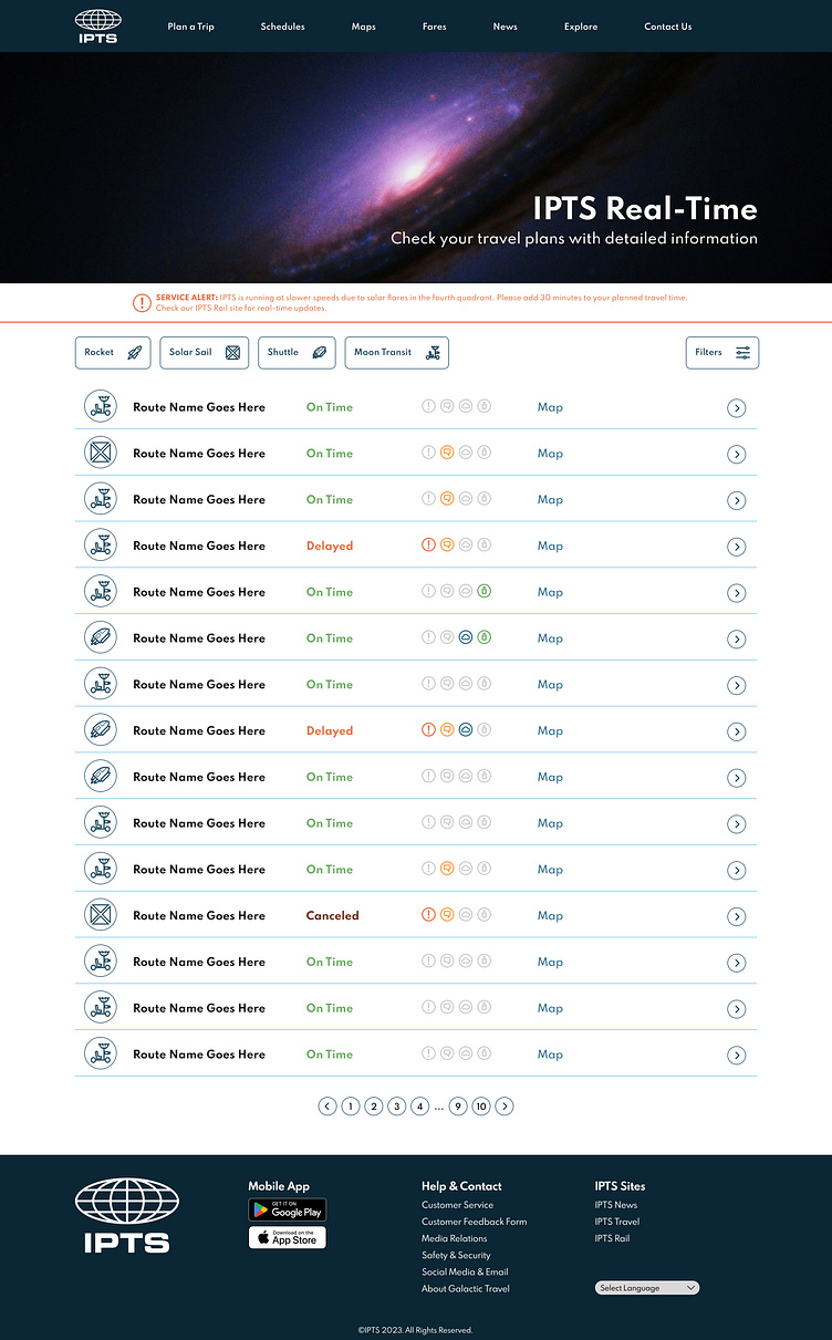
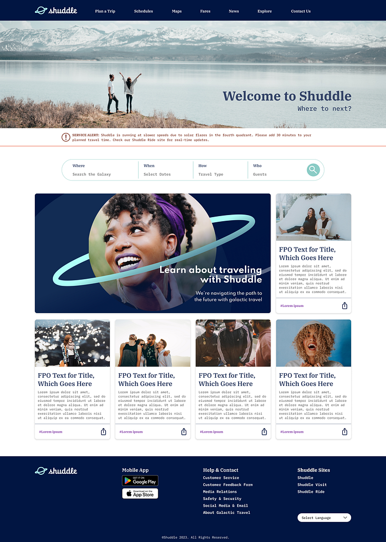
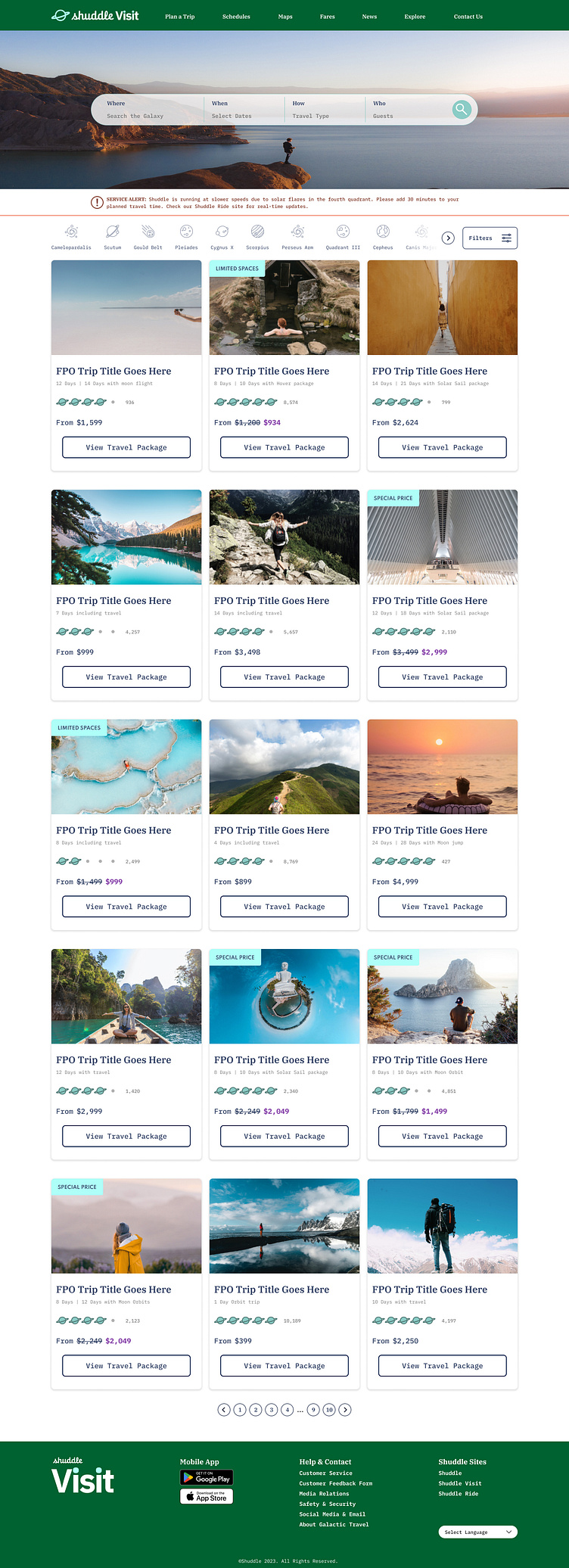
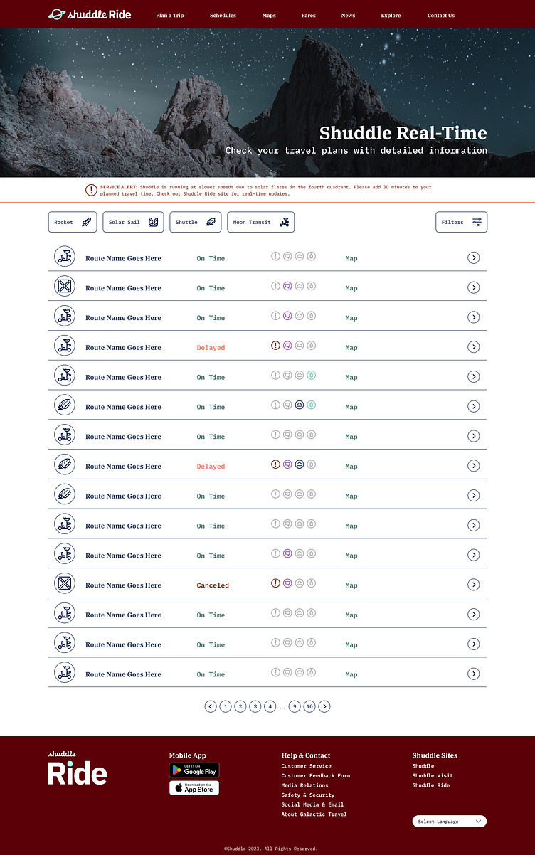
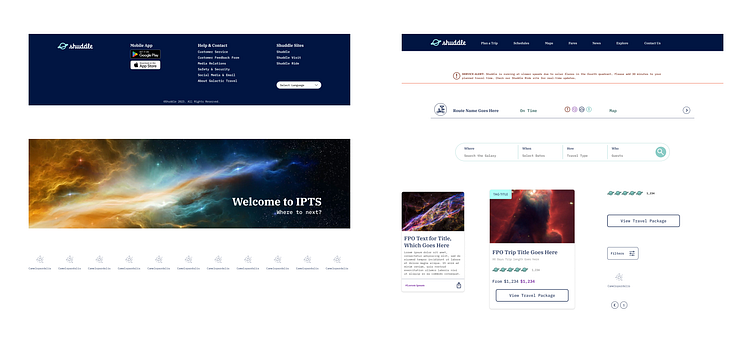
I began with simple wireframes and frankensteined elements as I needed them. The focus of this project wasn’t a cutting edge UX design but what I could do with elements when creating a Design System. Keeping that in mind (and sometimes suppressing my twitching for more data and information!), I laid out what I saw for a typical site that would benefit travel. I designed all three pages at once so I could begin to see similarities and where I could start creating reusable components.
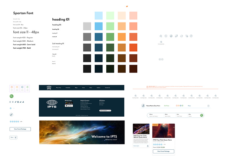
Design System Build
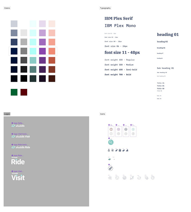
Once the initial layout was together, I looked for patterns that occurred at least 3 times (something taught during the course with Dan Mall). I also skipped buttons and went straight to larger elements like cards, banners and header/footer. This gave me the opportunity to also see how tokens would come into play. I started taking notes on colors, fonts and icons and how often they were used so I could take the atomic approach to building everything out (Hint: I knew something was coming with this project, but at this point all I knew is my system needed to be ready for that “curveball”).
I felt pretty confident at this point that my system could handle just about anything. Bring on the surprise!!!
The Curveball
As with so many projects I’ve worked on, things change. Some are minor. Some are not so minor. At first glance, I was guessing this one fell under “not so minor”.
Straight from the “top brass”, a full branding update was created from an outside (and fictitious) ad agency. Everything from color to the logo, to the font, and most importantly, the target audience, which impacted photography was changed. How was my design system going to hold up? I felt like it was bullet proof, but I guess we’ll see.
Updating the Design System
I started with color and font style updates within Figma. Since I had a strong system in place already, everything seemed to work out. Most components updated without any manipulation.
Moving on to the logo, I had to do some extra work. The toughest piece was adding the specific site word at the end, which I figured out quickly with an Auto Layout component. Everything was all feeling good!
I went back and forth with my three pages and saw how the updates impacted the overall design. I came across one major issue, which came back to me just not using Auto Layout properly in a component (fairly easy fix!). The last step was replacing photography, a per instance situation, but even that went smoothly. It took the longest to implement, but that was understandable. Overall, my design system did it! It was able to handle a decent sized curveball and still stand up! Not to hurt myself patting my own back, but I was pretty impressed with how quickly this update flowed into place. It was substantial, but my design system handled it!
Documenting
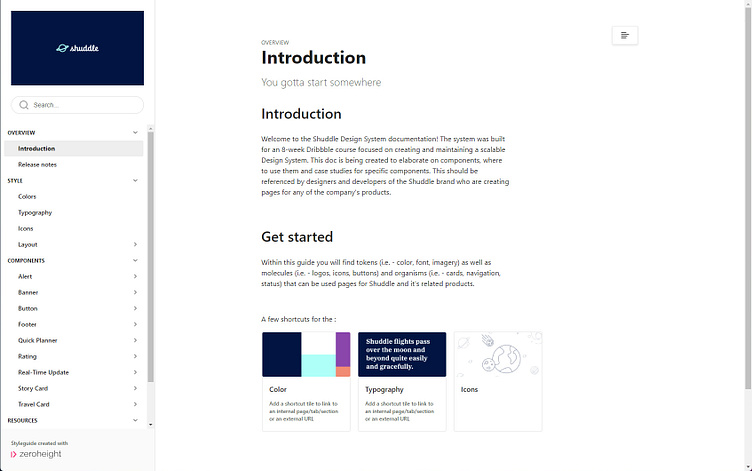
I don’t want you to think I didn’t document along the way (I did!), but I did do a significant amount of work after the curveball update. I had a base in Zeroheight with components and other elements, but I also knew this would change.
One thing I learned in this course and loved creating was case studies for components within the design system. I have personally run into issues with a complex component in real projects and used them improperly. Learning to create a step by step jumping off point on how to use something was eye-opening and, let’s be honest… a LOT of fun! I am a huge fan of sharing my knowledge so this worked out perfectly for me.
Next Steps
I highly doubt I’ll continue with this specific project since it was a class, BUT I know I learned a lot by stepping through creating a design, followed by a robust design system and then making a significant change to that system. My plan is to bring this into roles and projects in the near future and hopefully partner with some great companies to help them build a design system their designers are happy and proud to use. This has been a ton of fun and I’m inspired to get to do this for real!
