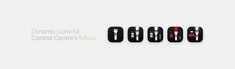
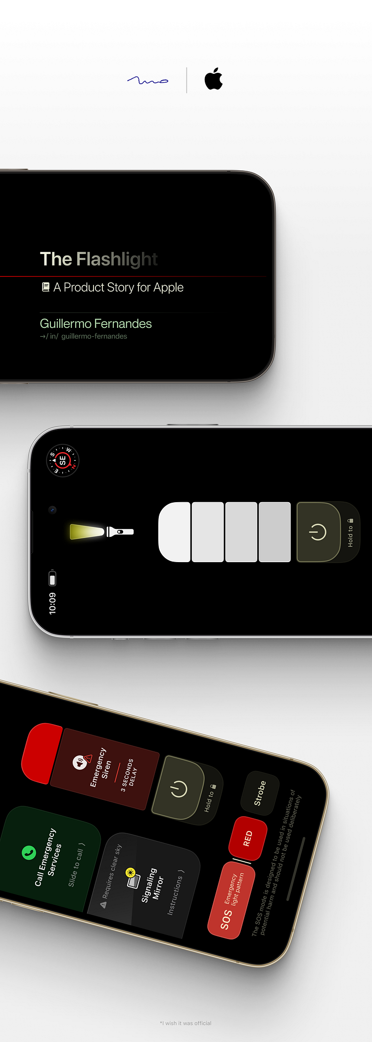
The new iOS Flashlight
— GALLERY AT THE END —
In my first work on Dribbble, I wanted to introduce the way I design. More specifically, how I get from “oh, that would be interesting” to "That’s the best I can do for now, and I’m happy with it”.
My goal is not posting snapshots of good looking interfaces with little to no context. Instead, I want to aim at the story the design tells, where it came from, and where it leads to. The intention the design has, and the message it wants to pass.
As of yet, I have very limited skills on prototyping, and that’s why my designs are mostly still. But that’s for now.
This one is the story about iOS’s Flashlight.
We all know how it works.
You either turn it on from your lock screen — if you have a Face ID iPhone, or you go to the Control Centre and turn it on from there. Control Centre itself is a fundamental part of the User Experience of the iPhone and iPad, but specially the iPhone.
It is a toolbox for all the device’s tool features.
This is not about the Control Centre, though, but what something worthy of a “tool” should be. Also, a tool should feel and respond as a tool. We are all humans, we are where we are because of tools.
Understanding the purpose of a flashlight is also understanding the why and how we use self-emitted light.
Why do we have light as a tool, in the first place?
— The idea behind every detail is to harness the light’s qualities and benefits to humans and create on top of it.

Naturally,
When telling a story, the main focus is to immerse. Give the means where the story will be unfolded; how it wants to be seen, how it wants to be felt.
For that reason, the story that the flashlight tool wants to tell needs a dark environment, as people often use their lights while in the dark. That’s the best way to represent what a real use situation would look like.
That said, all examples will be in the dark.
OLED darkness.
—

—
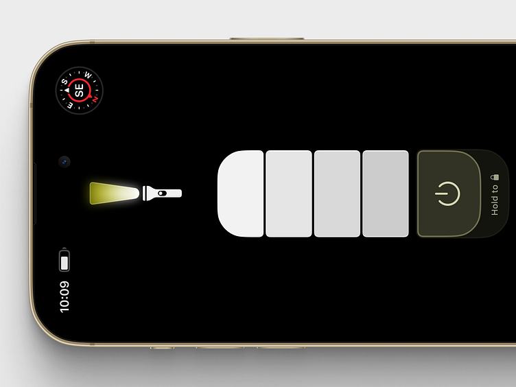
The full black screen is meant to evidence the main interactions and affordances of what a digital flashlight could have.
It spares the eyes of unnecessary noise, and makes the screen much less emitting, easing the sight in dark environments.
Moreover, the pitch black shown on an OLED panel further enhances the physicality of buttons crafted to be seen and felt as part of a tool, as if they seamlessly pop out from the device, not from a screen.
—
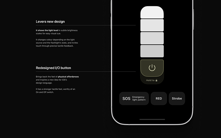
The redesigned ON/OFF button brings back the feel of physical affordances and inspires a new idea for iOS’s design language that borrows from the physical, yet being inherently digital.
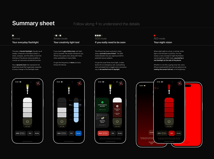
The levers hint the light level for easy visual cue, it changes colour depending on the light source and the flashlight’s state (more on that soon).

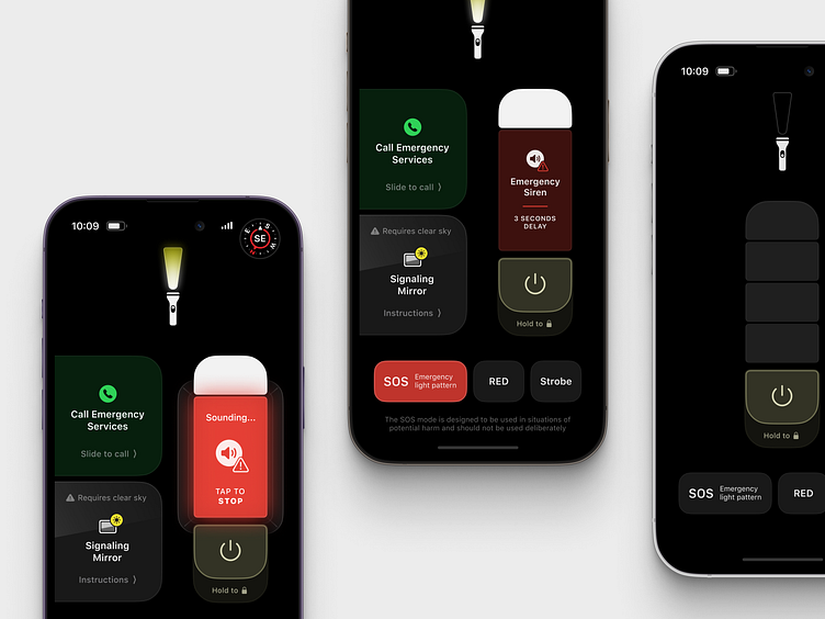
Strobe
—
The Strobe button allows light pulses in Hertz — a unit for frequency — making the device a tool for creating with light in fields such as education, arts such as dancing, photography and videography and more.
The Strobe lever has a slimmer shape (stacked squares) that swiftly pulls from the right when activated. It’s easy to reach from the thumb and shows the exact interval that the light is pulsing.
And to help illustrate to people what each Hertz unit is in minutes, it was added the frequency information as PPM, Pulses Per Minute.
—

—
The added modes elevate light to the uses it should have in such a ubiquitous device.
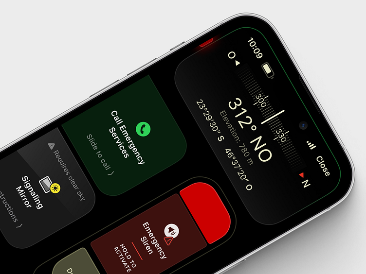
For instance, the SOS Emergency light pattern can be tricky to replicate through the power switch alone, and many people don’t have a standalone flashlight app, thus, this can come really handy in emergency situations, something that Apple is heavily investing on.
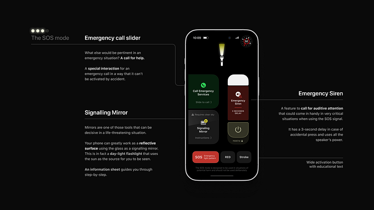
SOS mode
—
After some pondering, I realised there could be something else supporting such mode. If you think about the SOS signalling function itself, it wouldn’t be triggered and used without a real call for emergency. A desperate intention to be seen, and heard.
With that in mind, what else would be pertinent in an emergency situation?
A call for help.
It was reasonable to provide a special interaction for an emergency call, in a way that it can’t be activated by accident, instead, you’d need a clear intention to do so, by dragging it right.
The generous size also allows for an easy reach that can be decisive in a potentially harmful situation.
—
Going for a bit more push-ups using the prediction muscle, it was clear that having the option to reduce the brightness while at the SOS mode would be counter intuitive and could potentially reduce the effectiveness of the emergency feature.
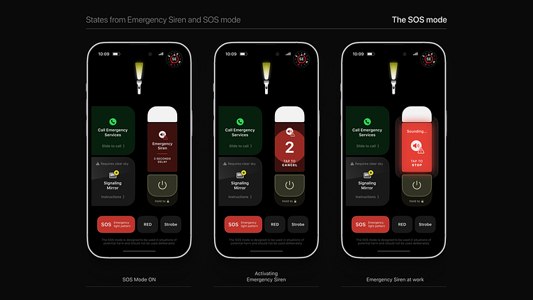
In that regard, the levers for lower brightness were replaced by an “Emergency Siren” button, a feature that could be used in very critical situations to call for auditive attention – also found on Apple Watch Ultra.
. . .
Now, something that's completely different in the way it's being thought of...
The SOS mode has grown to a point that it is becoming a powerful tool in an emergency condition.
It has the brightest Emergency Light Beacon for distress situations in the dark, both in RED and White, it has an earsplitting Emergency Siren that can’t be missed even from very afar, includes a sleight of hand Emergency Dial slider that immediately calls for help, and even if it cannot call, it’ll act as a trigger for the emergency text over satellite.
Features like those need to be tightly integrated into a seamless user experience that can’t be misunderstood. To educate users, people, you first need to educate yourself and play along with interactions that just feel right. Taking the SOS bit and diving into the very nature of emergency situations, it is taught to us that resources (and information) are fundamental for a person to survive, the ability to use these for sustaining life, and to be seen and heard.
—

—
Mirrors are one of those tools that can be decisive in a life-threatening situation.
It is used to reflect the sunlight in the direction of a potential rescue subject, far over the distance.
The thing is, you most likely won’t be carrying a specialised signalling mirror when you’ll need it, but you do actually carry a very, very reflective object in your pocket the whole time. Your phone. The glass surface greatly reflects the sunlight and can be used as well as a signalling mirror, and people have no idea how much their phones can do for them.
Giving users the information and sparkling curiosity throughout the interactions is a way of educating people about the mechanism and help them become conscient about the tool, the benefit and how Apple is caring for them.
It makes complete sense to be placed inside the SOS Mode, both from the emergency nature and the fact that it interacts with light, making it a day-time flashlight.
—

Video from Ranger Mike explaining Signaling Mirrors:
RED
—

—
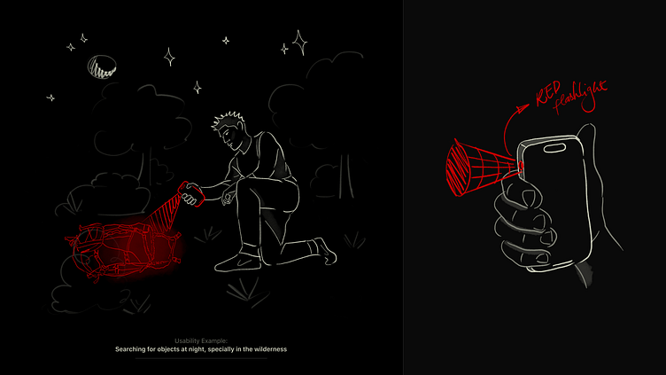
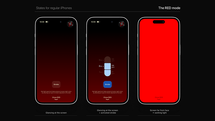
The RED button is a product study of itself. Going forward with a supposedly iPhone Ultra, built to endure nature in its full glory, the device should also have a built-in Red Flashlight to aid humans in dark situations.
It is known that red light can be useful for maintaining human night vision, as it does not disrupt the eye's dark adaptation process, enabling numerous activities that would not be as comfortable and intuitive with a standard white light.
The placement of this light source would not be at the back, though. Instead, harnessing the “tool” nature of such a feature, it could comfortably fit above the Mute Switch, on the side of the device.
That position enables the action of using the device as a handle, improving the grip and transforming the iPhone into a legitimate light tool.
Besides being genuinely optimal, that alone could create a product perception that was first hinted by the Apple Watch Ultra, and tirelessly waiting to land on the iPhone.
And while that doesn’t happen, and if it never happens, other models could benefit from the red light mode by making the screen full red at maximum brightness, something that already exists on Apple Watches.
—
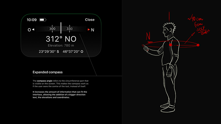
Built-in Compass
—
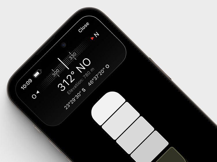
The Compass dynamic icon is also a welcome add-on to the Flashlight tool.
It can complement navigation while using the light, without having to leave sight from the controls.
—

—
It can aid astronomical spotting activities, help out in the wilderness, and also be a companion to people that are using the light, just as a joyful live gimmick, but still helpful in some situations.
It cleverly expands with the Dynamic Island giving more distilled details and aweing the users.
It could come in handy in a situation of having to inform the coordinates to an emergency central that orchestrating a rescue, at the same time of pointing out the light beacon in SOS mode towards some informed direction to help the rescuers spot you.
—
Also, the radius of the compass’s circumference is the approximation of the distance that a person would hold the device in front of it, meaning that the portion of the compass that is visible on the screen is part of circumference that extends around the person’s body.
In short, it makes the person holding the iPhone the centre of the compass.
Something that came as a result of the interface’s limited space.
It can also be cleverly used on a product commercial, too.
The small compass icon is a gift from Yuhang Lu, as he kindly authorised the use of his work in this design. He's an amazing UI designer with many well known work here at Dribbble.
—
And in regards to the way the Gyroscope's Cue is shown at the expanded compass, the solution was to embed it in the frame so as the interface become less cluttered.
It mimics how sunlight at noon would interact with this piece of interface as if it was physical.
One of the most interesting ways to visually show the "pitch" and "roll" orientations "without" a piece of interface. In addition, in order to educate users about the best orientation to use the compass, a green outline flashes around the whole frame and remains On at the top, if the orientation is preserved.
That provides not only a hint about how to properly hold the device, but surprises the user with an unexpected behaviour.
Something simple, unforeseen and quickly learnable.
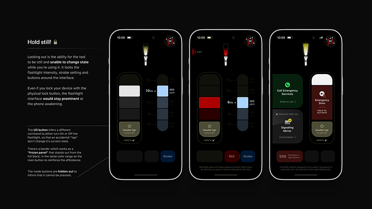
Locking out
—
One other feature that was pictured imagining the many scenarios that a flashlight is used, was the ability for the tool to be still and unable to change state while you’re using it.
—
—
That’s the reason for the “Lock” addition, which locks the flashlight intensity, strobe setting and buttons around the interface.
Furthermore, even if you lock your device with the physical lock button, the flashlight interface would stay prominent at the phone awakening. This then prevents unintentional button presses, resembling a real flashlight with hard switches.
The Digital Self
—
—
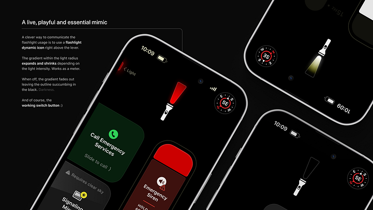
Another clever way to communicate the flashlight usage is to use a flashlight dynamic icon right above the lever.
The gradient within the light radius expands and shrinks depending on the light intensity. It also has a subtle glow that would naturally be there as if it was a real flashlight.
When off, the gradient fades out leaving the outline succumbing in the black. Darkness. And of course, the working switch button :)
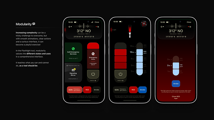
Everything just fits
—
—
Increasing complexity can be a tricky challenge to overcome, but with smooth animations, clear actions and a curious interface, it can become a playful exercise!
In the Flashlight tool, modularity salutes the different states and uses in a comprehensive interface.
It teaches what you can and cannot do, as a tool should be.
The Dance
—
There are uncountable ideas for motion in these examples.
For instance, at the Red light mode’s glancing state, the black → red gradient would gradually return to black at the finger’s drag, when the user closes the mode, giving it an organic transition.
In principle, all the buttons and states are “smart animated”, utterly organic and swift.
—
—
Also, in every opportunity, there’s a tactile feedback that blends with subtle smart sounds from the flashlight functionalities.
These combined will give the user the feeling and feedback necessary for it to sense the tool as a magical blend of a physical and digital equipment.
This is an inspiration directly from Apple Watch’s digital crown fine vibrations and emulated sounds. It feels like magic, absolutely utterly satisfying.
It needs to be scaled.
The One and Only
—

—
Last but definitely not least, the one and only Dynamic Island.
It also got a plate in the feast by making room for the flashlights’ usage, allowing it to be visually prominent while working in the background.
If it’s ON, it’ll be floating there with the intensity, colour, and strobe info.
That would inform the user with important information about its state while it’s navigating around the phone, being able to swiftly reach it, at any time.


Learnings?
![Where to now? How useful is it? How can we test it? [...] Green walking signal](https://cdn.dribbble.com/userupload/6452660/file/original-b09974430ab594b636a43812eec6d139.png?resize=752x&vertical=center)
Oh, definitely.
There are uncountable examples of learnings throughout this small project, personally, professionally, artistically.
The main one, and most obvious, is the lack of prototyping and user testing. I would never know if this design really works if I can’t test it. For this to be a real thing, or even try to be, I would need help.
Secondly, strobe settings and the actual wavelength of the RED flashlight is a doubt.
Regarding the Strobe, I don’t actually know the frequencies that would be best suitable for real people demands, to provide the best experience, relevant experiences.
About the RED flashlight, it is known that a monochromatic red is best to preserve human’s night vision, but it can compromise the distinction of other colours, and that could be troublesome. Tinting the red with just a little bit of white could resolve that, but would degrade the night vision experience, to some extent.
Personally, I was challenged to play my best role as a storyteller, artist and designer on this one. I wanted to paint the best picture and give all the details I could. I AM driven by details, and I don’t spare sharing, explaining and honing on them. I do have fun!
Professionally, this taught me what type of work I want to do for a living. Playing with possibilities and not being afraid to do and be the different. I guess that’s also why I’m so akin to Apple’s way of looking at technology. It’s an artform.
This also taught me to be and do more. Learn and take risks. Ultimately, being me.
—
There's still so much to do...
—

Interface's font: SF Family
Interface's icons: SF Symbols 4.0 / 3.0
Made in Figma
—
You're more than welcome to leave your point of view,
I'd love to hear from you! 😉
Please leave a like :)
—
My Linkedin:
https://www.linkedin.com/in/guillermo-fernandes/
—
April, 2023 > Edited in June.