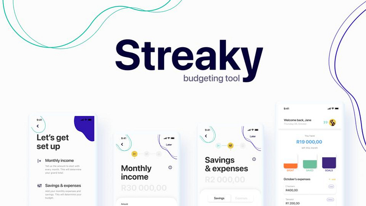
Streaky 🫣 Budgeting Tool
Streaky Budgeting Tool allows young community members to better manage their money. A straightforward setup allows for income, savings and expenses to be easily set up and tracked.
The Design Challenge
Design a digital solution to help members of your community budget better.
To meet this challenge, 7 tasks were done to gather research and insights from real users, sketch and run user testing, and finally create a high-fidelity prototype.
How might we create a budgeting app for 20-30 year-old South Africans that makes it easy and useful to follow a monthly budget?
User Research Insights
A quantitative research approach was taken to determine the real needs and goals of those using a budgeting app.
Sketching
An integral part of the User Experience journey is ideating through sketching. Sketching allows a designer to think through the screen's purpose and layout before jumping in to high fidelity design.
Usability Evaluations
Next up is user testing! One of my favourite UX research methods is to gain honest insight from others using your product.
We learned that:
i. 90% of users said the onboarding process was smooth, but some differentiation in terminology was needed.
ii. 60% of users said that capturing savings & expenses was valid, but the UI elements needed to be more apparent in what they afford the user to do.
iii. 100% of users received the habits (or streaks) part of the app excellently.
Visual Designs
The visual designs below exemplify the Budgeting tool and align with the identified user goals.
Thank you for taking the time to look at Streaky Budgeting Tool's UX case study 🎉


